
You’ve got the paint corrected, the trim cleaned up, and the stance looks right. Then you step back and the vehicle still feels unfinished. That usually means the body has shape, but it doesn’t yet have a voice.
That missing piece is often a decal. On a classic car, truck, or Jeep, the right graphic does more than fill empty space. It tells people whether the vehicle belongs to the hot rod crowd, the muscle era, the trail scene, or a factory-correct restoration mindset. It can whisper or it can shout, but it should always look like it belongs there.
A lot of owners get stuck between two bad options. One is going fully old-school and ending up with materials that don’t last. The other is using modern graphics that hold up well but look too slick, too thick, or too new for the vehicle. The sweet spot sits in the middle. You want authentic vintage aesthetics with the cleaner installation, better adhesion, and longer life that modern materials can provide.
Reviving History Your Guide to Vintage Automobile Decals
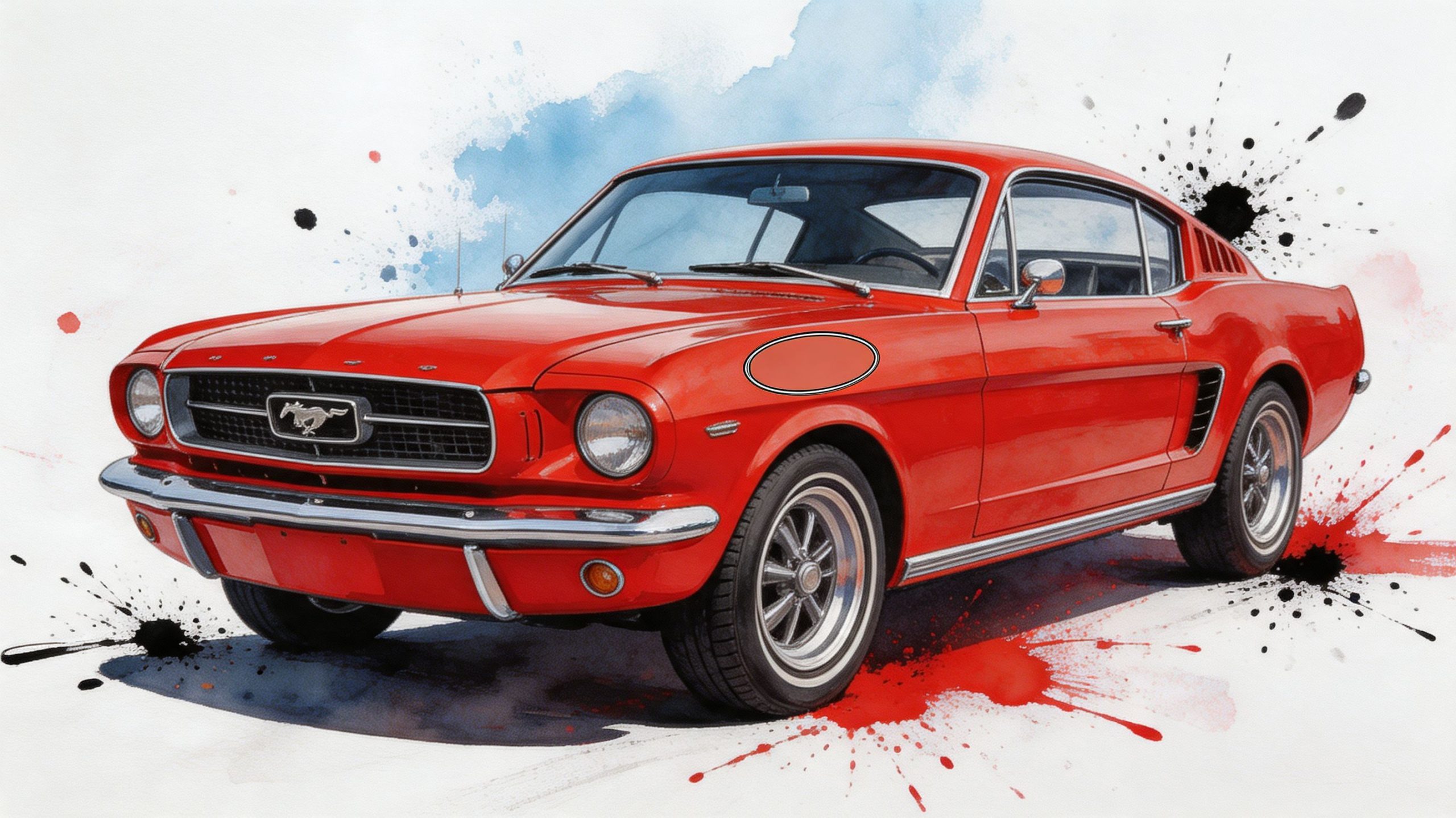
A good vintage decal usually starts with a real-world problem. A customer restores a pickup from the ground up, gets the body color right, and still feels like the truck looks generic. Another owner has a CJ-style Jeep that runs great and turns heads, but the sides look plain without period-style lettering or a stripe package. The metal is right. The story isn’t visible yet.
That’s where vintage automobile decals earn their keep. They add the finishing detail people remember. A small fender script can suggest dealership history. A windshield banner can hint at era and attitude. A pair of side stripes can make a body line look sharper than the factory ever intended.
What makes a decal feel vintage
It isn’t just age. It’s a combination of shape, placement, finish, and restraint. Older designs often work because they follow the vehicle’s body lines instead of fighting them. They sit where a badge, race number, or dealership mark would make sense. They use typography and spacing that feel tied to a specific era.
You can see the same design thinking in other decorative sticker uses too. If you want a simple visual primer on how style and placement change the feel of a surface, Quote My Wall's guide to car stickers is a useful example of how graphics can alter personality without changing the underlying object.
Practical rule: If a decal draws attention to itself before it complements the body shape, it’s probably the wrong size, finish, or placement.
The balance most owners actually want
Most enthusiasts don’t want a museum-only vehicle that can’t handle weather. They also don’t want a decal that looks like it came off a modern delivery van. The goal is simpler than that. You want something that looks period-aware from ten feet away and still behaves like a modern automotive material when exposed to sun, rain, washing, and road grime.
That balance matters most on vehicles people drive. A weekend Mustang, a square-body truck, an old Bronco, a military tribute build, or a trail Jeep all benefit from the same approach. Keep the style rooted in history. Let current materials do the hard work underneath.
The Language of Style Popular Vintage Decal Designs
Vintage decals work like dialects. A flame job says one thing. A pair of blocky side stripes says another. A gold script windshield decal speaks in a totally different tone than a racing roundel on the door. If you know the visual language, you’ll pick graphics that look intentional instead of random.
The modern bumper sticker itself traces back to 1946, when Forest P. Gill used surplus adhesive-backed paper and fluorescent paints from World War II to make self-adhesive designs. That change followed the arrival of standardized bumpers on vehicles like the 1927 Model A, and one of Gill’s first major orders was 25,000 stickers for a Florida tourist attraction, according to this history of bumper stickers from WTOP. That moment matters because it moved vehicle graphics from improvised signs into repeatable, mass-produced design.
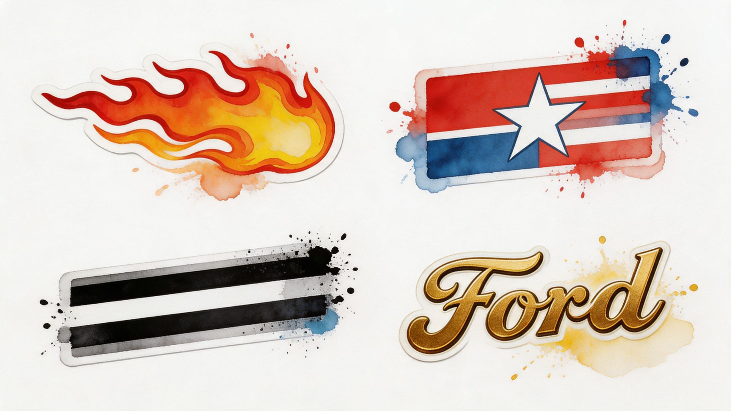
Hot rod language from the 1950s
If your vehicle leans toward chopped, lowered, loud, or custom, the hot rod vocabulary fits. This is the world of flames, pinstripe-inspired accents, scallops, and door graphics with swagger.
Flames work because they create motion even when the vehicle is parked. They belong on cars with visible personality. Think rounded fenders, aggressive rake, exposed mechanical attitude, or a custom build that doesn’t pretend to be factory stock. The mistake people make is choosing flames that are too sharp, too digitally perfect, or too oversized. Vintage-looking flames usually have flow. They shouldn’t look like a generic clip-art shape stuck on a fender.
Small striping accents can also do a lot. They frame curves, sharpen beltlines, and make old sheet metal read more clearly. On a truck, that might mean a modest side accent. On a coupe, it could be a hood edge detail or trunk line highlight.
Muscle car cues from the 1960s and 1970s
This design language is bolder and more disciplined. You see racing stripes, cowl callouts, hood lettering, block scripts, and factory-style logos. These designs don’t just decorate the body. They announce trim, power, or lineage.
A pair of longitudinal stripes says performance. A side stripe says the body has length and speed. A windshield or rear window logo can suggest club identity or model loyalty if it’s used sparingly. If you’re restoring a Chevy-based project, a period-style bowtie graphic is one example of the look many owners want, and a classic Chevy bowtie window decal shows the general style language clearly.
The best muscle-era graphics usually look measured, not busy. They feel like part of the car’s architecture.
Racing and rally visuals
Numbers in roundels, class markings, sponsor-style decals, and country or event identifiers bring in motorsport history. Even if the vehicle never saw a track, these graphics can reference a competition era.
Use them carefully. A race number on the door can look fantastic on a coupe with simple wheels and a stripped-down feel. The same number can look forced on a heavily chromed cruiser loaded with decorative trim. Context matters. Racing graphics work when the rest of the vehicle supports the story.
Service brand and shop decals
Oil, tire, spark plug, and speed shop logos signal a different kind of authenticity. They suggest that the owner knows the culture around the vehicle, not just the vehicle itself.
These are often best used in small doses:
- Quarter glass or rear side window: Good for small period shop marks.
- Toolbox, trailer, or garage glass: Great places for bolder service-brand nostalgia.
- Lower body or door area: Works only if the vehicle is built with a race or shop-truck feel.
Too many brand marks can make a thoughtful build look like a rolling swap meet. One or two can make it look seasoned.
Modern Durability for Classic Looks Decal Materials
A vintage style shouldn’t come with vintage failure. Material choice decides whether your decal hugs a curve and stays put, or shrinks, cracks, and starts lifting at the edges after heat and sunlight do their work.
For automotive use, the core comparison is cast vinyl versus calendared vinyl. The easiest way to understand it is clothing. Cast vinyl is like a custom-fitted jacket cut to move with the body. Calendared vinyl is closer to a stiff off-the-rack coat that looks acceptable on the hanger but fights you once it has to wrap around shape.
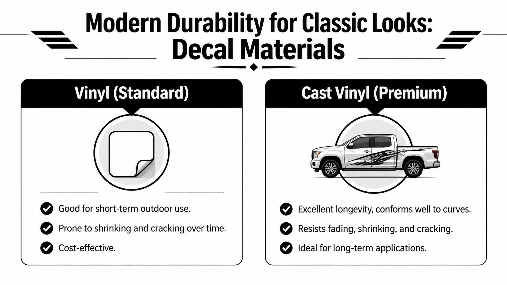
Why cast vinyl behaves better
Cast vinyl starts as a liquid resin that’s poured into a thin sheet. That process creates a film around 2 to 3 mil thick with minimal shrinkage of less than 2%. Calendared vinyl is rolled and stretched during manufacturing, and it can shrink up to 20% over time, which is why it’s more likely to crack or peel on curves. That same source notes that cast vinyl is the standard choice for a 7 to 10 year outdoor lifespan, which is why restorers and professional installers prefer it for cars. The manufacturing difference is outlined in this cast vinyl overview for classic car decals.
What that means on an actual vehicle
On a flat garage sign, economy vinyl can be fine. On a hood bulge, fender contour, or windshield banner, the wrong film starts showing its limits. The edges pull in. Corners tense up. Fine details distort. Then people blame the installer when the actual problem was material memory.
If you’ve ever seen a decal look good on day one and tired by the end of a hot season, that’s usually the story. The film wanted to return to its original shape.
Cast vinyl vs. calendared vinyl for automotive use
| Feature | Cast Vinyl (Professional Grade) | Calendared Vinyl (Economy Grade) |
|---|---|---|
| Manufacturing style | Poured as liquid resin into thin film | Rolled and stretched into sheet |
| Flexibility | High, conforms well to curves | Lower, better on flatter surfaces |
| Shrinkage | Less than 2% | Up to 20% over time |
| Best use | Vehicle graphics, curves, long-term installs | Short-term use, flatter applications |
| Outdoor life | 7 to 10 years | Shorter practical service life on vehicles |
| Typical failure mode | Wears gradually | Shrinks, cracks, lifts, peels |
Matching old looks with new film
Enthusiasts are often pleasantly surprised to find that modern material doesn’t have to look modern. You can use a better film and still choose a design and finish that feel period-correct. Matte and softer-gloss looks often suit older vehicles better than a slick showroom shine. Clean cut lines can mimic painted graphics from a distance, especially when the scale is right.
A windshield banner is a perfect example. It needs to sit flat, survive exposure, and read cleanly through glass. A product built for that kind of use, such as a vinyl windshield banner decal for a Chevy Corvette, shows why premium material matters more than people think.
Cheap vinyl fails loudly. Good cast vinyl disappears into the vehicle and lets the design do the talking.
When economy vinyl still makes sense
There are limited cases where lower-cost material is acceptable. Temporary event graphics, test layouts, or decals for parts that won’t see much weather can justify it. But on a classic vehicle with fresh paint, original paint, or careful restoration work, saving money on the film is usually the most expensive shortcut in the job.
If the decal has to live outdoors, follow body curves, and still look right after repeated washes and heat cycles, cast vinyl is the practical choice.
Perfect Placement Sizing and Applying Your Decals
Good decals can still look wrong if they’re badly placed. Most installation mistakes aren’t caused by shaky hands. They start earlier, when the owner guesses the size, ignores body lines, or applies the graphic before checking how it reads from a normal viewing distance.
For restorations, placement also affects credibility. Over 70% of classic car restoration queries involve decal accuracy, and high-fidelity replicas made from materials like Oracal vinyl can boost vehicle value by 5% to 15% when details are correct, according to Hemmings coverage on decal authenticity and restoration accuracy. That doesn’t just matter at a judged show. It matters any time someone knowledgeable walks up to your vehicle and instantly sees whether the graphic belongs.
Start with proportion, not installation
Before you peel anything, stand back and decide what job the decal is supposed to do. Is it meant to identify the model, fill visual dead space, stretch the body line, or create a competition vibe? The answer affects size.
Use painter’s tape to outline the decal’s footprint on the vehicle first. That simple mockup helps in three ways:
- You see scale clearly: What looks modest on a workbench can look oversized on a quarter panel.
- You check body breaks: Door seams, trim edges, and vents can interfere with the design.
- You test sight lines: A decal should read properly from standing height, not just from inches away.
Sizing by panel type
Different surfaces need different thinking.
- Windshields and rear glass: Keep the design high enough or low enough to avoid cluttering your view. Check visibility from the driver’s seat before final placement.
- Doors and quarter panels: Align to body lines, not the ground. Older vehicles often sit with visual rake, and a level decal can still look crooked if the sheet metal suggests a different angle.
- Hoods and center stripes: Measure from the exact centerline, then re-check from the front of the vehicle. Hoods can fool your eye.
- Jeep and truck side graphics: Let the decal work with the slab sides. Don’t stop awkwardly in the middle of a handle, flare, or fuel door if the design can be adjusted.
If you’re torn between two sizes, the slightly smaller one usually looks more authentic on a vintage vehicle.
The hinge method that saves installs
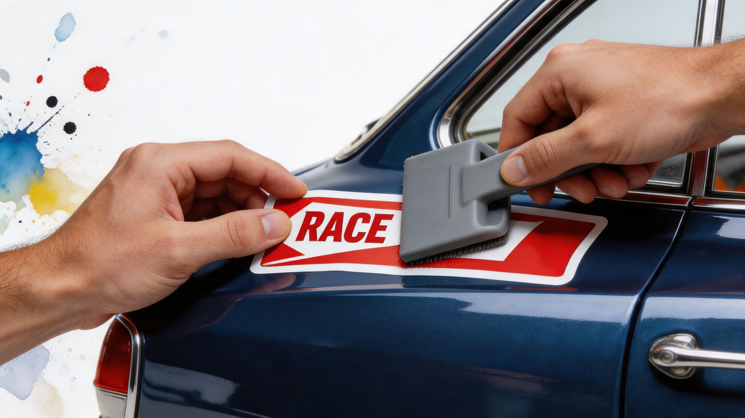
The hinge method is simple, and it’s still one of the most reliable ways to apply a decal straight.
Basic hinge method
- Clean the surface thoroughly. Remove dust, wax, and residue.
- Tape the decal in place while the backing is still on. Step back and inspect it from multiple angles.
- Run a strip of painter’s tape across the center or top edge. This becomes your hinge.
- Lift one side, peel back part of the liner, and cut away the peeled section if needed.
- Lay the decal down gradually with a squeegee. Work from the center outward.
- Repeat on the other side.
- Remove the transfer tape slowly. Pull it back at a sharp angle, not straight up.
This method works especially well for long stripes, windshield text, and multi-element layouts because the hinge keeps your alignment locked while you work.
A visual demo helps a lot when you’re doing this the first time. This install video shows the rhythm and hand positioning clearly:
Dry application versus wet application
Many modern automotive decals install well dry, especially when they arrive pre-spaced on transfer tape. Dry application gives you faster tack and cleaner edge control. Wet methods can help in some cases, but they also slow bonding and can frustrate beginners if the adhesive and transfer materials aren’t suited for it.
For most hobbyist installs, I’d keep the rule simple:
- Use dry application for standard cut vinyl lettering, banners, and most body graphics.
- Consider wet application only if the manufacturer specifically allows it and the decal is large enough that repositioning is necessary.
Small details that make the job look professional
A few habits separate a clean install from a home-garage disaster:
- Warm panel, not hot panel: Apply in moderate conditions. A scorching hood makes adhesive too grabby.
- Fresh squeegee edge: Nicked tools leave marks and trap air.
- Slow transfer tape removal: If a small part lifts, lay the tape back down and squeegee again.
- Final press on edges: Corners and thin tips need one more firm pass.
If you buy a pre-spaced, transfer-taped decal from a supplier set up for automotive installs, the process gets easier because the spacing work is already done. That matters most with script lettering and multi-piece vintage designs.
Care and Removal Preserving Your Paint and Decal
A well-installed decal doesn’t need babying, but it does need common sense. Most damage happens during washing and removal, not during normal driving. Owners scrub edges with stiff brushes, blast them with pressure, or attack old adhesive with tools that should never get near paint.
That’s why removal questions come up so often. Online forums show that 60% of decal-related questions are about safe removal, and a 2025 3M study found that heat-assisted removal paired with a citrus-based remover preserves 90% more of the vehicle’s paint than scraping or using harsh solvents, as summarized in this discussion of decal removal concerns. On older paint, that difference matters.
Washing without shortening decal life
Treat the decal as part of the finish, not as a separate object glued on top.
A few habits help:
- Use mild car-wash soap: Harsh cleaners can dry edges and dull the face film.
- Wash with the edge, not against it: Move your mitt or sponge in a way that doesn’t catch corners.
- Be careful with pressure washers: Keep distance and avoid directing high pressure at edges.
- Dry with a soft microfiber towel: This reduces water spotting and prevents edge snagging.
Safe removal on original or older paint
Removal is all about patience. You want to soften the adhesive, lift gradually, and clean residue without forcing anything.
A shop-style removal sequence
- Warm the decal gently with a hairdryer or controlled heat gun setting.
- Lift a corner with a plastic blade or fingernail. Don’t use a metal razor on painted panels.
- Peel slowly at a low angle. Let the heat stay a step ahead of the peel.
- Apply a citrus-based adhesive remover to residue, then wipe with microfiber.
- Wash the area after removal so no cleaner remains on the paint.
Older paint can be less forgiving than modern finishes. If the panel has unknown repaint history, test your heat and remover on a small area first.
If you want a removal walkthrough from another surface-care angle, the boat decal removal guide from Boat Juice is useful because it reinforces the same core principles: soften, lift, and clean gently instead of scraping.
When not to remove a decal yourself
Stop and reassess if:
- The paint is already checking or flaking
- The decal has baked on for years and breaks into tiny fragments
- You suspect a weak repaint under the graphic
- The surface is textured, repaired, or unusually fragile
In those cases, slower work or professional help makes more sense than forcing the job in an afternoon.
Ordering Your Piece of Automotive History
Vehicle graphics didn’t start with modern sticker shops. They go back to the late 19th century, when people hand-painted ads onto carts and trains. By the early 1900s, brands such as Ford and Kellogg were already using locomotives as rolling billboards, and the arrival of bumper-equipped cars created a new place for graphics to live. That tradition eventually grew into today’s multi-billion dollar vehicle wrap market, as outlined in this history of vehicle graphics from TKO Graphix.
That long history matters because ordering a decal isn’t just a shopping task. You’re choosing how your vehicle joins that tradition. A good order starts with clarity, not impulse.
What to check before you buy
Use a short filter before you click Add to Cart:
- Design fit: Does the graphic match the era and attitude of the vehicle?
- Material fit: Is it made for automotive use, not general craft use?
- Finish fit: Will the sheen look right on old paint, restored paint, or glass?
- Application fit: Is it supplied in a form you can install cleanly?
What a reliable supplier should tell you
You shouldn’t have to guess at the basics. Look for clear information on vinyl type, outdoor durability, installation format, and intended use. If the listing is vague, assume the material might be too.
If you need a one-off layout, model-specific wording, or your own period-inspired design, a make your own custom car sticker option is one practical route because it lets you adapt the graphic to your panel size and style instead of forcing your vehicle to fit a generic template.
A simple buying mindset
Don’t shop by color first. Shop by story first.
A decal should answer a few quiet questions. Does it look like it belongs on this vehicle? Does it respect the lines of the body? Will it still look right after weather, washing, and a season of use? If the answer is yes, the graphic becomes part of the vehicle instead of something merely attached to it.
That’s the difference between decoration and identity.
Vintage Decal Questions and Answers
Are vintage automobile decals the same as bumper stickers
No. A bumper sticker is one branch of the family tree. Vintage automobile decals include window lettering, hood graphics, side stripes, racing roundels, service logos, windshield banners, and reproduction factory markings. Some are decorative. Some are historical. Some are used in restoration because the vehicle looks incomplete without them.
How do I make a modern decal look period-correct
Focus on four things: the design style, the finish, the scale, and the placement. Even excellent material will look wrong if the lettering is too modern, the stripe is too wide, or the gloss level looks out of character with the vehicle. In practice, period-correct usually means choosing less flash and more discipline.
Should I choose factory-correct decals or era-inspired customs
That depends on the build. A judged restoration usually benefits from factory-correct markings and exact placement. A driver build, tribute truck, or vintage-style Jeep often has more room for interpretation. If the vehicle tells a believable story and the graphics support that story, an era-inspired custom can look just as satisfying.
Can decals go on original paint safely
Often, yes, but caution matters. Original paint can be more delicate than a fresh modern refinish. The biggest risks usually show up during removal, not application. Clean the surface gently, avoid aggressive solvents, and don’t rush placement or later removal.
A decal doesn’t damage paint by existing. Trouble usually starts when someone installs over contamination or removes it with scraping and harsh chemicals.
How can I tell if a reproduction decal is convincing
Look at the basics before you look at the shine. Check the shape of letters, the spacing, the border thickness, and whether the color feels true to the era. A convincing reproduction usually gets the small geometry right. A poor one may look close at first glance but starts feeling off when placed next to trim lines, badges, and body contours.
Are matte decals more authentic than glossy ones
Sometimes, but not always. Matte can help mimic older painted or aged finishes, and it often looks more believable on vintage trucks, off-road builds, and understated classics. Gloss still makes sense for many muscle-era styles and glass-mounted graphics. The right answer comes from the vehicle and the specific design, not from a rule that one finish is always better.
Where do owners most often place decals incorrectly
Common trouble spots include putting door graphics too high, centering stripes from an uneven visual reference, and choosing rear glass decals that overpower the entire vehicle. The easiest fix is to mock up the location with painter’s tape and walk several feet away before committing.
Is it better to install one large decal or several smaller elements
Several smaller elements often give you more control, especially on older vehicles with trim breaks, handles, or uneven body shapes. One large decal can look cleaner on smooth panels, but it leaves less room for adjustment. The right choice depends on the panel and the style of the artwork.
Do vintage-style decals only work on actual classics
Not at all. Plenty of owners use vintage automobile decals on newer trucks and Jeeps because they like the heritage look. The key is honesty. If the design clashes with the body style, it looks costume-like. If it complements the vehicle and uses restrained placement, it can look intentional and sharp.
If you’re ready to add a period-right touch to your car, truck, or Jeep, Custom Sticker Shop offers automotive vinyl decals and custom options built for real vehicle use. Browse by style, compare placements before you order, and choose a graphic that fits your vehicle’s story instead of just filling empty space.