
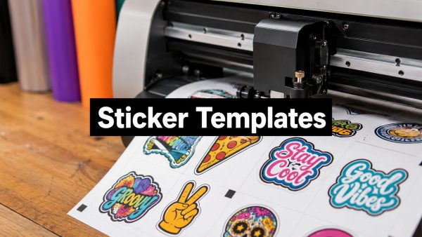
You can have a clean vector logo on screen and still end up with a sticker that peels at the corners, clips the text, or looks muddy after print. That usually happens because the file was built like a graphic, not like a production document. A proper sticker template design file has to survive layout, export, cutting, transfer tape, and the actual install, especially when the decal is going on glass or curved vehicle panels.
That's why I treat the template as the core product. The artwork is only one layer of the job. The rest is making sure the printer, cutter, and installer all get the same instructions from one file, with no guesswork and no room for the white edge surprise that ruins a first run.
Why Most Printed Stickers Fail Before the Press Ever Runs
A customer brings in a file that looked perfect on the screen, then the proof comes back with clipped lettering or a border that's too tight. Sometimes the print itself is fine, but the corners start lifting because the layout didn't respect the way vinyl gets trimmed and handled. The fix usually isn't “better printing.” It's a better template.
Sticker template design is where the job either gets organized or starts drifting. A strong template lets you place the cut path, bleed, and safe zone before the artwork starts competing for space. That matters even more when the decal has to read fast, like barcodes, labels, or small decals, where every edge has to stay crisp. If you want a practical extra reference on that kind of layout discipline, Industry Horror's barcode sticker tips are worth a look because they reinforce the same core idea, keep the mark readable, keep the border clean, and don't trust luck.
The real failure mode is usually layout, not ink
A bad sticker file can fail long before anyone loads the press. If the design was never built for trim drift, the cutter will expose problems the screen hid. If the text sits too close to the edge, the install looks rushed even when the print quality is decent.
Practical rule: if a sticker looks fine only when you zoom in, it probably won't look fine after it's printed and trimmed.
The printer can't rescue a file that ignores production reality. That's why good shops start with the template, not the artwork.
A useful habit is to think about where the sticker will live. A flat laptop decal has more tolerance than a windshield banner, and a vehicle graphic has a very different job from a simple planner sticker. If the layout doesn't answer those use cases up front, the print queue just becomes a reprint queue.
Setting Up Your Artboard and Base Document
Start with the exact output size, not a rough estimate. That's how printable planner sticker workflows handle it, and it's the same reason a vehicle decal should be built to its real dimensions instead of scaled later. In one printable planner sticker tutorial, the setup uses the page's exact size first, then aligns artwork to that page before export. That's the right mindset for vinyl too, because the file has to match the physical job, not just look balanced on screen.

Build the file around the real object
A planner sheet and a car decal don't use the same mental model. A printable planner page, like the 7 in by 9.25 in Happy Planner example in the tutorial, is a page-first document. A 4 in by 6 in vehicle decal is object-first, meaning it has to fit on a specific panel, glass area, or body contour. The file should reflect that from the first minute.
Set the units before you design anything. Millimeters are common in production conversations because they make bleed and safe zone work cleaner, while inches can be easier for mockup discussions. Either way, lock the artboard size before you add layers so nothing shifts behind your back.
Keep the foundation boring. Name the base layer, the guides layer, and the artwork layer before you start drawing, then lock the guides so you're not nudging them by accident.
If you want a product page example of how a vehicle decal is presented to buyers, the layout on this custom car decal listing shows the kind of straightforward, size-aware presentation that matches a production file.
Keep the file editable
Don't bury the design under random duplicates or unnamed shapes. Use clear layer names such as Artwork, Cut Path, Bleed Guide, and Safe Zone. That makes proofing faster and prevents confusion when the file moves from design review to print.
The point is control. A clean base document doesn't make the sticker prettier, but it makes the whole job less fragile.
The same discipline works whether you're building a window decal or a planner sticker. Exact size first, editable structure second, artwork third.
Color Mode, Resolution, and Palette Decisions
Use CMYK for any sticker template that's headed to production. That's the safe prepress choice because the template needs to match print behavior, not monitor behavior. If you keep designing in RGB and only convert at the end, the colors can shift in ways that are hard to predict on bright, saturated artwork.

Build for print, not for the screen
Raster elements should be set to 300 dpi at actual output size. That setting gives the printer enough detail to hold up in the final output without turning soft at the edges. Vector type and shapes can stay scalable, which is one reason they're so useful inside sticker template design.
Color decisions matter as much as resolution. A strong palette with 3 to 5 colors tends to hold together better after production, while too many similar colors can flatten out and lose contrast. In practice, thin borders and crowded color variations are the first things that disappear when a sticker gets cut, applied, and seen from a normal distance.
Practical rule: if two colors look almost the same on screen, they'll probably collapse into one visual mass on the finished decal.
The best color choices are the ones that stay legible after weather, glare, and motion enter the picture. That's where a simple palette wins over a fancy one.
If you want to connect color choice to local branding decisions, DesignStack's colour psychology advice for local businesses is a useful reminder that the palette should support recognition, not just decoration.
Keep the art simple enough to survive production
Simplified shapes and strong outlines are easier to cut cleanly and easier to read on a vehicle. Fine detail often looks good in a mockup, then turns fragile once the decal is scaled down or viewed in sunlight. That's why I'd rather see a bold shape with clean separation than a complicated illustration with a dozen nearly identical tones.
When the palette is disciplined, the file behaves better. The print shop gets fewer surprises, and the installer gets a graphic that still reads from a distance.
Defining the Cut Path, Bleed, and Safe Zone
The three layers that matter most are the cut path, the bleed, and the safe zone. The cutter follows the path, the bleed protects the edge, and the safe zone protects the parts you can't afford to lose. If those three aren't separated visually in the file, the template is too sloppy to trust.

Draw each layer for a different job
The cut path is the line the plotter or cutter follows. It should be clean, obvious, and isolated from the artwork so nobody mistakes it for a printed border. The bleed extends artwork past that line, and the goal is simple, if the blade drifts a touch, you still don't reveal a white edge.
For sticker template design, a reliable prepress workflow is to add 3 mm of bleed beyond the trim line and keep critical elements inside a safe zone. That gives the cutter room to breathe and keeps text from getting nicked. It also makes the install feel intentional instead of improvised.
Use the safe zone like a hard boundary
The safe zone is where important text, logos, and faces stay protected. For a vehicle decal, I'd treat 3 mm as the minimum margin when the layout is tight. If the design depends on ultra-fine spacing, the layout is already asking for trouble.
The actual shapes matter too. A rounded logo can tolerate a little drift better than a sharply framed wordmark, because the eye forgives organic edges more easily than precision corners. That's one reason simple, bold forms are easier to install cleanly on curved surfaces.
If you're building a larger install piece, a product example like this 11-inch-wide custom text window decal helps show how width, spacing, and readable type all have to work together before the file goes to print.
Don't draw the cut line as part of the visible artwork. Keep it separate, named clearly, and easy to remove before export.
Once the three layers are separated, the file starts acting like a production document instead of a sketch. That's the difference between a sticker that trims cleanly and one that forces the installer to guess where the edge really is.
Vector Versus Raster Inside the Template
Vector and raster aren't competing formats, they're different tools inside the same template. Use vector when the job needs sharp scaling, clean type, and dependable cut paths. Use raster when the artwork contains photos, texture, or scanned material that can't be redrawn cleanly.
| Element | Use Vector | Use Raster |
|---|---|---|
| Text | Best for crisp lettering and easy edits | Only if the text has already been flattened into artwork |
| Logos and icons | Best for scaling and clean edges | Use only if the source is a low-quality bitmap |
| Photos | Not ideal | Best for photographic detail |
| Cut path | Best choice | Not appropriate |
| Textured background | Less practical | Better when the texture is essential |
Pick the format that protects the job
A vector shape stays sharp when the file is enlarged, which is why it's the right choice for borders, type, and cut lines. Raster art has a fixed resolution, so it needs to be placed carefully and kept at the right output size. That matters when a template includes a photo panel, a weathered texture, or any artwork that started as a scan.
If you're making labels that need to survive handling and washing, the logic is similar to the use case behind durable dishwasher safe name labels. The file has to support the environment it's going into, not just the browser where it was designed.
Embed raster art without wrecking the file
Don't resize raster images randomly after they're placed. Put them in at the size they'll print, and make sure the rest of the template is built around that limitation. If the photo edge is going to sit near the cut path, simplify the area around it so the final trim doesn't expose a messy transition.
Vector inside, raster only where needed. That's the cleanest way to keep the template usable by both the designer and the production team.
Export Settings, Transfer Tape, and Pre-Spacing
Export is where a lot of good sticker template design files go sideways. The artwork may look finished, but the file still has to survive the handoff to manufacturing and, in some cases, arrive already spaced for install. That's where format discipline and transfer tape planning start to matter.
Choose the export that matches the shop workflow
PDF is a strong choice when the shop needs a clean print-ready file. SVG works well for editable vector artwork, and AI keeps native Illustrator structure intact. What matters is not the export label alone, but whether the file keeps the cut path separate and the artwork faithful.
Flattening or outlining type can be necessary, but don't do it until you've saved a backup with live text. Once the letters are outlined, they're no longer editable as text. That's fine for final output, not fine for a file you may need to revise tomorrow.
For buyers who want the whole process to feel more install-ready, a product like this custom text windshield banner decal shows why spacing and layout have to be considered before the job ships, not after it lands on the table.
Pre-spacing makes the decal easier to apply
A pre-spaced decal arrives with the elements already positioned so the installer isn't hunting for alignment under transfer tape. That matters on curved glass and hoods, where you get one shot to place the graphic cleanly. The tighter the spacing and the more deliberate the layout, the easier the install.
If the design needs the installer to “figure it out,” the template wasn't finished.
Transfer tape size should match the actual install footprint, not just the outer artwork shape. Too much extra tape gets awkward on curved surfaces. Too little leaves you with a narrow, hard-to-handle piece that shifts during placement.
The goal is simple. The file should hand the production team a decal that's easy to print, easy to weed, and easy to apply in one controlled move.
Pre-Flight Checklist and Common Print Failures
A fast pre-flight pass catches most sticker problems before they cost time and vinyl. Run the file through the same checks every time, and don't skip the boring ones. The boring ones are usually the expensive ones.

The checks I'd run before sending anything to print
- Confirm bleed exists: Make sure the artwork extends past the cut line so a tiny cutting shift won't reveal a white edge.
- Check the color mode: Verify the file is in CMYK, not RGB, before the printer sees it.
- Inspect the raster resolution: Any placed image should be at 300 dpi at output size.
- Separate the cut path: The cutter should have its own dedicated layer, not a random colored stroke inside the artwork.
- Save a text-safe copy: Keep one version with live type in case the wording changes later.
- Review contrast at normal distance: Thin borders and crowded colors can disappear once printed and installed.
- Mock up the decal on a vehicle photo: Make sure the size and placement feel right on the actual surface.
Common failures show up in the same places
RGB blacks often print muddy because the screen black isn't the same as a production black. Thin borders vanish faster than bold shapes. Raster art below production quality turns soft, and cut paths drawn as part of the visible design create confusion during export.
A small proof print helps too. Print at actual output size, then step back and look at it from a normal viewing distance. If the layout already feels awkward in a proof, the installed version won't fix itself.
The best habit is to treat the template like a final product, not a draft. If the file passes the checklist, it's ready to move. If it fails one item, fix that item before you send it anywhere.
If you want a sticker or vehicle decal that's built for print, cut, and install, send your dimensions, artwork, and placement goal to Custom Sticker Shop. A clean template saves time on the front end, and a production-ready file usually means fewer revisions, cleaner edges, and a much better first install.