
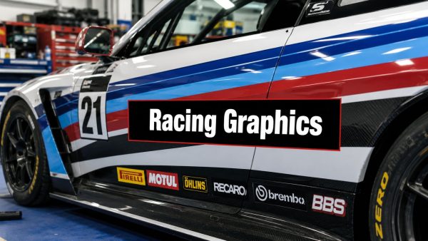
You've got the car washed, the panel gaps checked, and a fresh idea for stripes or a full livery sitting in your head. Now, the question is whether you want the car to look fast from ten feet away, or whether you also want the graphics to survive curves, door seams, and a long day of handling at the track without turning into a weekend repair job. That's where racing graphics for cars gets interesting, because the best look isn't always the easiest install, and the easiest install isn't always the one that reads cleanly at speed.
A lot of people start with the same instinct. They want something bold, something that looks at home in the pit lane, and something that feels connected to motorsport history. That instinct is right. The trick is learning how to choose the right style, the right material, and the right placement before you ever lay vinyl on paint.
Understanding Racing Graphics and Their Purpose
The clearest way to think about racing graphics is as a blend of identity, readability, and style. The modern racing stripe milestone goes back to the mid-1960s, when the Shelby GT350 was first fitted with stripes in 1965 to help pit crews identify cars more easily on crowded circuits, and that practical idea grew into a decorative automotive style used globally on performance and custom cars (history of racing stripes on the Shelby GT350, overview of graphic design history and automotive styling).

From track ID to visual branding
At first, graphics were there so a crew could tell one car from another without squinting through spray, dust, or a crowded pit lane. Over time, they became a styling layer and a branding layer, not just on racecars but on street builds too. That shift matters because the same stripe that once solved a visibility problem now also signals intent, whether the car is a weekend track toy, a drift build, or a show car.
A useful mental model is a team uniform. A plain uniform identifies the person. A well-designed one also tells you which team they belong to and how they want to be seen. Racing graphics do the same thing on a car body, only the canvas is curved, segmented, and moving at speed.
What the graphics are trying to do
Good graphics usually serve more than one purpose. They help the car stand out, they make the shape feel lower and more aggressive, and they can guide the eye along body lines so the car looks intentional instead of busy. That's why a stripe over a hood can feel elegant, while the same idea placed without regard for vents or seams can look awkward.
If you're looking at a car build from the side, the graphics should read quickly. If you're looking at it up close in a paddock, the edges should still make sense. That's the balance to aim for, and it's the reason planning matters more than buying the first decal set you like.
For anyone trying to understand how a full visual identity gets built around a car, the role of livery vehicles in motorsport is a helpful reference point because it frames graphics as part of the larger race presentation, not just decoration.
Common Styles and Materials for Racing Graphics
The easiest mistake is thinking every racing graphic has to be a full wrap. In practice, the best choice depends on how much visual impact you want and how much installation risk you're willing to take. A single stripe is straightforward. A sponsor block gives you a clean branding area. A full-body wrap gives the biggest transformation, but it also asks the most from your installer and your panel shapes.

Styles that fit different goals
Single stripes are the classic entry point. They're easy to read, they suit hoods, roofs, and trunks, and they don't fight the car's shape as much as larger coverage layouts do. Dual stripes keep that traditional racing feel while adding a bit more presence, which is why they're common on performance cars and resto-mods that want a vintage motorsport look.
Full-body wraps are in a different category. They're for people who want a complete visual identity, not just an accent. They also demand much more care around handles, mirror caps, bumpers, and sharp body transitions. Sponsor blocks make sense when the goal is to display names or logos in a controlled area without turning every panel into a busy surface. Accent decals are the lightest touch, and they're a smart pick when you want subtle motion in the design without committing to large coverage.
Materials that change the install
Material choice matters as much as style. Oracal 651 is a dependable general-purpose option, and it fits a lot of builds where the graphic doesn't need extreme stretch. Cast vinyl is the safer choice when the car has compound curves because it conforms better around difficult shapes. Reflective film works when visibility is part of the brief, and textured looks like carbon fiber vinyl are more about surface character than pure race authenticity.
Practical rule: the more complex the panel, the more you should favor a material that moves with it instead of fighting it.
If you're browsing specialty options for a custom layout, a source like Get Specialty Vinyl from T-Shirt Envy is useful because it shows how material selection changes the final look before you commit to a design.
A simple way to decide is this. If the car has flat, easy surfaces and you want a clean traditional feel, stripes and durable cut vinyl make sense. If the car has aggressive fenders, deep bumpers, or a wide body kit, cast vinyl becomes the smarter buy because it gives you more forgiveness during installation. For inspiration on a classic hood-band look, this sample band layout is a helpful visual reference.

Sizing and Placement Guidance for Car Graphics
Bad placement ruins good graphics faster than bad color choice does. A stripe that's too wide can make the hood feel heavy. A decal that drifts off-center makes the whole car look rushed. The fix is to measure first, mock it up second, and cut only after you know exactly where every edge should sit.

Measure the panel, not the idea
Start with the actual application area. Hoods, roofs, and deck lids rarely behave like perfect rectangles, so measure the surface where the vinyl will live, not just the outer dimensions you see from across the garage. Use painter's tape to mark the centerline and the outer boundaries, then step back and check the car from the front and rear.
A hood stripe that looks centered on paper can drift once it crosses a badge, scoop, or raised center section. That's why the shape of the panel matters more than the shape in your head.
Test the layout before anything gets cut
Paper templates and tape are cheap. Vinyl cuts aren't. Lay the design out temporarily, then compare both sides of the car and check the view from a normal standing distance, not just up close. That's especially important on cars with long noses or sloping roofs, because a line that's mathematically centered can still feel visually off if the body tapers.
Installers catch more mistakes with tape than with knives.
Respect seams, doors, and wrap-around areas
Door gaps, bumper transitions, and side skirt edges are where a lot of first-time installs go sideways. If a stripe crosses a door seam, you have to decide whether it should visually continue cleanly or be broken into separate sections. On bumpers, the graphic may need to tuck in and flow with the body rather than force a straight line across a curved shape.
The safest approach is to prioritize how the car reads at speed. That means long lines should stay visually consistent from a distance, even if they need to be split in hidden places to make the install cleaner. If you're tempted to improvise, stop and re-tape the layout instead. Ten extra minutes with a ruler beats an hour trying to peel and re-align a crooked stripe.
Design Best Practices and Template Examples
Good racing graphics don't shout everywhere at once. They pick a few visual jobs and do them well. That usually means strong contrast, enough empty space for the eye to rest, and a design that matches the car's body style instead of competing with it. The car should still look like a car, not a moving poster board.
Keep the design readable in motion
A decal that looks brilliant in a garage can disappear at track speed if the contrast is too low or the pattern gets too busy. Dark-on-dark graphics often flatten out. Thin lines can vanish on glossy paint if the surrounding color is too close. Clean shapes survive that problem better because the eye can separate them quickly, even when the car is moving.
Symmetry also matters more than many first-time buyers expect. A common but overlooked question is why racing graphics are often mirrored on both sides of a car, and the practical answer is that symmetry preserves balance at speed and fits tuner culture aesthetics (mirrored decal discussion). That doesn't mean every design must be mirrored, but it does mean the mirrored look often feels more finished and easier to read.
For a strong example of a side-profile style concept, this JDM-style reference image shows how a graphic can carry attitude without needing to cover every panel.

Build from a template, then adapt it
The smartest templates are the ones you can scale. A hood stripe layout can become a roof treatment with almost no redesign. A side-panel swoop can be shortened for a coupe or extended for a sedan. Sponsor blocks work best when they're treated like zones, not random stickers, so the logos stay organized and don't drift into each other.
A few practical rules help here:
- Use the car's body line as the anchor: A stripe should follow the design of the panel, not ignore it.
- Keep text separate from busy shapes: Fonts need room, or they'll blur into the graphic.
- Leave breathing space around logos: Empty space makes sponsor art easier to read.
- Test the design on the exact vehicle type: A shape that works on a hatchback can feel cramped on an SUV.
If you're editing in a vector program, keep the first version simple. Start with one main element, then add accents only if the car still looks balanced. That approach keeps the design from becoming cluttered, and it makes installation easier because fewer layers usually mean fewer alignment headaches.
Choose the style that matches the build
A vintage hot rod often looks better with a restrained stripe set than with a heavy wrap. A drift car can carry more visual energy because that culture already expects louder graphics. Rally-inspired builds usually benefit from graphics that feel purposeful and easy to identify from a distance, especially when the body already has vents, flares, and mud protection.
The best template is the one that survives both close inspection and real-world viewing. If it looks sharp parked, reads clearly at a distance, and doesn't fight the body, you've probably made the right call.
Installation Process and Essential Tools
Clean vinyl work starts long before the squeegee touches the panel. The surface has to be clean, the layout has to be right, and the installer needs enough control to avoid stretching the film at the wrong moment. On curves, this matters even more, because the material won't forgive the same mistakes a flat panel might.

Start with prep, not pressure
Wash the panel, then wipe it with isopropyl alcohol so you're not trapping grime under the vinyl. If the panel has wax, silicone residue, or polish dust, the adhesive can't do its job properly. That's why paint prep is part of the install, not a separate chore.
If the paint already has swirls or defects, a careful detail step can make the final result look much cleaner. For that kind of groundwork, Derek's paint correction expertise is a useful reference because it shows how surface quality affects the finish before graphics go on.
Lay it out and work the film slowly
Use transfer tape to hold the design in place while you check alignment. Once it's where you want it, start applying from the center outward and use a squeegee to push air out as you go. Heat helps the film relax around curves, but too much heat in one spot can make the vinyl behave badly, so keep the gun moving and work in small sections.
The install gets tricky near door gaps, mirror bases, and compound curves. That's where you want patience, not speed. The goal is to make the vinyl follow the car, not force the car to fit the vinyl.
Trim cleanly and finish the edges
Excess film should be trimmed carefully after the main section is seated. Pay close attention to panel edges, because lift often begins where the vinyl is cut too close or where tension builds near a curve. Once the graphic is down, run your hand along the edges and check for spots that need post-heating or extra pressure.
The most useful hand tools are simple: a squeegee, a heat gun, a sharp trim blade, and a corner tool for tight areas. Tacky gloves help keep fingerprints and drag marks down, and pin-prick tools can help release trapped air in stubborn spots. Complex surfaces reward calm hands. Rush the edge work, and you'll usually see the mistake later in the form of a lift line or a tiny bubble that won't disappear.
Maintenance Durability Tips and Legal Track Considerations
Graphics last longer when you treat them like part of the car, not a disposable accessory. Regular hand washing is easier on vinyl than aggressive washing methods, and edge care matters because once a corner starts lifting, dirt and water can work underneath it. Premium cast vinyl usually handles demanding shapes better, but any film will live longer if the edges are kept sealed and clean.
Keep the finish intact
If you're trying to preserve a gloss or satin finish, the biggest threat is usually neglect, not mileage. Wash gently, avoid harsh scrubbing at corners, and inspect the edges after track days or long highway runs. UV exposure also matters, so a quality material choice is part of the maintenance plan from day one.
The guidance around iRacing graphics is a useful reminder of a broader rule, too. When a simulator's default memory handling under-allocates VRAM, textures look blurry and streaming gets worse, which shows how graphics performance depends on respecting the limits of the system (VRAM tuning in iRacing). The same principle applies to real cars, because forcing material into a shape it can't comfortably hold usually creates visible wear later.
Respect the event rules before scrutineering does
Track events and sanctioning bodies can care a lot about what's printed on a car, where numbers sit, and how sponsor marks are arranged. If you're building for competition, don't assume the same layout that looks good in the driveway will pass inspection in the paddock. Check the event packet before you print anything.
Track compliance starts with the design file, not the last-minute phone call.
That means planning space for race numbers, leaving room for required decals, and understanding where your chosen series expects certain markings. It also means thinking about contrast. A number that looks cool on a render but disappears on track can create needless problems when officials need to identify the car quickly.
Watch the parts that fail first
The trouble spots are almost always familiar. Door edges, curved flares, bumper corners, and any area that gets touched often will age faster than the middle of a flat panel. If you're inspecting the car after a session, start there first.
A clean graphic job is part art and part maintenance schedule. The owner who checks edges, keeps the panel clean, and stays ahead of event requirements gets the longest life out of the vinyl. The one who ignores seams usually ends up redoing small sections sooner than expected.
Conclusion with How to Choose and Order Custom Decals
The easiest way to choose racing graphics is to work backward from the car. Decide how bold you want the look to be, pick a material that fits the panel shape, then settle the placement before you order. Cast vinyl is the safer long-term choice when curves are involved, while simpler layouts are better when you want easier installation and cleaner results.
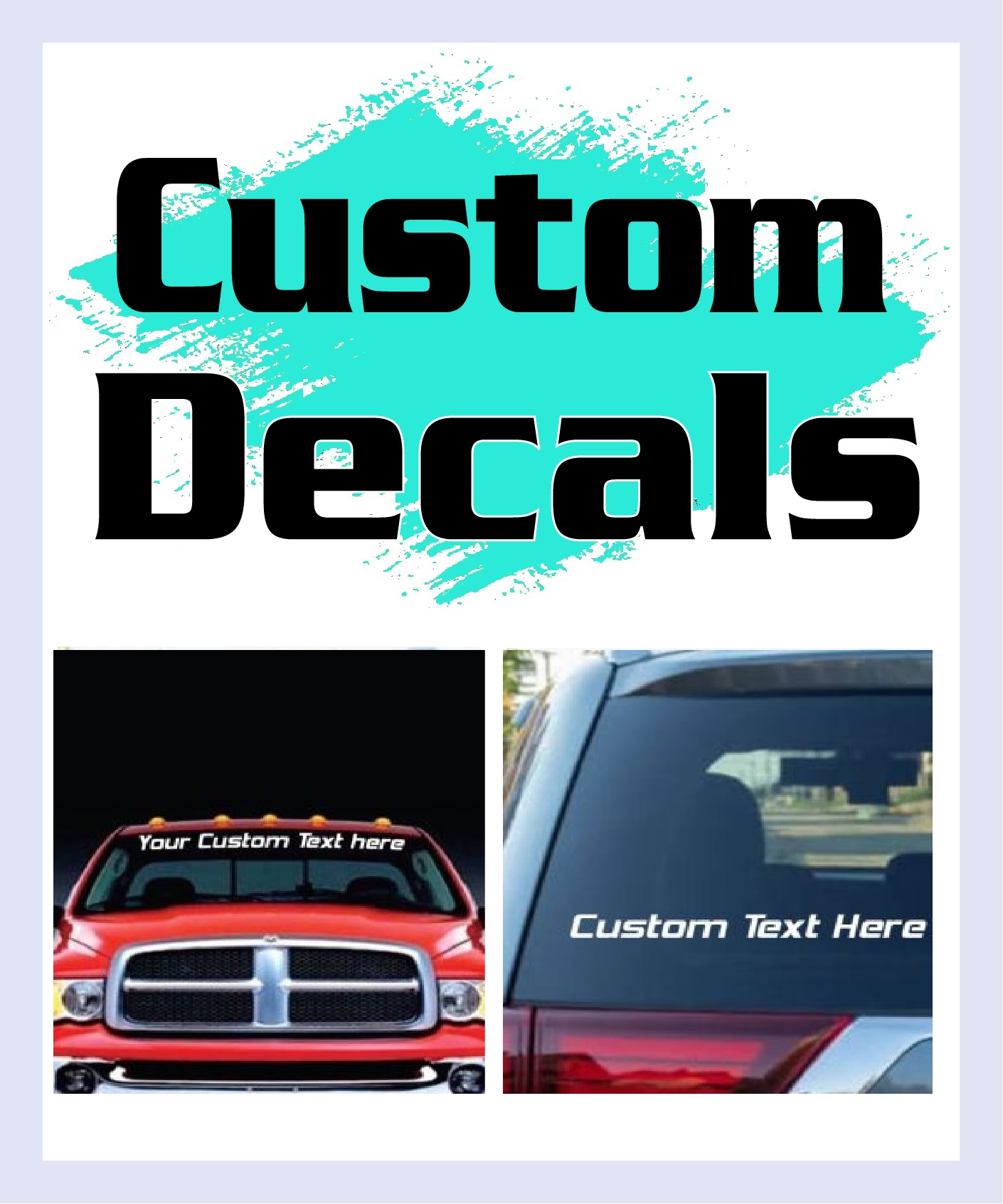
If you're buying custom decals, look for clear artwork submission steps, pre-spaced transfer tape, and a provider that makes the ordering process plain. The final design should match your car's body lines, your skill level, and how much time you're willing to spend at install. A graphic that looks great on screen but arrives impossible to align isn't a good buy, no matter how sharp the render looked.
For a practical visual example of a finished custom-style setup, this custom decal reference is a useful reminder of how a clean layout can carry a car's personality without overcomplicating the install.
If you want graphics that look right the first time and still make sense after months of driving, plan carefully, order with the surface in mind, and choose a supplier that understands both design and durability. Start with the car you have, not the fantasy version, then build a layout that your panels can wear cleanly and confidently.
A CTA for Custom Sticker Shop.