
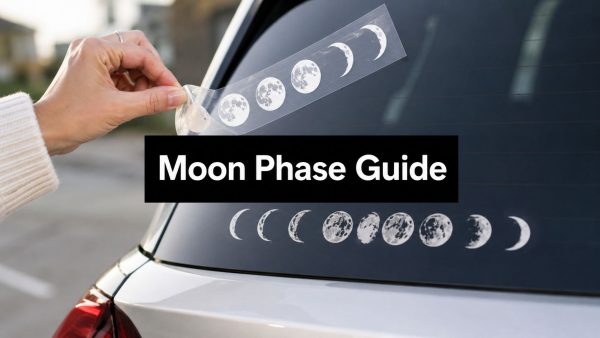
You've probably had this exact moment. You're staring at a tiny moon sticker sheet for your planner in one tab and a bold vinyl moon arc for your car in another, and both look right until you remember they live on completely different surfaces, under completely different conditions. That's where most buyers get stuck, because moon phase stickers aren't one product, they're a family of formats built around the same lunar sequence but made for very different jobs.
What Moon Phase Stickers Actually Are
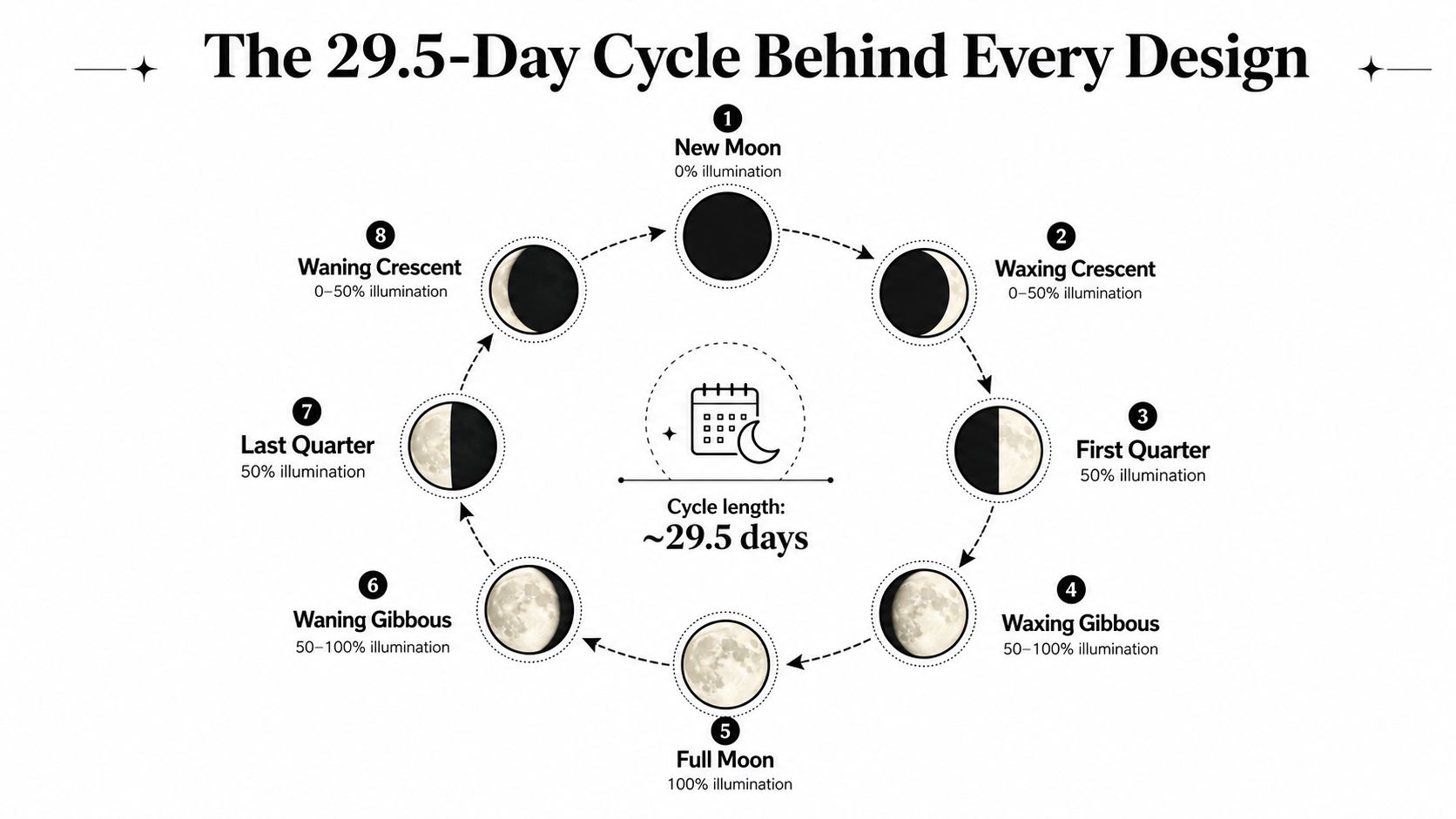
A good moon phase design starts with a real sky pattern, not a random row of crescents. The visual backbone is the Moon's 29.5-day synodic month, the average time from new moon to new moon, and NASA identifies eight named phases in that cycle: new moon, waxing crescent, first quarter, waxing gibbous, full moon, waning gibbous, third quarter, and waning crescent. NASA's moon phase reference is what makes the design language so easy to recognize, because the sequence repeats in a predictable order instead of drifting into decoration for decoration's sake.
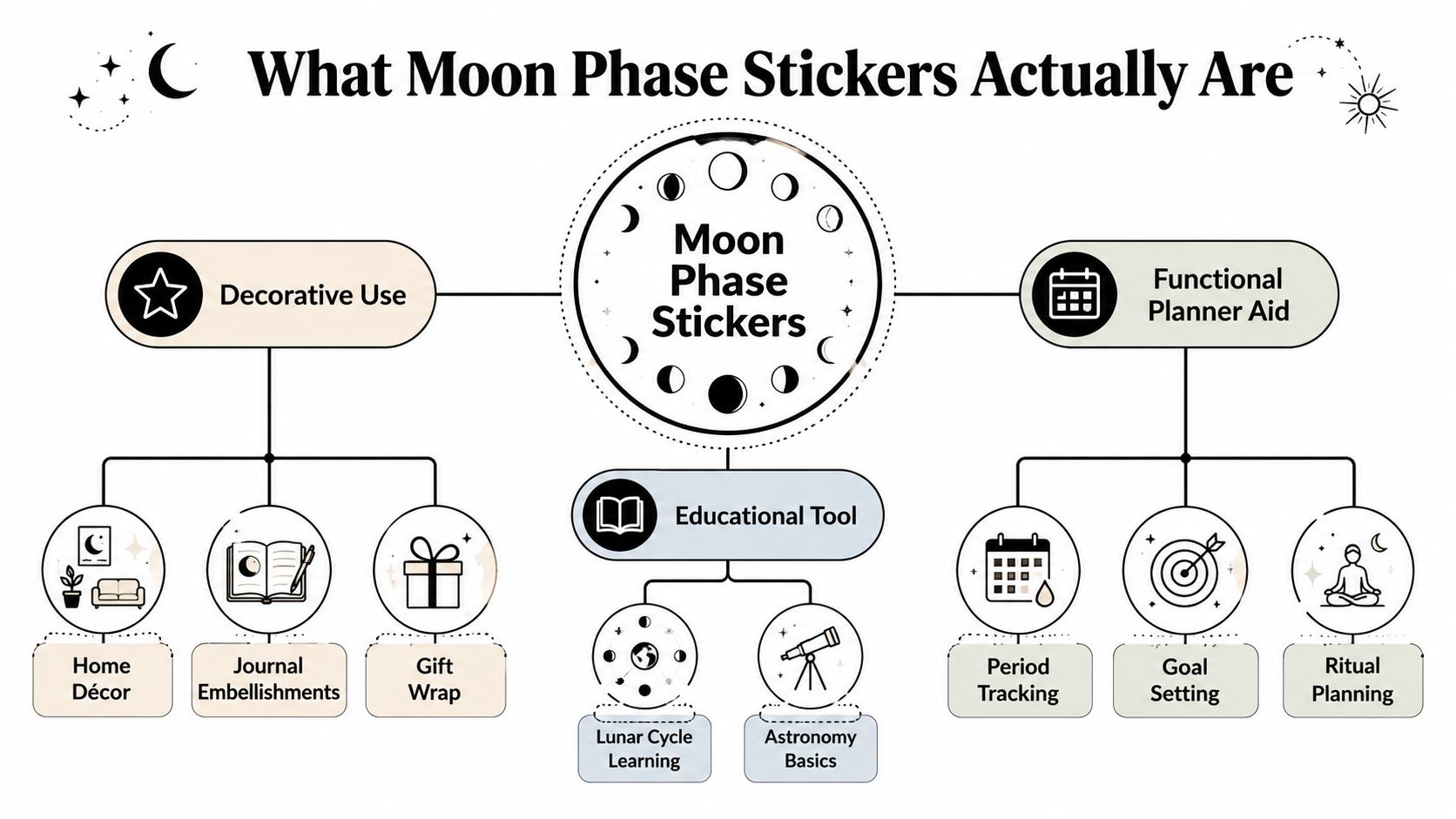
The product is broader than the name suggests
A planner sheet with tiny lunar icons, a classroom set for astronomy notes, and a vinyl arc on a rear window all fall under the same umbrella. The difference is not just style, it's function. Moon phase stickers can be decorative accents, educational visuals, functional trackers, or outdoor decals, depending on how they're printed and where they're installed.
The useful vocabulary is simple. A lunation is one full lunar cycle. Transfer tape holds pre-spaced vinyl in place during installation. Vinyl matters when the sticker needs to survive weather, while smaller paper or thin-film pieces are usually meant for journals and temporary layout work. If you're comparing product pages, those details matter more than the artwork.
Why the eight-phase sequence matters
The eight-step lunar sequence gives buyers a built-in visual logic. The U.S. Naval Observatory shows the light levels behind that logic clearly, with illumination at 0% at new moon, 50% at first and last quarter, and 100% at full moon. That numerical structure is why moon phase stickers work so well in planners, labels, classroom charts, and journaling spreads.
A sticker set that skips phases or scrambles the order usually feels off, even if the art is pretty. The strongest designs respect the rhythm of the sky first, then style it second. For anyone who wants a custom car-focused version, this custom car decal option shows how the same visual logic can move from paper planning into automotive use without losing clarity.
Practical rule: if the design doesn't map cleanly to the lunar sequence, it's probably decoration first and lunar tracking second.
The 29.5-Day Cycle Behind Every Design
The cleanest way to judge a moon sticker set is to ask whether it follows the lunar month or just uses moon-shaped art. NASA's phase guide makes the distinction easy to see, because the visible cycle repeats around the 29.5-day synodic month, while the Moon's actual orbital period is about 27.3 days. NASA's moon phase resource matters here because it explains why a sticker sequence should track phases, not equal day counts.
How designers build the sequence
The strongest sticker sheets usually organize around the four principal landmarks, new moon, first quarter, full moon, and third quarter, then fill the spaces between them with the waxing and waning crescents and gibbous phases. That's not an aesthetic preference, it's how the moon reads when you watch it over time. A well-made sheet feels like a calendar row because it is one.
Some products number the phases, some leave them unlabeled, and both can work. Numbering helps when the set is meant for teaching or exact tracking. Unnumbered icons work better when the goal is visual journaling or soft decoration, because the user already knows the sequence from context.
Why the history matters too
This cycle isn't a modern invention, and that stability is part of the appeal. The U.S. Naval Observatory provides moon-phase calculations for years 1700 through 2100, while the Astropixels Six Millennium Catalog extends phase tables across a 6,000-year period from 2000 BCE to 4000 CE. The Naval Observatory's phase tables show how long lunar prediction has been standardized, which is why the imagery feels trustworthy in both educational and decorative settings.
For buyers, the practical takeaway is simple. If a sticker sheet shows the eight named phases in a consistent order, it's aligned with the actual lunar cycle. If it treats moon art as a loose motif, that may still look nice, but it won't function well as a lunar tracker.
Planner-Scale Stickers vs Outdoor Vinyl Decals
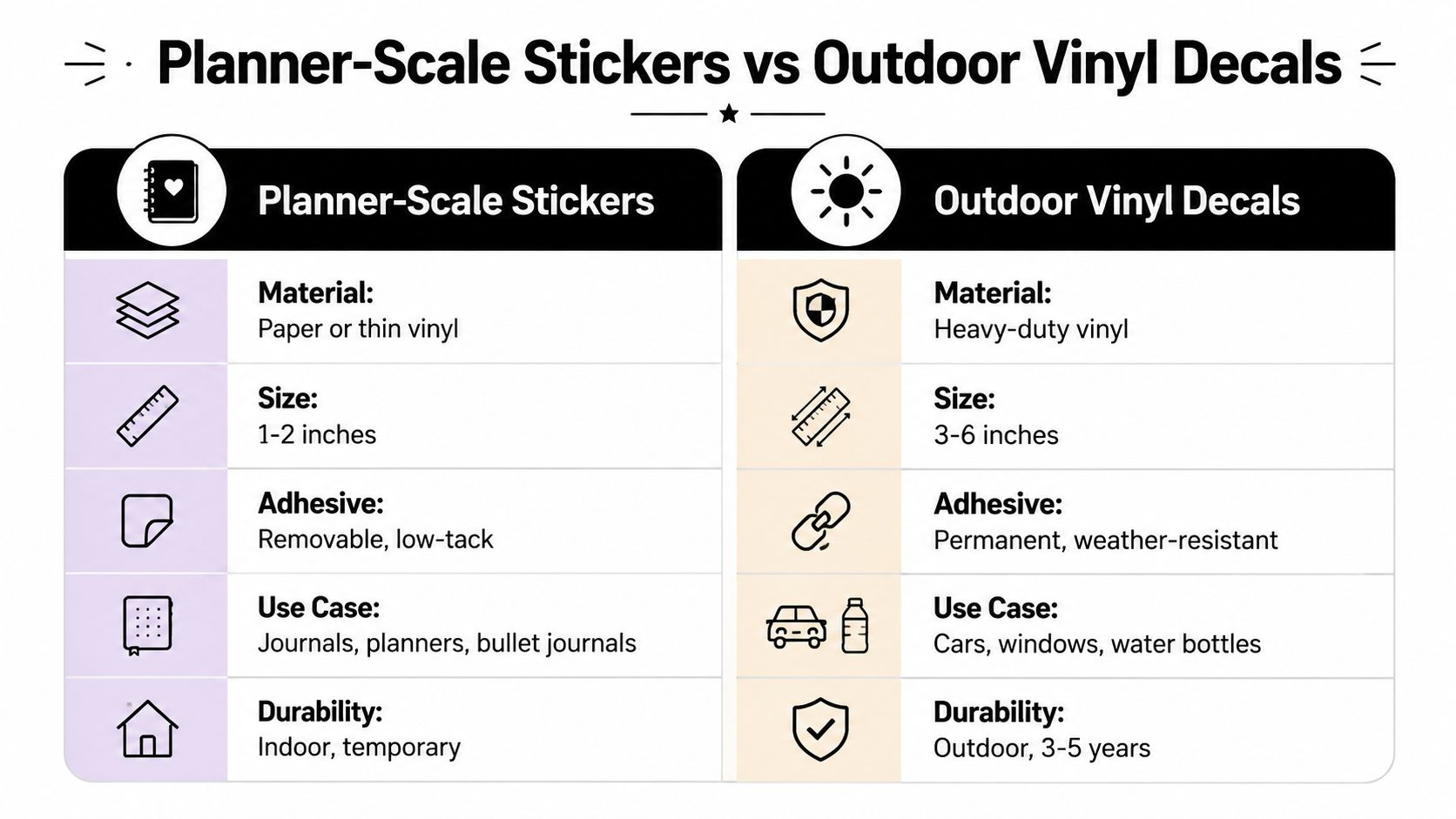
Moon phase products get mixed up because the artwork can look similar while the use case is completely different. Planner-style moon stickers are made for tiny layouts and indoor paper use. Outdoor vinyl decals are made for glass, paint, weather, and longer-term visibility.
What tiny planner stickers do well
Planner-scale moon phase stickers are usually cut for very small-format use, often around 0.2 in (5.1 mm) to 1.1 cm in diameter or height, and a single sheet can hold 91 to 162 individual icons. That small footprint is the point. It lets users place a full lunar month into a narrow margin, a calendar strip, or a crowded bullet journal spread without overwhelming the page. This product example shows why sharp edges, consistent die-cutting, and clear contrast matter more than raw size.
These pieces usually perform best with matte or repositionable adhesive, especially when the buyer wants to write over them or shift them slightly after placement. That kind of flexibility helps indoors. It does not belong on a vehicle, where heat, moisture, and repeated contact punish low-tack materials. Paper and light films are about control and convenience, not outdoor exposure.
What outdoor decals do well
Outdoor moon phase decals live in a different category. Vinyl-based versions are commonly marketed with 4 to 7 years of outdoor durability, plus water resistance and scratch resistance, and they often use transfer tape or static-cling installation depending on the surface. A vinyl product example makes the trade-off clear, because the priority shifts from packing density to staying intact through sun, moisture, and abrasion. A more vehicle-focused reference like this American Flag outdoor decal product page shows the same material logic in a larger outdoor format.
Practical rule: if the sticker is going on paper, choose compact and low-tack. If it is going on a car, window, or exterior panel, choose vinyl and expect a more deliberate install.
A lot of buyers pick the wrong format because the moon artwork looks familiar online. The better question is where the decal will live. For a larger automotive layout, a vehicle-specific example like this Jeep windshield decal reference is a better fit than a planner sheet, because it is built for glass, curvature, and outdoor exposure.
A quick decision filter
- Choose planner-scale stickers if you want journaling, habit tracking, or decorative lunar accents.
- Choose outdoor vinyl decals if you want a car, truck, window, or wall display that lasts.
- Choose transfer-taped vinyl if alignment matters and the decal has multiple spaced elements.
- Choose repositionable adhesive if the surface is paper and you want room to adjust.
Step-by-Step Installation on Vehicles, Glass, and Walls
A clean install starts before the backing comes off. The surface needs to be clean, dry, and close to room temperature, because dust, moisture, and cold adhesive all work against a smooth bond. The biggest errors I see are rushed placement, crooked alignment, and trying to smooth a decal before the piece is anchored.
Prepare the surface first
Wash the area with mild soap and water, dry it fully, then wipe it with isopropyl alcohol so you remove oils that soap can leave behind. On glass or painted panels, that last wipe matters more than people expect. Even a tiny amount of residue can show up later as lifting edges or small bubbles.
If the decal is long, mock the placement with painter's tape before you peel anything. That makes the final position much easier to judge, especially on rear windows, quarter glass, or a curved body panel. For vehicle interiors and fresh detailing jobs, a practical showroom shine and scent guide helps keep the cabin clean before you install anything near the glass.
Apply the decal without forcing it
For transfer-taped vinyl, leave the backing attached until the decal is aligned. Use the hinge method on larger arcs, tape one edge in place, flip the graphic open like a page, then peel the liner away gradually while pressing the vinyl down. A plastic squeegee or firm card wrapped in a soft cloth helps push air from the center outward without scratching the surface.
Smooth from the middle out, not from one end to the other. That keeps air from getting trapped in the middle of long crescent or full-moon rows.
Match the method to the surface
Glass is the easiest surface because it's flat and nonporous. Painted metal can also work very well if the panel is clean and cured. Curved areas, like hood edges or rounded Jeep surfaces, need extra patience because the vinyl has to settle without being stretched so far that the shapes distort.
Static-cling versions are useful on short-term windows, but they aren't a serious outdoor answer once rain and UV exposure start working on them. For walls, low-tack removable adhesive is the safer choice in rental spaces, while premium vinyl is better for a long-term display. If you're considering a larger wall treatment, the same logic applies as with a vehicle, but the surface prep is simpler and the pressure from wind and washing is gone.
Placement Ideas for Cars, Trucks, and Jeeps
The best moon decal placement depends on how much attention you want the design to take. A small icon can disappear on a large vehicle, while a large arc can look overbuilt on a compact sedan. The sweet spot is matching scale to the body line you already have.
A daily-driver sedan usually does best with a 3 to 6 inch rear-window decal or a smaller driver-side quarter glass placement. That keeps the design visible without crowding the driver's line of sight. For anyone checking fit on a Jeep, this Jeep-themed vinyl reference is a good reminder that flat or gently curved glass surfaces usually show lunar shapes more cleanly than heavily contoured body panels.
Three practical placement scenarios
A sedan owner often wants subtlety. A small moon sequence near the rear glass gives the car personality without competing with registration, defroster lines, or dash reflections. That's the safest choice for people who want the symbol more than the statement.
A Jeep owner usually has more real estate to work with. Rear windows, hardtop panels, and swing-out tire carriers all give full moon-phase arcs room to breathe. The surface is often better suited to a longer horizontal arrangement, which is why Jeep graphics and lunar themes pair naturally.
A truck owner usually wins on durability and visibility. Rear sliding windows, tailgate corners, and toolbox lids keep the design out of direct road grime while still making it easy to see. The key is avoiding spots that flex or catch constant spray.
A quick mock-up method that saves mistakes
Before committing, cut painter's tape strips to the rough size of the decal and hold them on the surface from a few feet back. Then check the car from the angle people will see it, not just from arm's length. That simple test prevents the common problem of buying the right moon sticker and putting it in the wrong visual lane.
For drivers who care about appearance inside the cabin as much as outside, a clean placement reads better when the glass and trim are already tidy. That's especially true for moon graphics, because their clean geometry loses impact fast when they're crowded by dust, clutter, or a badly chosen height.
Care, Cleaning, and Long-Term Durability
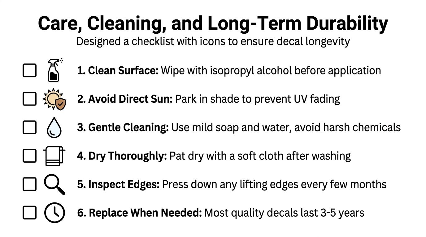
Fresh vinyl needs time to settle before you put it through a wash cycle. The usual safe window is 24 to 72 hours before the first wash, and touchless wash methods are the safer choice early on because they reduce mechanical stress on the edges. Once the decal has cured, a soft brush wash is less risky, but the harshest damage still comes from solvents, abrasives, and repeated scraping at the edges.
Keep the finish protected
Sun exposure is the enemy outdoors, especially on panels that sit all day in direct light. That's why premium vinyl constructions matter, because they're designed to resist the kind of fade and edge breakdown that cheaper films show first. A damp microfiber cloth and a gentle ammonia-free cleaner are enough for indoor pieces, and they're also the safest routine for glossy or matte decals that need to stay crisp.
Watch the edges before they fail
Most decal problems start small. A corner lifts a little, dirt catches in the seam, and the edge gets wider every time the surface flexes or gets washed. Pressing down the lifted area early is far easier than trying to rescue a peeling graphic later.
Remove vinyl without harming the surface
Heat helps with removal because it softens the adhesive. A hair dryer or steamer works well, and any residue can usually be cleaned with an adhesive eraser if you go slowly. For a practical removal reference, Boat Juice's decal guide is useful because it focuses on taking decals off without turning the job into paint damage.
Practical rule: if the decal resists hard, add heat, don't add force.
A quality outdoor moon decal is meant to stay put, but it should also come off cleanly when you're ready to change the look. That balance is what separates a good vinyl product from a frustrating one.
Customization, Inspiration, and Choosing Your Moon Phase Sticker
Customization is where a moon sticker stops being generic and starts fitting the person who owns it. Gloss gives the strongest pop, matte softens glare on glass or paper, and metallic or holographic finishes add movement when light hits the surface. For vehicle owners, color matching matters just as much as shape, because a black decal on dark paint reads very differently from a silver one on a light windshield.
People also pair lunar phases with names, zodiac references, memorial text, or birth dates. That turns the sticker into a keepsake instead of just a symbol. For a visual companion piece, an amethyst crystal from Astro West shows how lunar imagery often gets tied to personal ritual and giftable symbolism, especially when buyers want something reflective rather than purely decorative.
Use three questions to choose the right format
Ask where it will live. Ask how long you want it to last. Ask whether it needs to function as a tracker or just look beautiful.
If it's for a journal, planner, or classroom page, go small and low-tack. If it's for a car, window, wall, or exterior panel, choose vinyl with transfer tape and the right adhesive for the surface. If you're still torn between formats, buy for the hardest condition the sticker will face, not the easiest one.
Custom Sticker Shop is a strong fit for buyers who want pre-spaced, transfer-taped automotive decals that are ready for glass, hoods, and body panels, with sizes and themes that fit real vehicle use. If you want a moon phase piece that's built for the surface you have, visit Custom Sticker Shop and compare the options before you buy.