
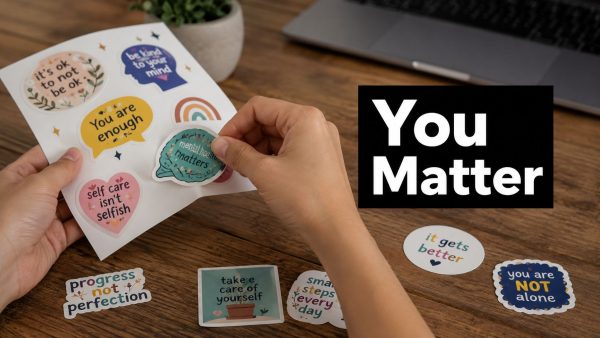
You're probably here because a simple sticker suddenly feels like more than a sticker.
Maybe you're planning a school event, a workplace awareness drive, a nonprofit giveaway, or a small run for cars, laptops, and water bottles. You want the design to look clean, last outdoors, and help. That last part is where many well-meaning projects go sideways. A message can comfort someone, or it can accidentally add pressure.
After two decades around durable vinyl decals, the practical side is familiar. Material choice, cut lines, transfer tape, curved glass, sun exposure, all of that matters. But with mental health awareness stickers, the message matters just as much as the adhesive. The strongest results come from treating both with equal care.
Understanding Mental Health Awareness Stickers
A student peels a sticker onto a laptop before class. A warehouse supervisor adds one to a break-room fridge. A parent puts one on a rear window. In each case, the sticker works as a low-pressure public cue that says mental health belongs in everyday spaces, not only in counseling offices or awareness weeks.
That practical visibility is the value of mental health awareness stickers. They are small printed prompts, usually made from vinyl for durability or paper for short-term use, that carry supportive language, symbols, or campaign branding tied to mental health awareness, self-care, peer support, and help-seeking. Neuroform's discussion of mental health stickers describes them as tangible reminders that can support self-care, reduce stigma, and reinforce broader awareness efforts. That matches what I have seen in production. The best sticker runs are not trying to solve mental health on a 3-inch circle. They keep a thoughtful message visible long enough to start a safer conversation.
Placement matters.
A sticker succeeds because it shows up where people already look. Water bottles, notebooks, toolboxes, office doors, car windows, and laptop lids give repeated exposure without demanding much time or attention. That repeat visibility is useful, but it also creates a responsibility. If the message is too vague, too cute, or too forceful, the design gets ignored or worse, it irritates the people you hoped to reach.
Used well, stickers usually support three practical jobs:
- Catch attention in ordinary settings: They sit in daily view instead of getting buried in a handout stack.
- Reinforce a campaign message: A short phrase can back up workshops, school programs, donor drives, or staff training.
- Signal openness: They show that talking about mental health is acceptable in that space.
The limits matter too. A sticker can normalize a message, but it cannot replace trained support, local referral pathways, or careful program planning. If your audience includes teens, schools, or youth-serving groups, it helps to review broader resources for youth mental health initiatives before finalizing your design set. The strongest projects connect the printed piece to something real, such as a school counselor, a peer program, a hotline list, or an event people can attend.
Crafting Responsible Messages and Imagery
The fastest way to weaken a sticker is to write a message that sounds bossy, sugary, or guilt-heavy. Mental health language has to leave room for real life. People don't need to be scolded into wellness.

Start with permission, not pressure
The safest phrasing usually sounds like permission. “It is okay to rest.” “You matter.” “Check in with yourself.” “It is okay to seek help.” These lines open a door instead of issuing an order.
By contrast, slogans that imply constant positivity can backfire. A Gettysburg College paper on motivational sticker use and emotional outcomes reported that poorly chosen motivational stickers were associated with a 15 to 20% higher correlation with symptoms of depression, anxiety, and self-injury among users compared to non-users, and the paper notes the negative association was stronger in men. The same source recommends non-judgmental messages and long-lasting materials such as waterproof vinyl so the prompt remains visible over time.
Test wording before you print
A quick audience check catches problems early. Don't ask, “Do you like this?” Ask what the message makes people feel.
Use a simple review like this:
Emotional read
Show three versions of the same idea. For example: “Stay positive,” “Take a breath,” and “It is okay to rest.” Ask which one feels supportive rather than demanding.Context check
Ask where someone would place it. Laptop? Rear window? Water bottle? Journal? Placement affects message length and legibility.Reaction notes
Watch for comments like “This feels preachy,” “This sounds too clinical,” or “I'd put this on my bottle.” Those are more useful than star ratings.
Practical rule: If a phrase sounds like something a tired person would resist, rewrite it.
Pair imagery with tone
Imagery should support the message, not overpower it. In practice, the most reliable combinations are:
- Soft abstract shapes for calm, non-clinical designs
- Simple botanical elements when you want warmth without sentimentality
- Minimal line art for modern sticker packs aimed at students or office staff
- Gentle symbols like suns, moons, waves, or hearts, used sparingly
Avoid visual clichés that feel theatrical. A sticker has very little space. If the artwork competes with the words, the message loses.
One more production note matters here. Waterproof vinyl is usually the better call for any sticker expected to live on bottles, cars, coolers, or windows. A supportive message can't do much if the edges curl in a week.
Designing with Color Font and Layout
A strong message still fails if nobody can read it at a glance. Most sticker problems aren't about creativity. They're about contrast, spacing, and trying to squeeze too much into a small shape.

Choose color for readability first
People often start with emotional associations. Soft greens can feel calming. Blues can feel steady. Warm neutrals can soften a serious message. That's useful, but readability comes first.
For practical use, test your palette on three surfaces: white, black, and tinted glass. If the sticker disappears on one of those, revise it before production. This is especially important for vehicle windows and dark water bottles.
A simple comparison helps:
| Design choice | Usually works | Usually fails |
|---|---|---|
| Light text on dark background | High visibility on glass and dark gear | Can feel heavy if contrast is too harsh |
| Mid-tone text on pastel background | Soft but often readable on paper goods | Gets lost on tinted windows |
| Script font with long quote | Stylish in mockup | Hard to read from a distance |
| Bold sans serif with short phrase | Clean and quick to scan | Can feel blunt if spacing is cramped |
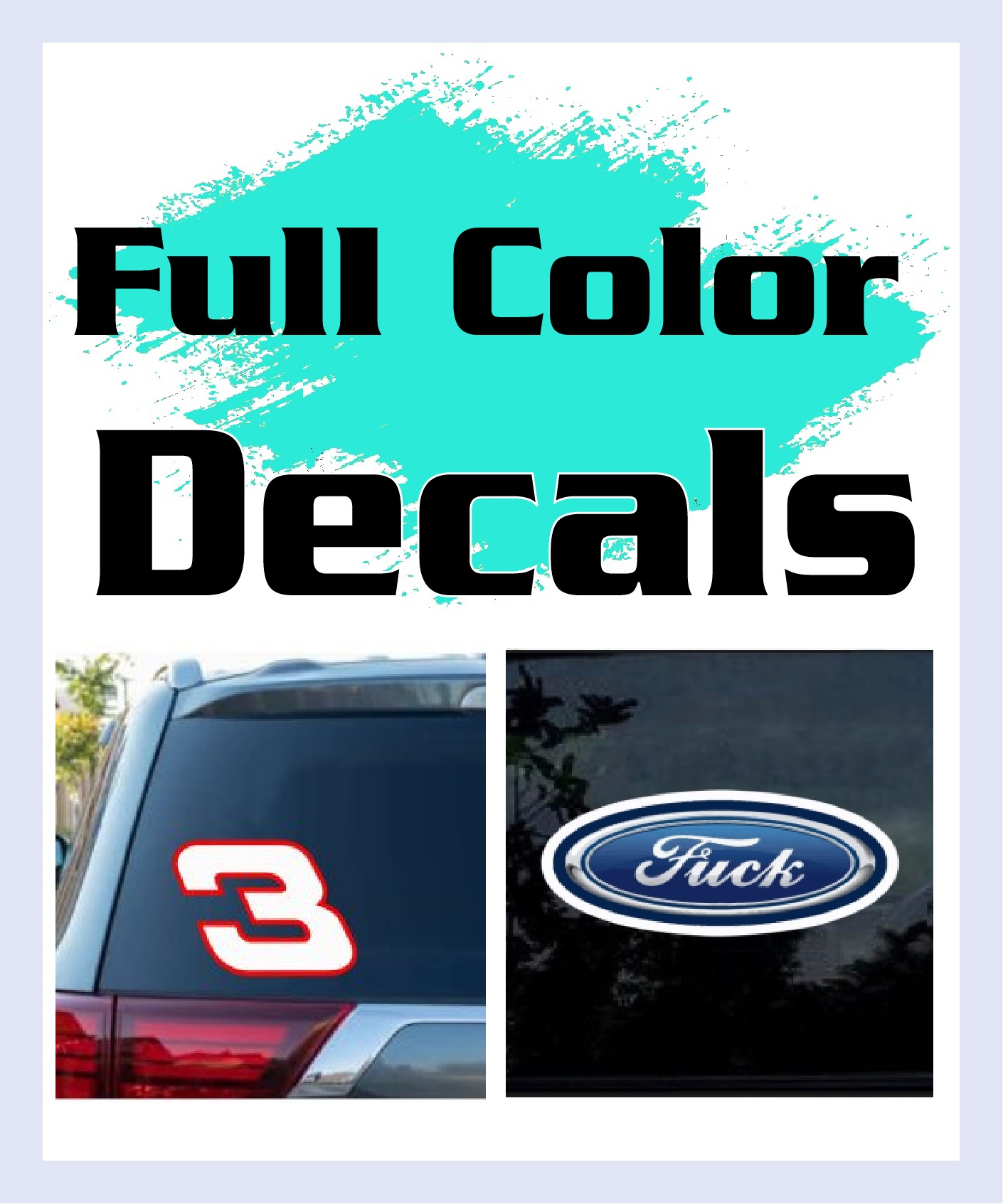
For print previews, it helps to review examples of full-color sticker output on real materials instead of judging everything on a bright monitor.
Fonts that survive real-world use
For mental health awareness stickers, I'd keep the font system boring in the best way. One display font at most. One reliable supporting font. That's enough.
Use these rules:
- Short phrases: bold sans serif works best
- Softer tone: rounded sans serif can take the edge off
- Handwritten accents: use only for one or two words, not the whole message
- All caps: fine for one-word stickers, rough on longer supportive phrases
Build visual breathing room
Most designs improve when you remove one element. If the sticker says “You matter,” it doesn't also need three icons, a border, a pattern fill, and a sub-line.
Try this layout checklist before approval:
- Focal point: One thing should grab attention first. Usually that's the phrase.
- Breathing space: Leave margin around the text so the design doesn't feel crowded.
- Hierarchy: If there's secondary text, make sure it's clearly secondary.
- Edge safety: Keep important words away from the cut line.
- Distance test: Shrink the mockup and see if it still reads instantly.
A sticker has to communicate in a glance, not in a close reading.
Selecting Materials Sizes and Ordering Stickers
Production quality decides whether your sticker lasts through rain, sunlight, handwashing, and repeated handling. In awareness work, durability matters because the sticker is supposed to remain visible long enough to become part of someone's routine.
Pick the material for the surface
For outdoor use, waterproof vinyl is the default choice. It holds up better on vehicles, windows, bottles, hard hats, and coolers than paper stock. If the sticker is going on glass or painted panels, a clean-cut vinyl decal with transfer tape gives a different look from a printed die-cut piece, so choose the style based on the end use, not just the artwork.

A few practical matches:
- Laptop lids and notebooks: compact die-cut vinyl with a matte finish if glare is a concern
- Water bottles and tumblers: waterproof vinyl with strong adhesive
- Vehicle windows: cut vinyl or high-grade outdoor decal stock
- Office glass and storefronts: clean lettering or simple shapes with transfer tape for precise placement
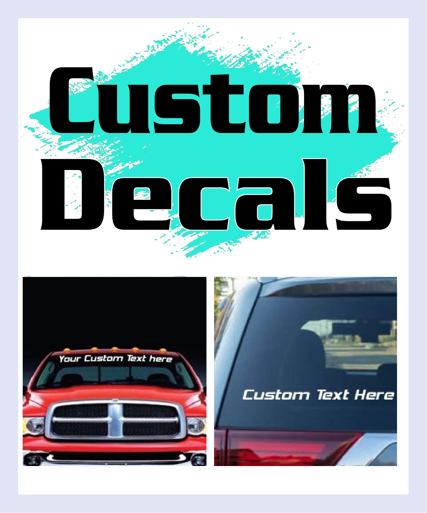
If you're comparing product styles, a real-world image of custom vinyl decal construction helps clarify the difference between printed stickers and transfer-taped lettering.
Size for the actual viewing distance
Small stickers work well for personal items. Vehicle and storefront applications need more restraint in wording and more confidence in scale. A phrase that reads perfectly on a laptop can vanish on a rear window if the letters are too fine.
Use this common-sense approach:
Handheld item
Keep the message short. Prioritize shape and personality.Car or truck window
Increase letter height and simplify the design. Avoid thin strokes.Office or event glass
Think about traffic flow. The message should read while someone is walking by, not standing still.
A short demonstration helps if you're training volunteers or first-time installers:
Ordering without surprises
Before sending artwork to print, check four things:
- Vector or clean high-res art: fuzzy uploads create ragged cuts and muddy text
- Correct dimensions: don't estimate from memory
- Finish choice: gloss, matte, or cut vinyl should match the use case
- Application method: if the design has separate letters or detailed shapes, request transfer tape or pre-spaced setup
The smoother your file prep is, the fewer production compromises you'll make later.
Installing Stickers on Vehicles and Windows
A good decal can look terrible if it goes onto a dirty panel or gets stretched during application. Vehicle glass and painted surfaces are less forgiving than notebooks and folders, so installation needs a little discipline.

The clean install sequence
The sequence is simple, and skipping steps is what causes most bubbles.
Clean the surface thoroughly
Use isopropyl alcohol and a lint-free cloth. Remove wax, dust, and skin oils.Position with tape hinges
Hold the decal in place with masking tape before committing. This matters on rear windows and long phrases.Peel and apply steadily
Remove the backing in a controlled motion and press the decal down with a squeegee from the center outward.Lift transfer tape carefully
Pull back at a shallow angle. If part of the vinyl lifts, stop and press it down again before continuing.
If you're comparing layouts for automotive use, it helps to look at examples of truck decal placement and scale before final install.

Curves tinted glass and bubble fixes
Curved panels punish stiff hands. Don't force the whole decal down at once. Work in smaller sections and keep pressure even. On lightly curved glass, patience matters more than speed.
For tinted windows, contrast is the deciding factor. Light vinyl usually reads best, but test the tone against the actual tint if you can. A sticker that looked balanced on your screen may disappear on the vehicle.
Useful troubleshooting:
- Small air bubble: press toward the nearest edge with a felt-edge squeegee
- Wrinkle forming: lift gently and reapply before the adhesive fully sets
- Cold-weather install: warm the surface first so the adhesive can seat properly
- Large multi-part decal: use the hinge method, not freehand placement
Don't chase perfect alignment by eye alone. Use reference points on the glass or body line.
If you're outfitting cars or trucks for an awareness drive, a practical guide on choosing custom vehicle stickers can help you think through visibility, placement, and style before you start installing a batch.
Campaign Planning Fundraising and Promotion Strategies
At a community fundraiser, I've seen the same mistake more than once. Organizers print a strong sticker, put it on the table, and expect the message to carry the campaign by itself. It rarely works that way.
Mental health awareness stickers work best as a prompt that leads to a conversation, a resource, a donation, or a follow-up action. In production terms, the sticker is the visible piece. In campaign terms, it is only one touchpoint.
A systematic review on media mental health campaigns reported positive proximal outcomes in 85 to 90% of evaluated studies, while successful behavior change appeared in 65% of studies. That same review found weaker long-term behavior effects when communication tools were used without sustained support. That trade-off matters. Awareness materials can improve recognition and reduce stigma, but they do more when the campaign gives people a clear next step.
Build around repeated contact and low-friction action
A single giveaway table can create visibility for a day. Repeated exposure does more. The better campaigns I've worked around tie sticker distribution to places and moments where people already pause, talk, or ask questions.
Use a simple rollout plan:
- Event tables: hand out stickers with a short resource card, helpline information, or a QR code that leads to local support options
- Partner locations: place small batches in counseling offices, libraries, coffee shops, schools, gyms, or union halls where staff can explain the message if asked
- Group distribution: create packs for teams, student groups, employee committees, or volunteers so the design shows up in clusters instead of one-off placements
- Follow-up promotion: post real photos from the campaign and repeat the support message, not just the artwork
That last point gets overlooked. Real placements signal credibility. Mockups help during approval. Field photos help people trust the campaign.
Fundraising without turning support into merch noise
Selling sticker packs can fund printing, event costs, and resource distribution, but the offer has to stay anchored to purpose. If the campaign starts sounding like a novelty drop, the message gets diluted fast.
A practical setup usually looks like this:
| Campaign element | Better approach |
|---|---|
| Sticker pack | Offer a small, consistent set instead of too many mixed messages |
| Sales language | State what the purchase supports in plain terms |
| Partner outreach | Work with local nonprofits, schools, clinics, or peer support groups |
| Promotion | Show real-world use and explain where funds go |
If you're coordinating online donations or add-on rewards, these effective crowdfunding campaign strategies can help you structure supporter perks without making the campaign harder to manage.
Common wins and common misses
The strongest campaigns keep the message consistent across print, events, and social promotion. They also choose sticker quantities and formats that match the setting. A small run of durable outdoor vinyl makes sense for car decals or storefront windows. Lower-cost handout stickers can work for short-term events if the design still reads clearly and the message stays respectful.
The weak campaigns usually miss in one of three places. They print too many designs with no unified message. They ask a sticker to do the work of outreach staff, educators, or counselors. Or they raise money without explaining where the money goes.
Good campaign planning is quieter than people expect. Clear wording, repeat exposure, visible purpose, and honest expectations carry more weight than hype.
Ensuring Accessibility Sensitivity and Next Steps
A sticker can be well-made, well-intended, and still exclude people. Accessibility and sensitivity checks aren't polish. They're part of the core design job.
Accessibility you can check before print
Start with readability. If someone with low vision, color-contrast challenges, or limited time can't read the message quickly, the design needs work.
Use this preflight list:
- High contrast: dark text on a light field, or the reverse, is usually the safest path
- Plain language: choose words people understand immediately
- Letterform clarity: avoid decorative fonts for the full message
- Size discipline: don't reduce supporting text until it becomes ornamental noise
- Shape recognition: make sure icons still make sense at final print size
Sensitivity checks that prevent harm
Mental health language lands differently across age groups, cultures, workplaces, and communities. A phrase that feels supportive in one context can feel exposed or patronizing in another.
Review each design with a small, mixed group and ask questions like these:
- Does this sound supportive or instructive?
- Would you display this publicly?
- Does any part of the wording feel shaming?
- Does the imagery feel calm, or does it feel loaded with assumptions?
- If someone was having a hard day, would this help or irritate them?
The best sticker messages leave room for honest emotions. They don't demand a performance.
A practical rollout plan
Treat your first run as version one, not the final word. That mindset improves both design quality and community trust.
A workable next-step sequence looks like this:
- Print a small pilot batch and place it on the actual surfaces people will use
- Collect feedback from staff, volunteers, students, or customers after a short trial period
- Revise weak points in wording, contrast, or size
- Pair the sticker with real support such as local resources, event programming, or trained contacts
- Reprint the winners once people respond positively to the message and format
That's how mental health awareness stickers become more than attractive vinyl. They become durable, respectful prompts that fit into daily life and support a larger effort to reduce stigma.
If you're ready to turn a thoughtful design into a durable decal that holds up on vehicles, windows, laptops, and bottles, Custom Sticker Shop is a solid place to get it made. They produce premium vinyl decals with pre-spaced, transfer-taped options that make installation easier, especially for clean text-based awareness designs.