
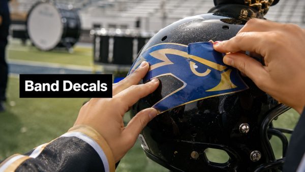
You know the feeling. The trailer looks sharp in the parking lot, the decals matched the school colors on screen, and everyone was proud of the proof. Then the band gets under stadium lights, the front sideline is a blur of motion, and the logo that looked crisp in the mockup turns into a dark sticker nobody can read from the stands.
That gap is where marching band graphics either earn their keep or fail. In a real program, these graphics have to do more than look polished online. They need to read fast, survive sun and rain, and still look like part of one coherent identity when they're moving across a field, riding on a trailer, or stretched across a drum head.
Why Marching Band Graphics Matter Beyond Aesthetics
A bad read on a decal usually shows up in the worst possible place, on the road, under lights, or in the middle of a packed stadium. The trailer looks clean in the shop, the mockup looks balanced on a screen, and then the real-world version starts fighting glare, distance, and motion. That is why marching band graphics have to do more than look polished. They have to hold their shape on uniforms, instruments, trailers, and promo pieces while the program is moving through public spaces and changing light.
The best visual systems in marching programs grew out of the same need for fast recognition. Military signaling and pageantry shaped the visual language of marching band history and visual language, and that same logic still shows up in current modern marching band use cases. Strong bold lettering, regimented spacing, symmetrical layouts, and high-visibility emblems do the heavy lifting because they stay readable when ornamental detail gets lost. A bee mascot can work well for a school identity, but only if the mark is simplified enough to hold together on a trailer panel or a small decal. A design like the bee mascot decal sticker makes that point clearly, mascot graphics have to survive real viewing conditions, not just look good in a proof.

Identity has to survive motion
On the field, nobody pauses to inspect the artwork. People are tracking movement, reading a group at speed, and catching only fragments of shape and color. When the icon gets too detailed or the spacing gets crowded, the design starts breaking apart once the ensemble turns, the camera shifts, or a banner moves through a bright patch of light.
Practical rule: If a logo only looks good close up, it is not finished for marching use.
Simple icons and strong contrast usually hold up better because they read on a helmet, a sideline sign, and a trailer panel without needing a second glance. That is also why testing matters before anything gets printed. A quick concept pass in the ShortGenius AI ad generator can help a band staff compare how a graphic behaves in a mockup, then catch weak edges, crowded type, or muddy contrast before the order goes out.
Coherence matters as much as style
A marching program is not one object, it is a moving set of surfaces. Uniform patches, instrument marks, field props, trailer graphics, and booster signage all send the same message when they share one visual system. That coherence is what makes a group look organized instead of assembled from unrelated pieces.
Even a small item carries that identity when the design language matches. If a mascot decal uses a different line weight, a different shade, or a different level of detail, it starts looking like an add-on instead of part of the program. The practical test is simple, each piece should survive the same conditions, sun, rain, handling, and long use on the road, without peeling or turning unreadable.
Designing Graphics That Read From the Stands
A graphic that looks great at arm's length can vanish from the press box. That's the core problem, and it's why design choices for marching band graphics need to be judged by the conditions they'll face. Stadium lighting flattens some colors, motion blurs fine details, and distance turns delicate shapes into clutter.
Build for distance first
Start with the biggest viewing problem, not the prettiest mockup. If the design has to be understood from the stands, simplify the silhouette until it can be recognized in a quick glance. A strong edge, a clear negative-space shape, and a limited number of internal details usually outperform a crowded composition, especially when the surface is moving or angled away from the audience.
The same goes for typography. Lettering should be compact and decisive, because narrow strokes and decorative scripts tend to collapse under glare and distance. When a band is on the move, the viewer is decoding shape before reading nuance, so the lettering has to carry meaning even when it's partially obscured.
Good field graphics usually share one trait, the outline tells the story before the details do.
Treat light and angle as part of the design
Stadium lighting changes how color reads. Dark elements can disappear against shaded turf, while certain combinations lose definition when they're lit from above or viewed at a shallow angle. That's why contrast isn't a cosmetic preference, it's a legibility requirement.
Use the press box and sideline as your test viewpoints. If possible, print a draft, pin it to a wall, and walk it back until it mimics distance. Then view it under indoor light and again in daylight. The question isn't whether it looks attractive, it's whether the message still lands fast.

Match the design to the medium
A trailer panel, a flag, and a bass drum head are not the same canvas. A trailer can support broader composition, while a smaller label needs fewer elements and heavier visual hierarchy. Fabric moves, so it can tolerate a little more openness than a flat surface, but it also distorts, so overly intricate linework becomes a liability.
For programs that need a central visual anchor, custom marching bass drum heads can carry the show identity in a place the audience naturally notices. They work best when the artwork stays bold and centered, not when it tries to cram the full show concept into a small circular surface. That same principle helps keep game-day audiences, judges, and cameras on the same page without forcing each medium to do too much.
File Specifications and Sizing Guidelines by Application
A graphic can look clean on screen and still fail in production if the file is wrong for the surface. I see that most often with artwork that is too small, built in the wrong format, or packed so tightly that trimming, curves, and handling expose every weakness. The practical fix is straightforward. Start with clean vector art whenever possible, then build each layout around the object it will live on.
Match file type to the job
For most marching band graphics, vector files are the safest place to start because they stay sharp across small labels and large decals. That matters when the same design has to hold up on a trailer, an instrument case, and a window panel without falling apart at different sizes. If a supplier asks for editable artwork, send the cleanest source file you have, then keep a flattened proof for approval so color placement and spacing do not drift during production.
Smaller instrument and gear graphics do not benefit from extra effects that look fine on a monitor but can cause trouble in print or cut work. For larger surfaces, leave enough breathing room around the edges so the design does not feel cramped once it is installed. On curved or segmented surfaces, simpler shapes are easier to apply cleanly and easier to read after the equipment has been hauled, handled, and washed down.
A good rule on the road is to keep the file as simple as the surface allows. If the item moves, reduce the number of elements. If the surface curves, simplify the edge treatment. If the piece gets touched every day, protect exposed corners and avoid tiny details that will wear first.
| Application | Recommended Size Range | File Format | Viewing Distance |
|---|---|---|---|
| Trailer or vehicle graphics | Large panel coverage, scaled to the vehicle face | Vector preferred, print-ready artwork | Long distance, parking lot and roadside |
| Instrument labels | Small, compact marks | Vector or high-resolution art | Close range, quick identification |
| Helmet or gear graphics | Small to medium, shape-limited | Vector preferred | Near to mid-range |
| Show logos and field props | Medium to large, bold composition | Vector preferred | Mid to long distance |
For teams using window graphics, a custom text window decal sticker works best when the wording is short, the letterforms are heavy enough to read through glass, and the layout is built for quick recognition from a distance. That same practical standard applies across the rest of the shop. The file has to match the job, not just the mockup.
For larger centerpieces like custom marching bass drum heads, the artwork needs a stronger focal point than a small decal does. Keep the main mark bold, centered, and readable from the stands, because the drum head will be seen in motion and under changing light. Dense linework and crowded text usually get lost before the season ends.
Place graphics where the equipment still works
Placement matters as much as the art itself. Do not put labels where they interfere with valves, straps, hinges, slide movement, or folding points. On uniforms, avoid locations that stretch badly or rub against seams and trim. On equipment cases and trailers, place the mark where it stays visible after doors open, handles extend, or the unit is parked at an angle.
For show identity pieces, start with what the audience sees first. A side panel can support a larger composition, while a smaller facing surface needs a clear focal point and fewer moving parts. If the design tries to fill every inch, it usually loses readability before it gains impact.
Planning Your Order Timeline and Budget
The best-looking decal in the world won't help if it shows up after band camp. Production timing is part of design, and for marching band graphics that means the calendar has to be treated as seriously as the artwork. Yamaha's show-design guidance recommends building aesthetic and graphic elements in parallel with music acquisition, giving drill designers at least a 60-day lead time before drill instruction begins, and staging prop, flag, and costuming work across a long runway that starts well before delivery season Yamaha marching band show design timeline.
Design freezes need to happen early
If the logo is still changing when print prep starts, someone is going to lose time. Finalize the theme, spelling, and lockups before production moves forward, then stop tweaking unless there's a real functional reason. That discipline protects the schedule and keeps the entire season from getting stuck in revision loops.
Here's the part many programs miss. The show concept and the graphics concept should mature together, because a late visual change can ripple through everything else, from props to uniforms. That's why it helps to treat the artwork as part of the same early planning cycle as drill and music rather than as a last-minute accessory.
Design late, and every downstream decision gets more expensive in time, stress, or both.
Budget around quantity and consistency
Ordering fewer pieces usually costs more per item in wasted setup time, while coordinated orders make the identity feel cleaner across the program. If you know you'll need matching marks for trailers, cases, and show assets, it's smarter to plan them as one visual family instead of piecemeal one-offs. For a custom branding workflow, a custom design request is most useful when the program already knows the logo family, surface types, and intended placements.
Licensing also needs a real conversation. If the graphic uses a school name, mascot, or existing program mark, get the necessary permission before you send it to production. That prevents arguments later and avoids the awkward situation where a great design can't be used publicly because the rights weren't cleared.
Use the production window as a planning tool
January through summer is a reasonable mental model for how far ahead these projects can stretch, especially when props, flags, and costumes all compete for attention. Once the order is placed, the best use of time is not more redesign. It's proofing, confirming quantities, and making sure every application has the right orientation and size before anything ships.
That approach saves more than money. It keeps the visual identity stable long enough for students, staff, and families to recognize it across the whole season.

Installation Techniques and Long-Term Maintenance
The road is hard on decals. Heat, moisture, repeated handling, and a few long weeks in and out of trailers will expose bad prep fast. If the installation is rushed, even a high-quality graphic can start lifting at the edges before the season is over.
Prep the surface like it matters
Clean the surface first, then clean it again if the vehicle, drum, or case has sat in a dusty storage area. Adhesive performs best on a dry, smooth surface without wax, oil, or loose residue. If the item is cold, give it time to reach a workable temperature before applying anything, because rushed installation on a chilly surface often causes bubbles or weak adhesion.
On painted trailers and metal surfaces, take extra care around seams and rivets. On plastic or curved gear, press the graphic down gradually instead of trying to anchor the entire piece at once. On fabric, use the right application method for the material, because a decal that works on a case shell won't behave the same way on a uniform panel.
Install in stages, not all at once
For small decals, align the graphic carefully, tack one edge, then smooth across the surface with even pressure. For larger multi-piece graphics, use transfer tape or a comparable positioning method so the composition lands squarely before full contact is made. A squeegee helps push out trapped air, but it works best when you move slowly and keep the pressure consistent.
If bubbles appear, don't stab them blindly. Small pockets can often be worked toward an edge before the adhesive fully sets. If an edge lifts, stop and fix the cause, which is usually poor cleaning, uneven pressure, or a surface that was too cold or too textured for a clean bond.
Keep the season from wearing the art down early
Wash gently, avoid harsh chemicals, and keep the graphics out of unnecessary abrasion. That's especially true for trailers and cases that get loaded, unloaded, and stacked in tight spaces. When the season ends, store spare decals flat and out of direct sunlight so they don't curl or age unevenly before the next use.
UV exposure is a real issue for anything living outdoors. Even well-applied graphics will fade and fatigue over time if they're left to bake season after season without care. A little maintenance extends the life of the identity and keeps the program from looking tired before the next show even starts.
Your Complete Marching Band Graphics Checklist
The strongest programs treat marching band graphics as a system. The design has to read from the stands, the files have to print cleanly, the order has to arrive on time, and the installation has to survive the season. Miss any one of those pieces and the whole presentation feels less finished than it should.

Use this before you place an order
- Pre-Season Planning: Lock the theme, confirm who owns the artwork, and decide where the graphics will live before anyone starts mockups.
- Design and Production: Test the logo at distance, keep the shapes simple, and choose materials that fit the surface instead of forcing one layout everywhere.
- Logistics and Delivery: Build the order around the rehearsal calendar so proofs, approvals, and shipping don't collide with band camp.
- Performance and Care: Clean surfaces properly, inspect edges during the season, and store extras so the look holds up through the final show.
If you're ready to turn a field-ready concept into decals, trailer graphics, or custom pieces that can stand up to a real season, Custom Sticker Shop can help you get there with made-to-order vinyl graphics built for the job. Visit Custom Sticker Shop and start with artwork that's made to read in the stands, survive the road, and look sharp long after the first performance.