
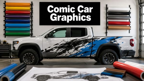
You're standing in the driveway with a truck or Jeep you like well enough, and one question keeps coming back. Will that comic character still read at 60 mph, or will it turn into a busy blur the first time the sun hits the paint and the road starts vibrating under it? On vehicles, comic book graphics aren't just art choices, they're readability choices, because the surface moves, curves, heats up, and gets judged in split seconds by people passing in traffic.
The best vehicle graphics borrow from comic art's oldest strengths, bold outlines, flat color fields, exaggerated silhouettes, and clear action flow. Those traits were already built for distance and fast reading when comic books became a mass-market visual medium in the 1940s and early 1950s, with U.S. circulation reaching 18 million copies per month in 1943, making up one-third of total magazine sales, and a market worth $72 million according to Britannica's comics history Britannica's comics industry overview. That same scale explains why comic language still works so well on trucks, doors, and rear glass, it was designed to be legible in motion long before vinyl ever entered the picture.

If you're testing a concept before you spend money on print and install, an AI mockup can help you spot the ugly parts fast. A useful starting point is AI Photo Generator comic book feature, especially if you want to see how a pose or outline behaves against your actual vehicle color before you commit.
Why Comic Book Graphics on Vehicles Are Their Own Animal
A comic decal on a laptop can get away with a lot. A comic decal on a truck gets judged by glare, curvature, dirt, door seams, handle placement, and whether somebody can understand it in a glance while the vehicle is rolling past. That's why the job is less about “making it look cool” and more about making a piece of art survive a moving, reflective billboard.
The surface changes the art
A hood bulges. A door breaks the image with trim. Rear glass throws back light in a way a flat poster never has to deal with. The cleanest comic-style vehicle graphics respect those realities by using strong silhouettes and keeping the main read inside the safest visual zone, not stretched across every inch of the panel.
Practical rule: if the design only works when you stare at it straight-on in good light, it's too fragile for a vehicle.
That's where comic language helps. In classic comic art, the eye follows the figure first, then the action line, then the background. Vehicles need the same hierarchy, except the background is often your paint, your glass, or your tailgate. A design with bold outer contour, compact internal detail, and one obvious focal point tends to survive weather and distance much better than a crowded composition full of tiny references.
Why comic art reads so well at speed
Comic books became a dominant print language because they were built for fast comprehension. By the mid-century period, Britannica says more than 100 million Americans read comic strips in newspapers Britannica's comics industry overview. That widespread familiarity matters on the road, because people already know how to decode a figure, a logo, or a motion cue without lingering.
The same thinking applies whether you're wrapping a work truck, adding a superhero tribute to a weekend cruiser, or building a custom mascot. The art has to read in motion, then still hold up when somebody walks up to it in a parking lot. That's a durability decision as much as a design choice.
Choosing the Right Comic Art and Character
Start with the silhouette, not the detail. A strong comic character should still make sense if you squint at it from across a parking lot, because that's closer to how people see it on a road than the tidy proof on your monitor. The classic superhero templates that emerged with Superman's 1938 debut in Action Comics #1 still work for that reason, they were built around bold logos, exaggerated anatomy, kinetic energy, and obvious shape recognition FunkidsLive's comic-book history summary.
Pick the pose that survives distance
A wide, readable stance beats a busy background every time. If the scene depends on tiny buildings, floating debris, or layered effects to make sense, it usually loses power on a door panel or rear quarter. The better move is to choose the pose that carries the emotion on its own, then strip the rest down until the character is still unmistakable from far away.
A good resource for seeing how themed vehicle art can stay readable without overloading the panel is see Volkswagen art at Volkswagen Memorabilia. It's useful for studying how bold linework and compact compositions hold their shape on real metal and glass instead of on a clean digital canvas.

Simplify the scene before it gets printed
The mistake I see most is choosing an image because it looks great as a poster, then expecting it to work as a vehicle decal. A poster can lean on background detail. A car graphic can't, because the viewer only gets a fraction of a second before the angle changes. Simplifying to the cleanest version of the character usually improves the install too, because fewer micro-details mean fewer places for lift, edge wear, and visual clutter.
If you're using a custom mascot, family figure, or parody-style character, keep the same rules. Make the outline unmistakable, then cut any element that doesn't help the read. That's how you get something that feels like comic art instead of a collage of references.
The best vehicle graphic isn't the one with the most detail. It's the one that still makes sense when half the audience is passing it in motion.
One internal example worth studying for scale and placement is this Baby Yoda Grogu peeking window decal. It shows how a simple character read can work better than a crowded scene when the target is glass, not a flat page.
Color, Contrast, and Panel-Inspired Layout
Comic art on a vehicle lives or dies by contrast. If the main figure and the vehicle body collapse into the same value range, the art disappears in shadow and the whole graphic looks cheaper than it was. That's why two- and three-color schemes often outperform more elaborate palettes on cars and trucks, especially when the base paint is already doing visual work for you.

Build the palette around the vehicle, not around the screen
A white truck can carry darker comic colors cleanly. A black sedan usually needs brighter tones or crisp light outlines to avoid vanishing. The same graphic can look sharp on one vehicle and muddy on another, so the base paint has to be treated as part of the palette, not as empty space.
Readability comes first: on a vehicle, a strong outline is doing the work of an inker, a shadow layer, and a separator all at once.
Comic logic and shop logic line up. Traditional inking uses line weight to define form, and vehicle graphics need that same separation because sunlight, dirt, and reflections flatten the image. A heavier outer border can protect the main shape, while thinner interior lines can keep details from turning into a black blob. For more visually disciplined color framing, RemotionAI's colour grading advice is a useful parallel, because it shows how deliberate tonal choices keep an image coherent instead of washed out.
Panel borders and speech bubbles can anchor the design
A comic panel border can do more than look cute. On a door or tailgate, it can act like a frame that locks the image into the vehicle's geometry. Speech bubbles can also create a strong stop point for the eye, which matters when the art sits near handles, seams, or body lines that would otherwise chop the composition apart.
The trick is restraint. If every part of the vehicle looks like a page of comic panels, the design stops feeling intentional and starts feeling noisy. Use borders to anchor one section, not to box in the whole truck.
Test the contrast before you print
A taped printout beats a guess every time. Hold the design against the actual vehicle in daylight, step back, and check whether the outline still separates from the paint when you're not standing right on top of it. If the figure disappears from ten or fifteen feet away, it won't magically improve after installation.
Avoid combinations that rely on subtle gradients, low-contrast gray-on-gray fills, or tiny highlights to do the heavy lifting. Vehicles move through glare, shade, and dust. Comic graphics need to survive all three.
Sizing and Placement for Real Vehicles
A comic graphic can look strong on screen and still fail on the truck if it lands in the wrong zone. Hood art, rear glass art, door graphics, and tailgate graphics all read differently because each one deals with a different viewing angle and different breaks in the body. On a truck, the tailgate gives you a broad read from behind, while a door panel has to work around handles, trim, and seams.
Measure the usable canvas before you buy vinyl
Use the width of the specific panel, not the general body style. A rear window on one SUV and another SUV of similar size can still have different slopes, borders, and usable spaces. Measure the area you want the graphic to occupy, then leave breathing room at the edges so the art does not look jammed into the frame.
A good fit usually feels intentional because it respects the vehicle's structure. A design that runs straight through a crease or disappears behind a mirror often looks like a sizing mistake, even if the artwork itself is strong. The vehicle should feel like the stage, not something the design has to fight.
Place the art where people will see it
Door placement is quieter and more personal. Hood placement can be more aggressive and immediate, but it also has to survive reflections and engine-bay heat. Rear glass and tailgates give you stronger visibility in traffic, while side panels let you build a more character-driven composition that people notice when the vehicle is parked.
One practical example of body-panel-specific design is this Dodge Ram bedside graphic decal design. It shows why a graphic should be fitted to one zone instead of forced into a generic rectangle.
Mock it before the cutter ever runs
Painter's tape and a printout tell you more than a screen ever will. Tape the mockup to the vehicle, step back, and view it from the distances that matter, driveway, curbside, and across a parking lot. If the top edge fights the body line or the character is clipped by a handle, fix that before the order goes to production.
For windshield or glass placement, stay aware of local visibility rules and do not let the graphic interfere with safe sight lines. If you are unsure, keep the art in a zone that is visually strong but does not obstruct the driver's view. On vehicles, a smart placement often beats a large one.
Vinyl Materials, Finishes, and Durability
The look of comic book graphics shifts a lot with the vinyl and the finish you choose. Gloss usually reads more like classic superhero art because it gives the colors more punch and a sharper pop under light. Matte reads more like a graphic novel page, quieter and less reflective, which works better if you want the illustration to feel grounded instead of flashy.
A lot of the decision comes down to where the vehicle lives and how the art has to behave on metal, glass, and curved trim. On a parked showpiece, a finish can be chosen mostly for appearance. On a daily driver, the same finish has to handle sun, washing, road film, and the way light changes as the vehicle moves through traffic.
Cast versus calendared vinyl
Cast vinyl is the safer long-term choice for curved vehicle surfaces and daily-driven use. It is built to conform better and hold its shape, while cheaper calendared films are more likely to shrink and lift at the edges over time, especially on hot panels and around contours. If the graphic wraps a subtle curve or needs to survive weather and washing, cast film is usually the smarter buy.
If the vehicle lives outdoors, the bargain film is rarely the bargain you think it is.
Custom Sticker Shop lists Oracal vinyl rated for up to 7 years outdoors on its product pages and company information, which is the kind of rating that makes sense for a daily driver or a truck that lives outside most of the week. A windshield banner example is here: vinyl windshield banner decal stickers. That kind of outdoor rating matters because sunlight, heat, and road grime are what punish edge adhesion first.
Lamination changes both durability and appearance
Lamination adds a protective layer that helps guard printed graphics from scratches, abrasion, and UV wear. It also changes the visual finish a bit, so the same comic graphic can feel sharper, softer, or more premium depending on whether the laminate is gloss or matte. If the vehicle gets washed often or sees highway debris, that top layer earns its keep quickly.
The trade-off is straightforward. More protection can mean a slightly less raw, less sticker-like look. Less protection can mean a brighter first impression, but the art wears faster. For a vehicle that stays outside, I would choose durability first.
Ordering, Customization, and Bubble-Free Installation
A clean install starts before the decal comes out of the tube. The proof needs to be right, the sizing needs to match the vehicle, and the graphic should arrive pre-spaced and transfer-taped so the install isn't trying to fight itself. That preparation is why better shops make the process feel calm instead of chaotic.

Get the proof right first
Check the layout, the scale, and the spacing before anything gets printed. If the character looks too small on the proof, it'll look too small on the vehicle. If the border feels tight on screen, it'll feel even tighter once it meets trim, glass edges, or panel gaps.
A lot of first-time buyers rush this part because the artwork is exciting. That's how they end up with a beautiful decal that's the wrong size for the surface. Measure twice, proof once, and save yourself the redo.
Install on a warm day with the right tools
Use a simple kit, a spray bottle with soap-and-water mix, a microfiber towel, a squeegee, masking or hinge tape, and a clean blade if any trimming is needed. Clean the panel thoroughly, then dry it completely, because dust and residue show up fast under transparent transfer tape. Warm, not blazing hot, is the sweet spot because the film stays workable without flashing into place too fast.
Set the graphic with hinge tape so the alignment stays steady. Peel back a small portion, squeegee from the center outward, then keep working in sections so air doesn't get trapped. After the main application, go back and re-squeegee the edges, because that second pass catches the places most beginners miss.
Don't force the vinyl
Stretching the film to make it “fit” usually causes trouble later. The shape may look good for a few minutes, but tension in the vinyl can show up as distortion, edge stress, or premature lift. Direct sun causes the same kind of headache because the adhesive gets too eager too fast and you lose control over placement.
If a bubble appears, lift the affected area gently and reset it. If an edge doesn't settle, don't hammer it down with force, fix the underlying alignment. Smooth installs are rarely about speed, they're about control.
Long-Term Care and When to Replace
Wash the graphic gently and keep harsh brushes off it. A soft wash mitt, mild soap, and low-pressure rinsing do far less damage than aggressive automated washing. The first signs of trouble are usually tiny edge lifts, dulling at the corners, or small scuffs where road debris has been hitting the same area over and over.
The smartest maintenance habit is also the simplest. Check the edges after a wash, keep the vehicle out of unnecessarily brutal cleaning cycles, and replace the graphic before a small lift becomes a full peel. When the art starts looking tired, that's usually the right time to refresh it rather than trying to rescue film that's already spent.
If you're choosing comic book graphics for a car or truck, treat the job like a mix of design and fitment, not just decoration. Custom Sticker Shop makes that easier with durable vinyl decals, pre-spaced installs, and vehicle graphics built for real roads, real weather, and real daily use. Take a look at Custom Sticker Shop if you want a comic-style decal that's sized for the vehicle, readable in traffic, and built to hold up once it's out in the sun.