
You’re probably here for one of two reasons. Either you manage vehicles that need to look official, readable, and safe on the road, or you want to show support for law enforcement on your own truck, Jeep, or rear window without crossing a legal line. Those are very different jobs, but they both come down to the same thing. A decal has to say the right thing, in the right way, on the right vehicle.
A lot of people still think of decals as decoration. Anyone who’s spent time around patrol units, fleet installs, or memorial graphics knows better. Good law enforcement decals identify the vehicle, reinforce authority, improve visibility, and carry meaning. Bad ones peel, fade, confuse the public, or worse, make a personal vehicle look close enough to official that it invites trouble.
I’ve been around this business long enough to see both sides. Departments need consistency and durability. Families and supporters want something respectful that doesn’t look tacky or overdone. The smart choice usually isn’t the loudest design. It’s the one that fits the mission, the vehicle, and the law.
More Than Just Markings An Introduction to Law Enforcement Decals
A patrol SUV pulls up behind a disabled motorist at dusk. Before anyone reads a door seal or unit number, the vehicle has already done its job. Its markings tell the driver who is there, whether the stop is official, and how visible that unit will be to traffic coming up fast from the rear.
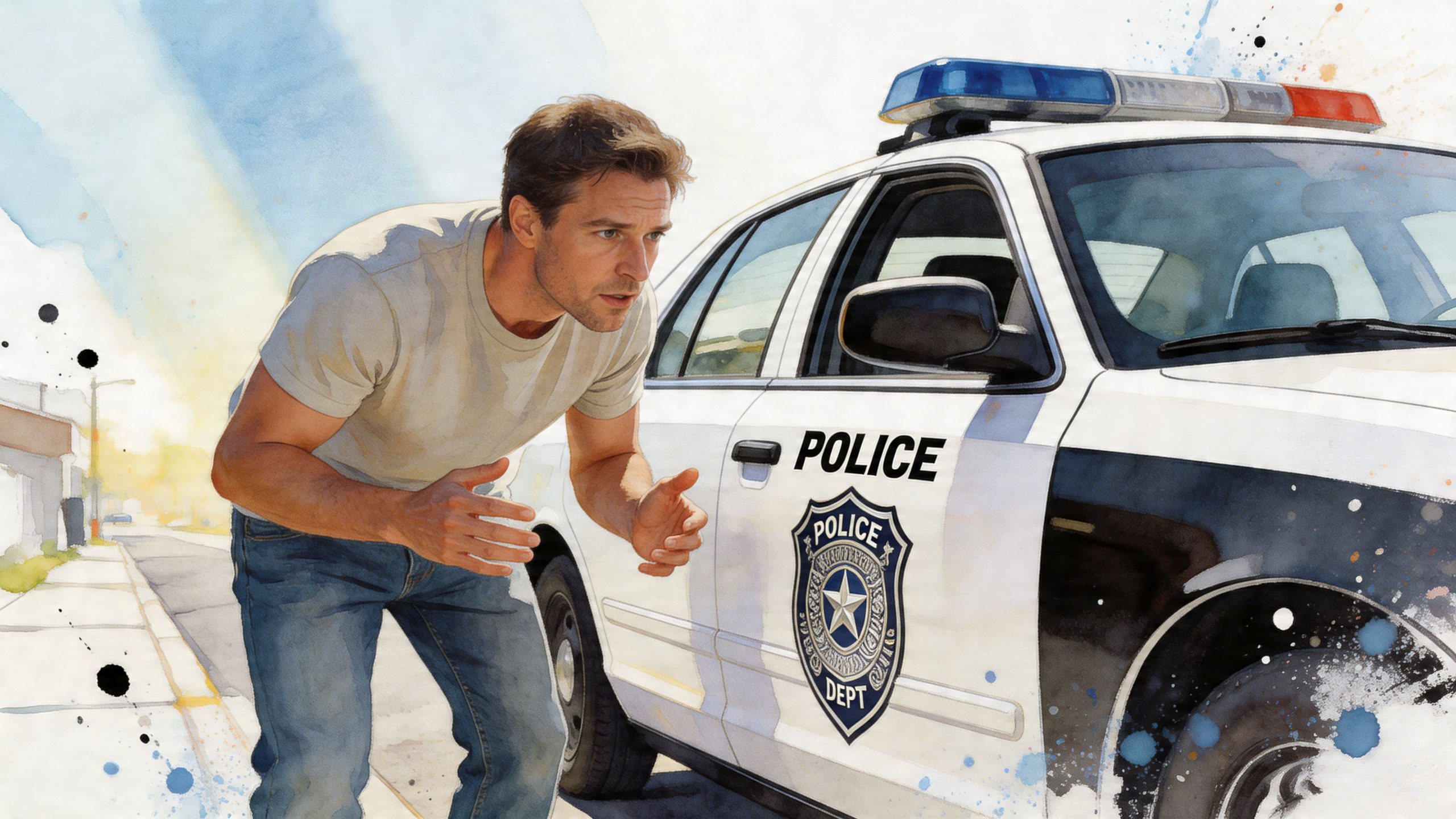
That is how I look at law enforcement decals after more than two decades in this business. On a fleet vehicle, graphics identify the agency, support visibility, and hold up under weather, washing, and daily use. On a personal vehicle, the job is different. A support decal, memorial piece, or tribute graphic should read as respect, not as an attempt to copy an active unit.
That distinction gets missed in a lot of articles. Fleet managers need markings that are readable, durable, and consistent from one vehicle to the next. Civilian supporters need clear boundaries so a tribute stays legal and tasteful. Both groups benefit from the same plain advice. Pick graphics that fit the vehicle, the purpose, and the rules in your area.
Two buyers, two very different needs
Department buyers usually start with function. They want to know whether the vinyl will conform over curves, how reflective films perform at night, and whether the same package can be installed cleanly across sedans, SUVs, and trucks without turning the fleet into a mismatched mess.
Private buyers ask a different set of questions. Will this look respectful? Will it hold up on rear glass or painted panels? Could it be mistaken for official law enforcement markings?
Practical rule: If the design could make an ordinary driver think your personal vehicle is a real police unit, it’s the wrong design.
That is why a supporter decal like a Thin Blue Line Punisher skull graphic belongs in a different category from a door-sized agency seal, patrol-style side lettering, or anything that imitates a marked unit. One shows support. The other can create public confusion and legal trouble.
The Anatomy of a Police Decal Package
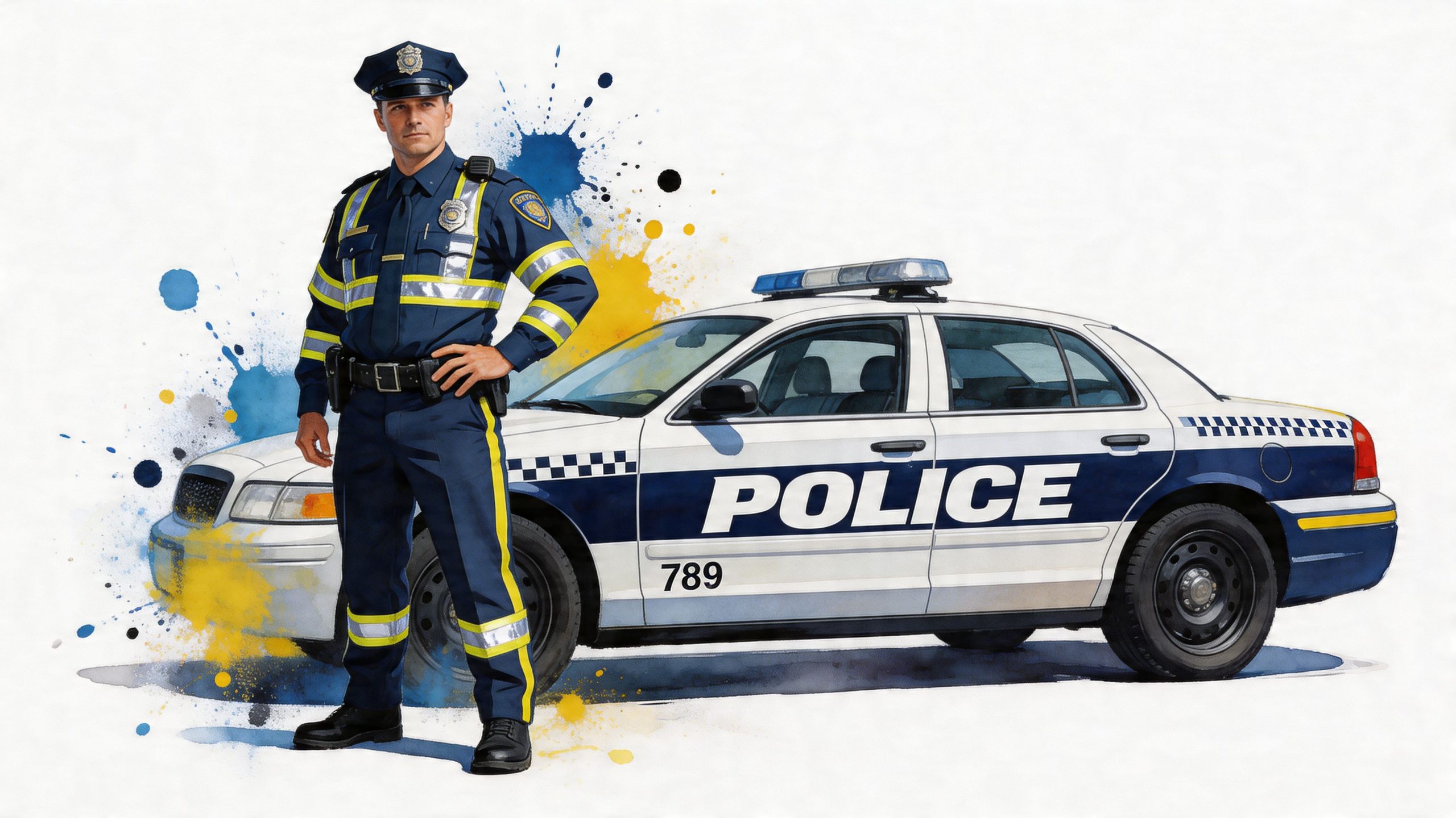
A proper police graphics package works like a system. Every piece has a job, and when one piece is weak, the whole vehicle suffers. You can read a patrol car the same way you read a uniform. The large identifier gets your attention first. The secondary text tells you whose vehicle it is. The emblem ties it to the department. The small numbers and rear markings handle accountability and safety.
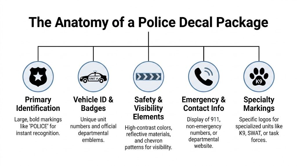
Primary identification
This is what is seen first. It’s usually POLICE, SHERIFF, or another primary agency label in large lettering. On a marked unit, this text does the heavy lifting for immediate recognition. If it’s too stylized, too small, or broken up by body lines, the message gets weaker.
The best layouts stay simple. Big letters. Strong contrast. Clean spacing.
Secondary text and official symbols
Once the primary ID grabs attention, secondary elements do the clarifying. That usually means the municipality, county, or agency name, plus an official shield, star, or seal. These symbols matter because they carry department identity, not just decoration.
That design language has roots in uniform tradition. Police patches emerged in the early 1900s as simple sleeve markings and evolved into more symbolic designs tied to authority, community pride, and professional identity, as described in this history of police patches and their design influence. Modern vehicle graphics borrow directly from that same visual tradition.
Vehicle numbers and specialty identifiers
Function always takes precedence over style with law enforcement decals. Unit numbers, vehicle IDs, precinct references, K9 markings, task force names, or supervisor identifiers help officers, dispatch, and the public distinguish one vehicle from another.
A few common pieces you’ll see include:
- Unit numbers: Usually placed where they can be read quickly by other units or supervisors.
- Rear identifiers: Useful when a vehicle is viewed in traffic from behind.
- Special assignment graphics: K9, response team, marine, aviation, or traffic enforcement markings.
- Badge or shield references: Often included in smaller form to reinforce agency identity.
A clean specialty graphic can work well on support vehicles too, especially designs in the response-team style, such as response team truck decals, as long as they aren’t presented as official government insignia on private vehicles.
The best decal package looks organized from ten feet away and readable from across a parking lot.
The Functional Purpose of Law Enforcement Graphics
A patrol vehicle’s graphics package isn’t a cosmetic add-on. It’s part of the vehicle’s working equipment. If the markings fail, the vehicle can still drive, but it doesn’t communicate as clearly, and that matters in traffic, on scenes, and during nighttime operations.
Visibility is a safety tool
Reflective films are where professional law enforcement decals separate themselves from cheap automotive graphics. According to this police vehicle graphics overview, law enforcement vehicle decals prioritize reflective materials such as 3M Scotchlite for visibility under different lighting conditions, and those materials are used to meet standards such as NFPA 1901. The same source notes that poor visibility is a factor in up to 30% of pursuit-related accidents, and high-performance films can reduce civilian driver reaction time from 500ms to under 200ms at 60 mph.
That’s not a styling detail. That’s reaction time on a real road.
Retroreflective material works because it throws light back toward the source. In plain terms, when headlights hit the decal, the driver sees the marking sooner and more clearly. That matters during roadside stops, lane closures, scene protection, and any situation where a patrol unit needs to be recognized fast.
Authority needs to be immediate
Clear graphics also reduce hesitation. A vehicle with sharp markings, balanced placement, and proper contrast looks official at a glance. Drivers are more likely to respond appropriately when they instantly understand who is behind them or parked ahead on a shoulder.
That doesn’t mean every patrol vehicle should be loud. Some agencies use lower-profile layouts for certain units. But even then, the design still needs discipline. Sloppy ghost graphics, weak contrast, or undersized text can create delay and confusion.
Professional graphics also shape public perception
People notice whether a vehicle looks squared away. Faded lettering, peeling edges, and mismatched replacements send the wrong message. Crisp markings signal that the department takes care of its equipment and presents itself consistently.
In practical terms, strong law enforcement decals support three jobs at once:
- Recognition: The public can identify the vehicle quickly.
- Safety: Reflective and high-contrast elements improve visibility.
- Credibility: A professional layout reinforces authority and order.
A support or tribute decal works differently, but the same principle applies. It should be clear, intentional, and easy to understand. Something like a K9 caution decal can make sense in the right personal context, such as a dog-handler enthusiast build or a memorial setup, but it shouldn’t be arranged in a way that mimics a working patrol unit.
Clean design does more than look good. It helps other people make the right decision faster.
Navigating Legal and Departmental Guidelines
Many buyers encounter problems. They focus on what looks sharp and forget to ask what’s allowed. Official fleet markings live under one set of rules. Civilian tribute decals live under another. Mixing those up is a mistake.
What departments need to get right
Official police decals have to do more than fit the vehicle. They have to be readable and properly placed. According to these custom police vehicle design guidelines, standard placement typically centers on the side doors and trunk lid, with hood or fender use depending on agency preference. The same source notes that legibility standards favor sans-serif fonts and clear sizing for quick recognition, and that full municipality naming is part of common guidance for official use.
That tracks with what works in the field. A clean sans-serif face reads better than script. Straight text reads better than italic text. Door placement reads better than trying to cram core identification into awkward panel shapes.
For a department, smart rules usually look like this:
- Keep the main identifier consistent: Every marked unit should share the same visual language.
- Respect vehicle geometry: A sedan door, SUV rear quarter, and pickup bedside don’t carry graphics the same way.
- Use official symbols carefully: Badges, stars, and seals should reproduce cleanly and at proper resolution.
- Plan for replacement work: If one door gets repainted, the graphics package should be easy to reproduce exactly.
What civilians absolutely need to avoid
This is the gap most articles skip, and it’s the part that matters most for private owners. If you’re not an agency, don’t mark your vehicle like one.
A source discussing ghost graphics and related police-style applications notes that 18 U.S.C. § 912 prohibits false impersonation of officers, and state laws can also restrict police-style markings on non-official vehicles, including California rules on police-style vehicle markings. The same source also mentions an FBI report noting 150+ impersonation cases in 2023, many involving decals, in this discussion of ghost graphics and impersonation risks.
That should settle the question for the majority.
Here’s the practical split:
| Design type | Personal vehicle |
|---|---|
| Thin Blue Line flag or support symbol | Usually appropriate if clearly expressive |
| Family memorial with badge number or memorial text | Appropriate when it’s clearly a tribute |
| Official city seal, department star, or door-sized POLICE marking | Wrong choice for a civilian vehicle |
| Full ghost-graphic patrol lookalike layout | High risk and not worth it |
Respectful support looks different from imitation
Support graphics should read as personal expression, not state authority. Good examples include memorial names, end-of-watch tributes, subdued support imagery, family-of-officer graphics, or a badge-number reference presented as remembrance rather than enforcement identity.
Bad examples are fake municipal names, shield graphics copied from a real agency, oversized patrol-style side-door text, push-bumper cosplay, and anything arranged to make traffic react to you like you’re an actual unit.
Common-sense test: If a driver in your mirror might move over because they think you’re law enforcement, remove the design.
Why Material Quality Matters for Lasting Performance
You can ruin a solid design by cutting it in the wrong vinyl. In these situations, buyers often get fooled by price. Two decals can look nearly identical on day one. Six months later, one still sits flat and clean, and the other has shrinking edges, lifting corners, or a brittle look around curves.
Cast vs calendared in the real world
For vehicle work, cast vinyl is the better material when the decal needs to conform, stay stable, and hold its shape over time. It starts thinner, relaxes better over curves, and doesn’t fight the panel as much. Calendared vinyl can work for simpler, flatter jobs, but on vehicles it’s more likely to show its limits.
That doesn’t mean every small rear-window sticker needs the most advanced film on the market. It does mean the buyer should match the material to the job. Door markings, body contours, high-speed use, harsh sun, and frequent washing demand better film than a bargain-bin promotional sticker.
What failure looks like
Cheap material usually fails in familiar ways:
- Edge shrinkage: The decal pulls inward and leaves a dirt outline.
- Cracking on curves: Common around compound body lines and recessed areas.
- Adhesive problems: Either too aggressive during removal or too weak during use.
- Premature fading: Dark blacks turn chalky, and colors lose contrast.
Laminate matters too, especially on printed or high-exposure graphics. It adds abrasion resistance and helps the surface hold up through washing and weather. If a vehicle has already had bodywork or paint correction, a quality substrate matters even more. Shops doing quality auto paint refinishing know that the finish under the decal is only half the equation. The film on top has to be worth applying.
The wrong vinyl costs more twice
First you pay to install it. Then you pay to strip it, clean the adhesive, and replace it after it fails. That’s why serious buyers ask what film is being used, whether the graphic is laminated when needed, and whether it’s suited for automotive exposure instead of generic sign work.
Sizing Placement and Customization Guidance
A decal can be cut perfectly and still look wrong on the vehicle.
I see it all the time. The size looked fine on a screen, then it landed across a body crease, got chopped by a door handle, or took up so much glass that it started looking more like a prop than a tribute. Good placement fixes that. It gives official vehicles the consistency a fleet needs, and it helps civilian supporters show respect without drifting into impersonation.
Start with the vehicle, not the artwork
Every panel has limits. Rear glass has defroster lines, tint, and wiper sweep to work around. Doors have handles, moldings, and stamped curves. Bedsides and quarter panels often give you cleaner real estate, but only if the design fits the shape.
Fleet managers usually need repeatable placement across sedans, SUVs, and trucks. That means building a package that keeps the same visual identity even when panel sizes change. Civilian buyers have a different job. They need a layout that reads clearly, looks respectful, and stays well away from official-style placement that could create the wrong impression.
That trade-off matters.
A memorial or support decal on the lower corner of the rear window usually reads better than a large centered layout. It stays visible without taking over the vehicle. A small side-window graphic can work well too. Full front-door placement on a personal vehicle is where buyers get into trouble fast, both visually and legally.
A practical sizing method
Before ordering, answer four questions:
What is the decal supposed to do?
Fleet ID, memorial, family support, and general law-enforcement pride all call for different scale and placement.Where will people see it?
Door graphics are read from the side. Rear-window decals are read from behind at stops, in parking lots, and during slow traffic.What will interfere with the design?
Handles, trim, fuel doors, body lines, hinges, and curved glass all affect the usable area.How much blank space should stay blank?
Some of the cleanest installs leave more open area than the customer expected. That open space keeps the message readable.
The goal is not to fill the panel. The goal is to make the graphic look like it belongs there.
Custom details that add meaning
The best custom work is usually restrained. Badge numbers, initials, unit references, and end-of-watch wording can make a memorial feel personal without turning it into a copy of an official agency marking. As noted earlier, badge numbers carry real weight in law enforcement history, which is why they mean something to families, coworkers, and supporters.
That history is also where civilian buyers need to use judgment. A badge number paired with a memorial phrase or name can be appropriate. A badge number dropped into a full official-style door layout is a different matter. One honors a person. The other can read like an attempt to mimic a marked unit.
After two decades in this business, the best-looking law enforcement tribute decals tend to follow the same rule. Keep them clean, keep them proportional, and make the meaning obvious without copying an actual design.
Choosing Your Decals at Custom Sticker Shop
When buyers ask what matters most, the answer is usually a mix of things, not one thing. The decal has to fit the vehicle, fit the purpose, hold up outdoors, and avoid crossing legal lines. That’s true whether you’re outfitting a work truck with a support graphic or ordering a memorial decal for a family member.
Custom Sticker Shop is built around that practical approach. It’s a veteran-friendly, family-run shop in Topeka, Kansas, and it’s been producing American-made decals since 2001. The company uses professional-grade Oracal vinyl rated for up to 7 years outdoors, with decals shipped pre-spaced and transfer-taped for easier, cleaner installation. That matters if you’ve ever tried to align lettering by hand and ended up fighting bubbles or crooked spacing.
The catalog is broad enough for both straightforward supporters and buyers who want something more personal. There are more than 1,200 designs, including 295+ military tributes, 240+ Jeep graphics, and 165+ family options. Pricing starts at $7.99, there’s free US shipping on orders over $25, and an unlimited Buy 2 Get 1 Free offer helps if you’re ordering multiple decals for a couple of vehicles or matching windows.
What stands out most is that the shop’s setup matches what serious buyers need. American-made production. Practical install prep. Durable automotive vinyl. Responsive service. No gimmicky mystery materials.
If you want law enforcement decals that respect the difference between official use and personal support, start with designs that are clear about what they are. Support decals should look like support. Memorials should look like memorials. Official-looking agency graphics belong on official vehicles.
If you’re ready to order a durable, American-made tribute or support decal, browse the selection at Custom Sticker Shop. You’ll find veteran-friendly service, premium Oracal vinyl, easy-to-install pre-spaced graphics, and a deep catalog built for truck owners, Jeep drivers, families, and proud supporters who want something that looks right and lasts.