
You’re probably here because you like the look of police-style graphics, but you don’t want your vehicle to cross the line from “tasteful tribute” into “that might get me stopped.”
That’s a fair concern. A lot of people want the same thing. They want a hood number, a reflective side stripe, a ghost-style badge on black paint, or a subtle supporter decal that feels sharp and deliberate. What they usually can’t find is one guide that treats the topic like both a design project and a compliance project.
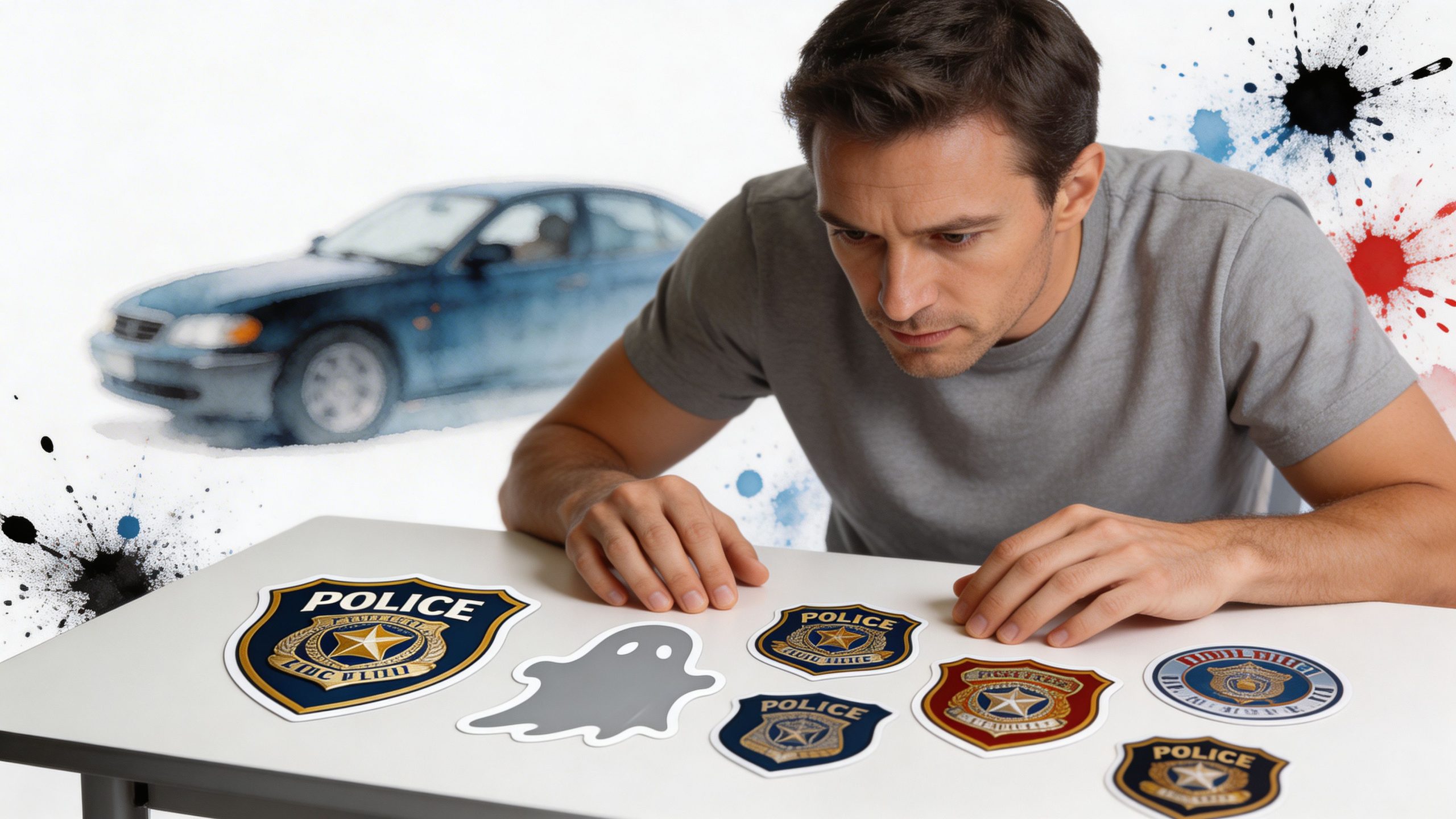
Take Alex, an off-road owner with a dark Jeep and a practical problem. He likes the low-profile look of stealth markings used on some patrol vehicles, especially the way they almost disappear in daylight and light up when headlights hit them. He doesn’t want a cartoon look. He doesn’t want a giant novelty sticker. He wants something clean, reflective, and restrained. But he also doesn’t want a decal setup that confuses other drivers or creates impersonation concerns.
That tension is why police stickers for cars confuse so many buyers. The category mixes several very different things under one label. Some decals are built for official fleet visibility. Some are supporter graphics. Some are ghost-style reflective overlays that look nearly invisible until light catches them. Those aren’t interchangeable, and they shouldn’t be treated as if they are.
The other common point of confusion is placement. A design that looks balanced on a Crown Victoria-style sedan may look awkward on a lifted truck. A hood marking that reads clearly on flat sheet metal may wrinkle or distort on a sharply curved panel. Even a good design can fail if the vinyl, sizing, and location don’t match the vehicle.
Introduction to Police Sticker Customization
Police-style decals sit at the intersection of function, symbolism, and personal taste. That’s why they attract very different buyers. One person wants a memorial tribute. Another wants a tactical look for a truck build. Someone else wants a reflective ghost graphic that stays understated in daylight.
The first useful mindset is to stop thinking of these decals as one product type. They’re more like a family of products. A hood number, a stealth side marking, a thin blue line supporter sticker, and a department-style door emblem may all look related, but they solve different problems and carry different meanings.
Why people choose them
Some buyers care most about appearance. They want crisp lettering, high contrast, or a subdued monochrome finish that matches black, gray, or olive paint.
Others care more about visibility. Official police graphics exist for reasons beyond appearance. Police car decals help with identification and safety, and the U.S. has approximately 800,000 sworn law enforcement officers operating vehicles with specialized graphics, while nearly all marked and unmarked patrol cars use reflective identifiers for visibility and tactical benefits, as noted by The Emblem Authority’s overview of police car decals.
That official background matters because civilian builds often borrow the visual language of emergency fleets without sharing the same purpose. If you’re customizing a personal vehicle, that difference should stay obvious.
The smart starting point
Before you shop, answer three questions:
- What look are you after: Supporter tribute, ghost-style stealth, or overt patrol-inspired styling?
- What’s the vehicle: Sedan, Jeep, truck, or SUV?
- What’s the risk level: Do you want something unmistakably civilian, or something closer to fleet aesthetics with very careful wording?
Practical rule: If a stranger could reasonably read your graphics as official law enforcement markings, the design needs to change before it ever reaches the hood.
That one rule prevents most expensive mistakes.
Understanding the Key Concepts
The phrase police stickers for cars covers several distinct categories. If you don’t separate them first, it’s easy to buy the wrong material, choose the wrong scale, or create a design that sends the wrong message.
Official graphics, ghost decals, and supporter designs
Start with the broadest split.
Official law-enforcement graphics are built for agency use. They identify the vehicle, improve recognition, and often use reflective materials so markings remain visible in poor light. These are the graphics people associate with patrol sedans, interceptors, SUVs, and traffic units.
Ghost graphics are more subtle. They’re designed to blend into the paint in daylight while still reflecting light at night. Think of them like a low-contrast watermark on paper. You may barely notice it until the angle changes and it suddenly becomes obvious.
Supporter or tribute decals are the civilian-friendly branch. These include memorial designs, family support themes, thin blue line variants, veteran tributes, and symbolic graphics that reference law enforcement culture without trying to pass as official vehicle identification.
A simple analogy that helps
If regular reflective graphics are like a bright safety vest, ghost graphics are like lightly tinted lenses with a hidden coating. They still perform, but they do so with less overt visibility.
That’s why ghost-style decals appeal to off-road owners, blacked-out truck builders, and people who want visual restraint. The effect is controlled rather than loud.
Ghost decals work best when the owner wants the shape and authority of fleet graphics without the daytime shout.
What each category is good at
A quick way to sort your options is to match the decal type to your goal.
- Need visibility first: Reflective fleet-style striping and clear identifiers make the most sense.
- Need subtlety: Ghost-style reflective overlays are the better fit.
- Need a clear civilian message: Supporter decals with unmistakable wording are safer and easier to explain.
What often confuses buyers
The confusion usually comes from mixing two ideas.
First, people see official patrol markings and assume the same layout works on any personal vehicle. It doesn’t. Official graphics are designed around public recognition, department standards, and fleet body shapes.
Second, many buyers treat “reflective” and “ghost” as synonyms. They aren’t. A decal can be reflective and still highly visible during the day. Ghost graphics are a narrower style choice. Their main trick is low daytime contrast paired with nighttime reflectivity.
A better way to choose
Use this sequence:
- Decide whether the decal is symbolic or functional.
- Choose how visible you want it in daylight.
- Make sure the wording can’t be mistaken for official status.
- Then choose material, size, and placement.
That order saves time because it starts with intent, not with color charts.
Navigating Legal and Ethical Considerations
This is the part many buyers skip, and it’s the part that matters most.
A police-themed decal can be stylish, respectful, and harmless. It can also create a problem if it looks too close to official insignia, uses restricted wording, or mimics the visual signals of an actual patrol unit. The legal issue usually isn’t “Do decals exist?” It’s “Would a reasonable person mistake this for law enforcement identification?”
Where the line usually gets crossed
The biggest legal risk is impersonation. That risk grows when a civilian vehicle combines several cues at once. A badge-like door graphic. Large “POLICE” text. Reflective striping that resembles agency layouts. Official-looking shields. Emergency-style color schemes.
The law often focuses on unauthorized use of police patches, text, or markings. According to Thin Blue Line Shop’s legal overview, over 20 U.S. states treat unauthorized use of police patches or text as a misdemeanor, with fines up to $1,000, and Texas specifically banned civilian displays of “police” text in 2024 after misuse complaints spiked by 15%.
That doesn’t mean every tribute decal is illegal. It means context matters. The same symbol can be harmless in one format and risky in another.
The ethical side matters too
Legality is the floor, not the ceiling.
A design can be technically defensible and still be a poor choice if it confuses the public, causes hesitation during traffic interactions, or undermines trust in real emergency markings. Civilian vehicles don’t need to look official to show support.
That’s especially true with reflective and ghost-style layouts, because subtle markings can look more credible than bright novelty decals. The cleaner the design, the more careful you need to be with language and placement.
Legal gut-check: If your decal package would make another driver slow down because they think you’re an unmarked unit, it’s too close.
A practical compliance checklist
Use this before ordering anything.
- Avoid restricted wording: Skip “police,” “sheriff,” “deputy,” “state trooper,” and similar official identifiers unless local law clearly permits the exact use.
- Remove badge mimicry: Don’t use shield shapes, patch replicas, or department-style seals that resemble real agencies.
- Add civilian context: Words like “supporter,” “tribute,” “memorial,” or family-oriented language reduce ambiguity.
- Be careful with placement: Door logos and hood markings often read as official faster than window decals do.
- Check local rules: State and municipal enforcement can differ, so review local impersonation statutes and traffic equipment rules before installation.
If you want a plain-language resource on broader vehicle-related legal implications, that guide helps frame how traffic laws, presentation, and enforcement issues can intersect around car modifications.
Safer design choices
A compliant design usually does three things well.
First, it states support without claiming status.
Second, it avoids official terminology.
Third, it looks custom rather than agency-issued.
For example, a tribute build might use monochrome striping, a memorial phrase, a flag element, or a symbolic motif without using restricted text. A supporter who likes tougher iconography might look at a product such as this thin blue line Punisher-style decal as a reminder of the style category that stays clearly in the tribute lane rather than the official-identification lane.
State-by-state nuance without pretending every rule is identical
People often ask for a neat 50-state chart. Real life rarely works that cleanly.
Some states focus on specific words. Some focus on badges, uniforms, or emblems. Others care most about intent and whether the presentation could deceive. Then there are separate issues involving reflective materials, windshield placement, and color restrictions that may apply even when impersonation law doesn’t.
That’s why the best approach isn’t to search for a single yes-or-no answer. It’s to make your design obviously civilian from the start.
When in doubt, simplify
If you’re uncertain, use one of these safer routes:
- A small supporter decal on rear glass
- A memorial ribbon or symbolic line graphic
- A ghost-style design with non-official wording
- A custom text decal that says exactly what the tribute means
The more a design needs explanation, the weaker it is from a legal standpoint. Good customization should be easy to understand at a glance.
Choosing Materials and Ensuring Durability
Material choice changes everything. Two decals can have the same shape and color, yet behave very differently once they hit sunlight, road grime, winter wash cycles, and curved body panels.
For police stickers for cars, the main material question is simple. Are you buying for appearance only, or for appearance plus reflectivity?
Why reflective film isn’t all the same
Reflective vinyl spans a wide range. Entry-level reflective products can work for mild visual effects, but they don’t all perform the same way when viewed from sharp angles.
That matters because vehicle graphics are rarely seen straight-on. Other drivers approach from offset lanes, parking lot angles, and rear-quarter positions. According to StrucknDesign’s law-enforcement graphics material notes, Diamond Grade prismatic conspicuity films outperform engineer-grade reflective vinyl by 400% in wide-angle visibility under ASTM D4956 Type XI specs, and they resist fade for over 3,000 hours of QUV testing.
That’s a strong clue about use cases. If your build depends on nighttime readability or a true ghost effect under headlights, material quality matters more than color alone.
Comparison of Vinyl Materials
| Material Type | Reflectivity | Durability (Years) | Best Use Case |
|---|---|---|---|
| Standard non-reflective vinyl | Low or none | Shorter-lived than premium reflective options | Basic supporter decals, temporary styling, low-cost accents |
| Engineer-grade reflective vinyl | Moderate | Varies by product line | Entry-level reflective lettering and simple visibility upgrades |
| Diamond Grade prismatic film | Very high, strong wide-angle performance | Long-term use with strong fade resistance | Ghost graphics, high-visibility striping, premium patrol-inspired layouts |
| Premium Oracal cast vinyl | Available in non-reflective and reflective styles depending on product | Up to 7 years for the Oracal vinyl referenced in the source background on ghost graphics | Long-term custom decals on painted vehicle surfaces |
How to match material to the vehicle
Think of vinyl like footwear. Dress shoes, hiking boots, and track spikes all cover your feet, but each one fails outside its intended job.
Daily driver
A daily driver needs easy cleaning, stable adhesion, and moderate visual impact. If the graphic is mostly symbolic, standard premium cast vinyl may be enough. If you want a subtle night response, move into reflective film.
Off-road Jeep or truck
A Jeep, truck, or trail rig sees more texture, more wash abuse, and more contour changes. Ghost graphics can look excellent here, but they need material that tolerates curves and rougher use. Premium cast films and higher-grade reflective products make more sense than bargain calendered stock.
Show-oriented build
A show car often prioritizes finish quality and edge sharpness. In that case, thin cast films, tight cut lines, and clean transfer application matter as much as reflectivity.
Better vinyl doesn’t just last longer. It usually looks more “factory” because it conforms better and keeps its edges cleaner over time.
When a decal should become a wrap discussion
Some people start by shopping for decals, then realize they want panel coverage, not isolated graphics. At that point it helps to compare decals to broader car wrap options so you can decide whether a hood stripe, partial side package, or full wrap better fits the look.
A windshield banner can also shift the whole visual balance of a vehicle. If that’s part of the plan, a customizable format like this custom text windshield banner decal shows the type of product people use when they need lettering scaled across a wide top edge rather than a door or quarter panel.
A few durability habits that matter
Material quality helps, but owner habits still decide whether a decal ages well.
- Wash gently: Aggressive brushes and harsh chemical cleaners wear edges faster.
- Watch panel texture: Smooth painted surfaces hold decals better than rough plastics.
- Respect the climate: Heat, UV, and freeze-thaw cycles all stress adhesive over time.
- Choose the right finish: Matte, gloss, and reflective surfaces each highlight dirt and scratches differently.
Most bad decal experiences aren’t caused by the idea. They’re caused by a mismatch between material and use.
Customization Options and Sizing Tips
Design is often an exciting phase, but also where many mistakes begin.
A police-style decal has to fit the vehicle the way a custom-fitted jacket fits a body. The same chest measurement doesn’t mean the same cut works for everyone. A long hood, upright windshield, flared fender, or slab-sided truck door all change what will look balanced.
Start with the shape of the vehicle
Sedans usually reward horizontal designs. Their side surfaces are lower and longer, so stripes, low door text, and rear-quarter accents tend to read cleanly.
Jeeps and trucks often work better with chunkier elements. Their doors are taller, their hoods can be flatter, and their bed sides or rear quarters allow larger graphics without looking stretched.
A useful sizing method
Measure the actual panel, then reduce the usable space.
That sounds obvious, but people often measure only the widest point and ignore curves, handles, body lines, fuel doors, and trim interruptions. The result is a decal that technically fits but looks cramped.
Use this sequence:
- Measure the full panel width and height.
- Mark every interruption such as handles, vents, gaps, hinges, or ridges.
- Remove the outer margins so the decal isn’t pushed to the edge.
- Size the graphic inside the clean center zone.
That center zone is your real canvas.
Ghost graphics need even more restraint
One underserved area in police stickers for cars is civilian use of ghost graphics. As noted by OnSite Decals’ ghost graphics discussion, forums show rising interest in stealth decals that match paint by day and glow only when headlights hit them.
That style works best when the design is simple. Bold, complicated artwork fights against the subtle effect. Large block text, understated insignia, and clean bars or side sweeps usually perform better than busy illustrations.
Design choices that age well
Here are the options that usually stay attractive longer:
- Monochrome text: Cleaner than multi-color novelty layouts
- Pre-spaced lettering: Better for custom names, callsigns, memorial words, or support phrases
- Single accent element: A stripe, badge outline, or number often does more than a crowded package
- Panel-aware scaling: The graphic should echo the vehicle’s lines, not fight them
If you want fully custom sizing for a hood, side glass, or quarter panel phrase, a build-your-own option like this custom car decal format reflects the kind of approach that lets you match text length and letter height to the specific panel rather than settling for a generic stock size.
A good decal should look like it belongs to the vehicle. If it looks pasted on, the problem is usually scale, not artwork.
Recommended Placements and Real-World Examples
Placement changes the whole mood of a build. The same decal can look respectful on one panel, aggressive on another, and awkward on a third.
Vehicle history helps explain why. Police fleet graphics have always adapted to the vehicles agencies used. Ford’s Crown Victoria Police Interceptor became the most iconic patrol car in North America after Chevrolet discontinued the Caprice in 1996, and that shift shows how decal makers must adapt layouts to changing models from sedans to SUVs, as described in the history of police vehicles in the United States and Canada.
That same principle applies to civilian customization. You don’t place graphics by copying a patrol car photo. You place them by reading the body.
Example one with a Jeep Wrangler
A Wrangler gives you broad, upright surfaces and visible seams. That means every placement decision is obvious.
A strong setup might use hood numbers near the outer edges and a restrained side stripe that avoids hinges and latches. The hood works because it’s flat enough to keep lettering crisp. The side stripe works if it clears the door handles and doesn’t run into the exposed hardware.
What usually fails on a Jeep is over-decorating. Too many decals compete with the body’s already busy lines.
Good Jeep placement rules
- Keep hood text low-profile: It should follow the hood length, not spill into vents or edges.
- Respect hinges and latches: Hardware breaks visual flow fast.
- Use the rear quarter carefully: Small tribute graphics often sit better there than on the front doors.
Example two with a pickup truck
A pickup offers more side real estate than most vehicles, which is both a gift and a trap.
The gift is that ghost graphics can look excellent along the bed side or lower door section. The trap is that large empty panels tempt people to scale everything up until it starts reading like utility fleet branding.
For a pickup, subtle side ghost panels often work better than giant center-door markings. Bedside graphics can echo the truck’s length without borrowing too heavily from official patrol placement logic.
Example three with a tuner sedan
A tuner sedan usually has less forgiving body curvature. Door scallops, rocker contours, and sloping rear quarters can distort straight graphics.
In these situations, support-style accents or Battenburg-inspired fragments can work better than full patrol mimicry. A smaller side element near the rocker, a rear-glass supporter decal, or a low-contrast hood overlay can keep the car sharp without overwhelming the body lines.
Quick placement map by panel
| Panel | What it does well | Common mistake |
|---|---|---|
| Hood | Strong visual statement, easy to read on flatter vehicles | Oversizing text into curves or vents |
| Front doors | High visibility and symmetry | Looking too official too quickly |
| Rear quarter | Good for tribute or low-key graphics | Ignoring wheel arch distortion |
| Rear glass | Easy way to signal support clearly | Blocking visibility or crowding defroster lines |
| Bed sides | Excellent on trucks for long graphics | Making the truck look like a municipal vehicle |
Clean placement beats bigger placement. A small decal on the right panel looks more intentional than a giant decal fighting the body shape.
Installation and Care Workflow
Even premium vinyl looks cheap when it’s installed badly. Silvering, bubbles, crooked alignment, edge lift, and trapped dust all come from process errors more often than product flaws.
Use a steady workflow and the result improves fast.
A quick visual reference helps before you start.
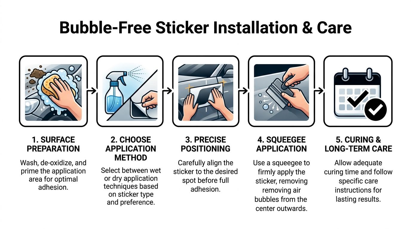
Prep the surface properly
The surface has to be clean, dry, and free from wax, oxidation, and road film. If the panel feels slick with protectant or gritty with contamination, the adhesive won’t bond evenly.
Wash first. Then inspect with your fingertips, not just your eyes. If the paint feels rough, you still have contamination.
Prep checklist
- Wash thoroughly: Remove dirt, salt, and road residue.
- De-grease the panel: Focus on edges where wax often lingers.
- Dry completely: Water hiding in trim gaps can ruin alignment.
- Test the surface: If it feels chalky or oxidized, stop and correct that before applying anything.
Choose wet or dry application
Both methods can work. The better method depends on decal size, film type, and your experience.
Dry application is direct and fast. It’s often preferred for smaller graphics and pre-spaced lettering when you’re confident in the placement.
Wet application gives you a little repositioning help on some decal types, especially larger pieces. It can reduce panic during alignment, but it also requires more patience before final adhesion settles.
Align before you commit
Use masking tape hinges or temporary marks. Don’t peel backing and hope for the best.
Stand back and check the angle from different viewpoints. A decal can look straight up close and crooked from ten feet away because body lines trick your eye.
Shop-floor advice: Align to the vehicle’s strongest visual line, not to the ground. Cars often sit on uneven surfaces, but body lines reveal crooked decals immediately.
Squeegee with discipline
Work from the center out. Short, overlapping strokes beat wild swipes.
The verified material guidance around law-enforcement graphics notes application methods can be wet or dry and describes using a squeegee at a controlled angle to avoid bubbles on curved panels. In practice, that means steady pressure and patience, especially with reflective films that don’t forgive rushed handling.
If you trap a small bubble, don’t panic. Many tiny bubbles settle as the adhesive sets. The primary danger is dragging dirt under the film or forcing wrinkles into a corner.
Remove transfer tape carefully
Transfer tape comes off after the vinyl has set enough to stay put. Peel it back slowly at a low angle rather than yanking upward.
If a letter starts lifting, lay the tape back down, press again, and wait longer. Fast removal causes more failures than commonly realized.
Give the decal time to cure
Fresh adhesive needs time. Don’t wash the vehicle immediately. Don’t blast the edges with pressure. Don’t assume “stuck” means “finished.”
Many clean installs get damaged at this stage. The vinyl may look done while the adhesive is still building bond strength.
For a simple motion reference, this installation video shows the kind of careful, controlled handling that prevents bubbles and skewed placement:
Long-term care that preserves the finish
After curing, maintenance is simple if you stay gentle.
- Wash by hand when possible: Soft mitts are kinder to edges than aggressive brushes.
- Avoid picking at corners: Small lifts grow quickly once dirt gets underneath.
- Watch temperature extremes: Very cold weather makes vinyl less forgiving.
- Inspect after trail use: Mud, sand, and brush contact can stress exposed edges on trucks and Jeeps.
Troubleshooting common problems
Micro-bubbles
Usually harmless if they’re tiny and evenly scattered. Many disappear with time. Large trapped pockets usually point to rushed squeegee work.
Edge lifting
This often comes from contamination, poor surface prep, or early exposure to washing and weather. Pressing it down again rarely solves the root problem.
Wrinkles on curves
That’s usually a sizing or conformability issue. Some films don’t like deep contour changes, and some designs should have been split into smaller sections instead of forced as one piece.
The best install looks uneventful. That’s the goal. No drama, no stretching wars, no “close enough” alignment.
Conclusion and Next Steps
Police stickers for cars can look sharp, restrained, and meaningful when the design is built with intent. The strongest results usually come from a simple sequence. Pick the right category first, stay on the safe side of impersonation law, choose material based on how the vehicle is used, scale the design to the actual panel, and install it with patience.
Ghost graphics deserve special care because they sit in that narrow space between subtle style and official visual language. They can look excellent on trucks, Jeeps, and darker vehicles, but they work best when the wording, placement, and overall presentation stay clearly civilian.
If you’re narrowing down your own project, use a short checklist:
- Confirm the design won’t be mistaken for official markings
- Choose material based on visibility and durability needs
- Measure the usable panel area, not just the biggest dimension
- Install on a clean surface with careful alignment
- Treat the decal like a finish, not like a temporary sticker
A good result shouldn’t just look good on day one. It should still make sense months later, in daylight, at night, and in the eyes of everyone else on the road.
If you’re ready to turn an idea into a clean, durable decal, Custom Sticker Shop is a practical place to start. They offer custom automotive graphics, windshield banners, tribute decals, and pre-spaced vinyl designs made for real vehicle surfaces, so you can build something that fits your style without guessing on format.