
You're probably here because you've seen that black, white, and red flag on a rear window, bumper, or truck back glass and wanted to make sure you understood it before putting one on your own vehicle. That's the right instinct. A Thin Red Line car decal isn't just another automotive graphic. It's a public sign of respect for firefighters and for the sacrifice tied to that work.
Done well, it looks clean, deliberate, and honorable. Done poorly, it can look like an afterthought, or worse, interfere with visibility or fail early because it was placed on the wrong surface. The details matter.
This guide is built for the practical questions people ask. What the symbol means. Which decal style makes sense. Where it should go on a sedan, SUV, or truck. How to install it so it stays put and still looks right months down the road.
A Symbol of Honor on Our Highways
A firefighter tribute decal works best when it feels intentional. You see it every day on the road. A pickup with a clean flag in the corner of the rear glass. An SUV with a modest decal centered low on the liftgate glass. A sedan with a small mark tucked into the rear side window. The common thread is restraint and respect.
That's why people pause before buying one. They don't want to slap a symbol with real meaning onto a vehicle without understanding what it represents or how to display it properly. That caution is a good thing.
A thin red line car decal usually succeeds when it does three jobs at once:
- Carries the symbol clearly so the red stripe is visible and recognizable
- Fits the vehicle's shape instead of fighting body lines or window curvature
- Stays readable from a distance without becoming oversized or distracting
A tribute decal should look like it belongs on the vehicle, not like it was squeezed into the first empty spot.
The practical side matters just as much as the symbolic side. A decal that's too large can crowd a sedan's rear glass. One that's too small can disappear on a full-size truck. A glossy painted panel may look sharp, but glass is often easier to install on and easier to keep clean.
The strongest results come from matching the decal to both the meaning and the machine.
Understanding the Thin Red Line Meaning
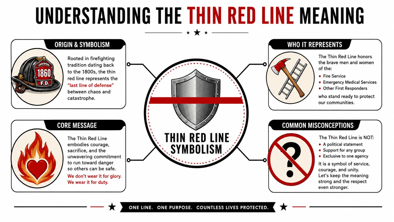
The Thin Red Line is a fire service symbol of remembrance, support, and solidarity. It's used to honor firefighters who were injured or killed in the line of duty, and it reflects the role firefighters hold between the community and disaster. The Wake New Hope Fire Department notes that the modern symbol was reportedly conceived in 1999 by the Apex Volunteer Fire Department in North Carolina, and it has since become a recognized memorial tradition in the fire service (Wake New Hope Fire Department on the Thin Red Line).
What the design represents
The version widely recognized uses a black-and-white American flag layout with a single red center stripe. That visual consistency is a big reason the symbol translates so well into decals, stickers, helmet graphics, and window tributes.
The Thin Red Line is first a sign of honor. It isn't just decoration.
That's the right way to approach it. If you're displaying one, you're saying something in public. You're showing support for firefighters, for their families, and for the risks tied to the profession.
Why etiquette matters
This symbol carries more weight than a general patriotic graphic. It isn't meant to be loud for the sake of being loud. It's meant to be respectful. In practice, that usually means:
- Keep it legible: Don't distort the design so much that the red line disappears into a novelty layout.
- Avoid cluttered placement: If the area already has multiple decals, badges, and slogans, the tribute loses clarity.
- Choose a scale that matches the vehicle: A modest, visible mark usually communicates more respect than an oversized decal forced across awkward body lines.
Some buyers also look at related service-symbol decals when comparing styles, such as a Thin Green Line military flag decal sticker, but each line has its own meaning and audience. That distinction matters. The Thin Red Line should remain specifically tied to support for the fire service.
What it does and doesn't say
A good rule is simple. This symbol should point attention toward firefighters, not toward the owner's ego or taste for shock value. When people see it, the message should be obvious: support, gratitude, remembrance.
That's why the cleanest presentations tend to age the best. A recognizable flag layout, a visible red stripe, and placement that doesn't interfere with safe driving will always feel more appropriate than something busy or exaggerated.
Choosing the Right Thin Red Line Decal
Once the meaning is clear, the next decision is practical. Material, finish, and scale change how the decal behaves on the vehicle. They also change how visible it is by day, at night, and from different angles.
Standard vinyl versus reflective vinyl
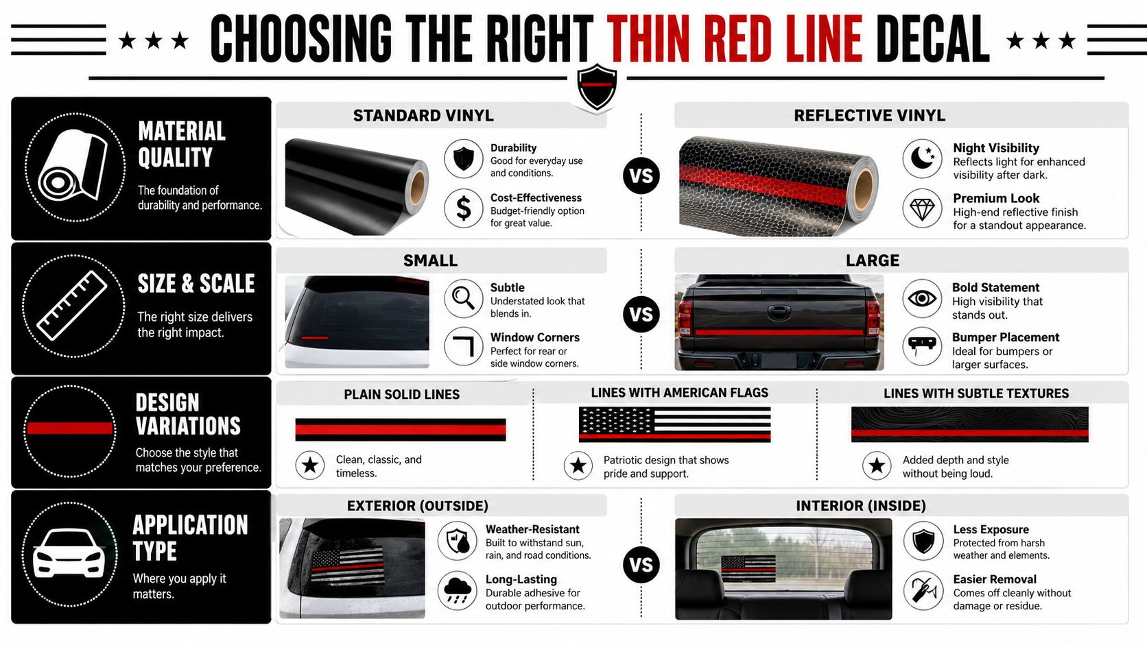
Manufacturers commonly offer standard and reflective vinyl versions, with sizes ranging from small helmet decals up to large 35-inch graphics, which shows the market supports very different use cases and visibility preferences (reflective Thin Red Line decal options).
Here's the trade-off in plain terms:
| Material | Works well for | Watch out for |
|---|---|---|
| Standard vinyl | Daily driver windows, subtle rear glass placement, classic appearance | Can be less noticeable at night |
| Reflective vinyl | Vehicles parked outdoors at night, roadside visibility, stronger after-dark presence | Can look more assertive than some buyers want in daylight |
Standard vinyl gives you the traditional look often expected. Reflective material changes the personality of the decal. That's not good or bad by itself. It depends on the job. If the goal is a quiet tribute on a family SUV, standard vinyl often feels right. If the vehicle sees night use and visibility matters, reflective may be the better fit.
Practical rule: Pick the material based on where the vehicle spends most of its time, not just how the decal looks on a product page.
Size should follow the panel
Regarding decal placement, many people make the wrong call. They choose based on the design they like, not on the amount of flat, usable space on the vehicle. A thin red line car decal needs enough room around it to read cleanly. If the decal nearly touches trim, defroster lines, wiper paths, or badging, it starts to feel cramped.
A few buyer-friendly approaches work well:
- Small format for corners: Better for rear side glass, quarter windows, and compact sedans
- Mid-size for rear windows: Good when you want visibility without taking over the whole glass
- Large format only on broad, simple surfaces: Better suited to truck rear glass or larger smooth panels
For shoppers comparing options, one example is this Thin Red Line Fireman American Flag decal sticker, which fits the familiar support-graphic format used on vehicle glass.
Design matters less than clarity
Weathered textures, cut-out styles, and integrated flag looks all have their place. The deciding factor should be whether the red stripe remains easy to identify and whether the overall shape still reads as a respectful fire service tribute. If the graphic needs explanation, it's usually too complicated.
Best Decal Placement for Your Vehicle
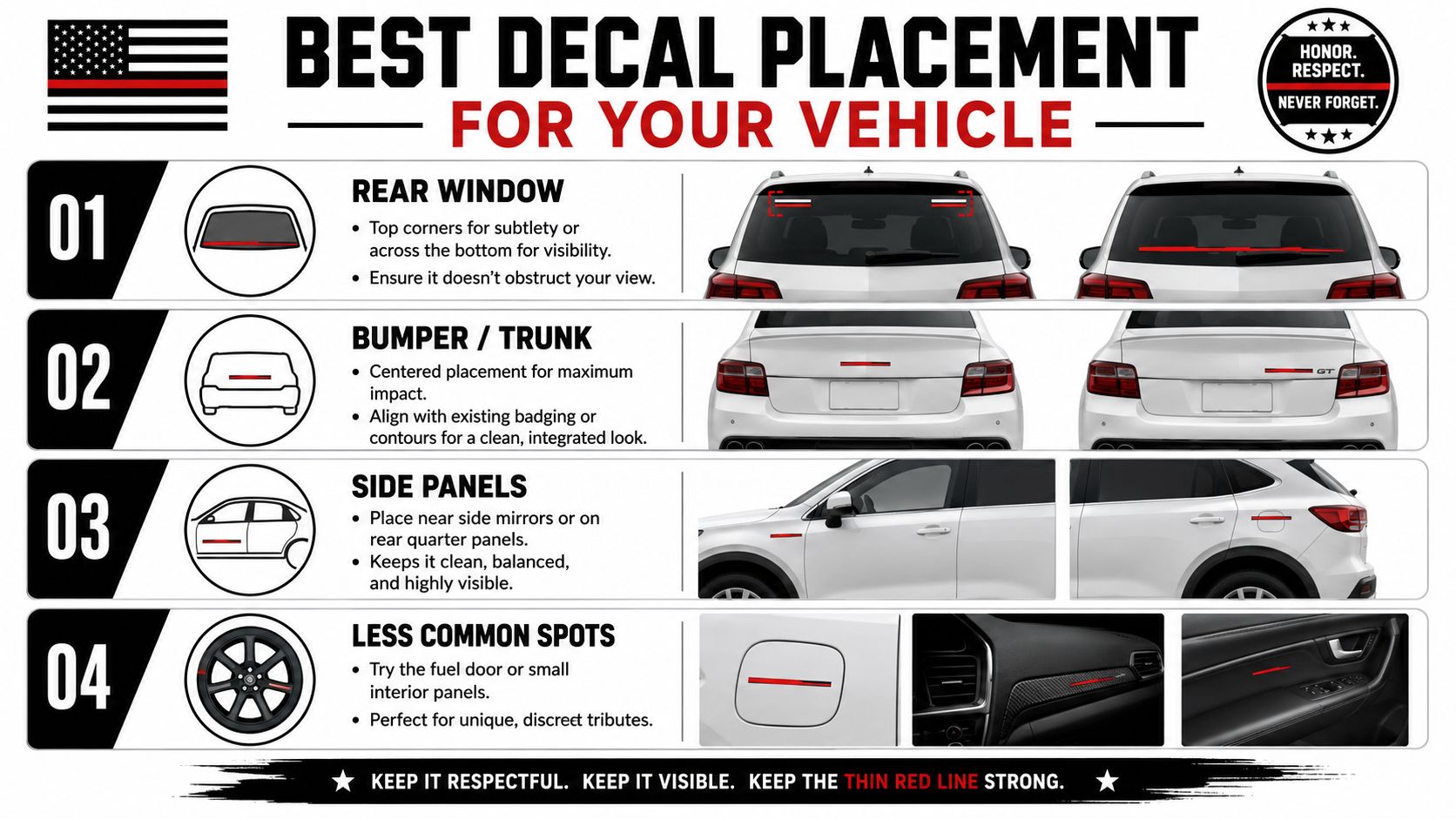
Placement is where respect and practicality meet. A decal can have the right meaning and the right material and still feel wrong if it's put in the wrong spot. The strongest placements preserve visibility, follow the vehicle's lines, and give the design enough negative space to breathe.
Retail versions are often around 3" x 4.25" or 4" x 6.5", and that range is commonly used because it fits most car and truck glass as a high-contrast mark without obstructing the driver's view (common retail decal sizing).
Sedans
Sedans usually have the least forgiving glass area. Rear windows are often more sloped, trunk lines are tighter, and side glass can be narrow.
Best placements for sedans:
- Upper rear windshield corner: Clean, traditional, and easy to see without taking over the glass
- Lower rear windshield corner: Works well if the top edge already has tint or factory markings
- Rear quarter window: Good for smaller decals and a quieter look
What usually doesn't work is trying to stretch a larger decal across a heavily curved rear windshield. It can look oversized fast, and installation gets harder as the glass bends.
SUVs and crossovers
SUVs usually give you more usable glass, especially on the rear liftgate. That opens up more options, but it also tempts people to go too big.
A good SUV setup often looks like this:
| Vehicle area | Why it works | Best use |
|---|---|---|
| Top rear glass corner | Balanced and understated | Family SUVs, daily drivers |
| Lower liftgate glass | Easy to read at traffic distance | Medium decals |
| Rear side cargo glass | Good visual frame for smaller tributes | Cleaner side profile |
Curved liftgate glass can still be tricky. If the panel wraps aggressively near the edge, move the decal slightly inward. Flat center sections almost always install better than edge zones.
Trucks
Pickups offer the easiest real estate for a thin red line car decal. Rear cab glass is often broad enough to support either a compact flag or a more visible statement piece without crowding.
For trucks, these placements usually look right:
- Rear glass corner: The safest default. Clean and proportional on most pickups.
- Center lower rear glass: Better when the decal is meant to be seen straight-on from following traffic.
- Tailgate area: Works if you want the tribute on paint instead of glass, but the surface needs more careful prep and placement discipline.
On a truck, bigger isn't automatically better. The right size is the one that leaves margin around the graphic and doesn't compete with sliding rear windows, brake lights, or existing decals.
A simple fit test before you buy
Use painter's tape to mark the decal's expected height and width on the exact surface. Then step back from a few angles. If the taped outline looks crowded from ten to fifteen feet away, size down. If it disappears into the panel, size up.
That quick test catches most placement mistakes before they become install mistakes.
How to Install and Care for Your Decal
Most decal failures don't happen because the vinyl is bad. They happen because the surface wasn't properly prepared. Residue from wax, silicone, or road film can keep the adhesive from bonding and lead to early edge lift (surface preparation guidance for universal window decals).
Start with a clean, cool surface. Don't apply on dirty glass, hot paint, or over dressings and detail sprays.
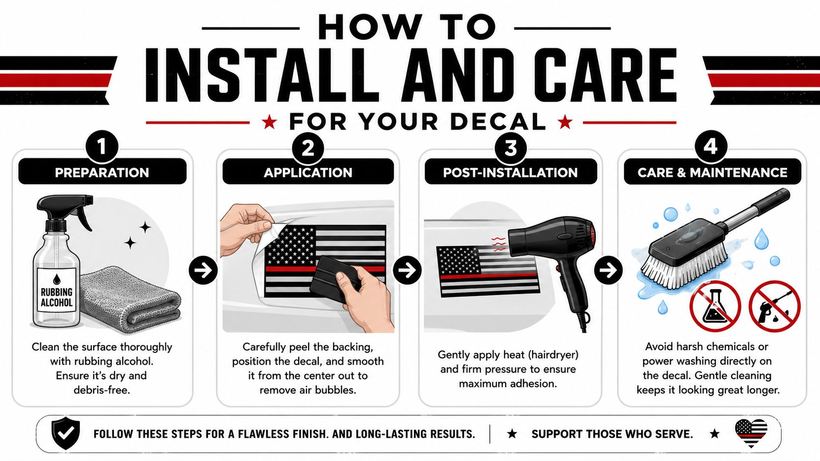
A straightforward install routine
- Wash the area first. Remove loose dirt before you do anything else.
- Wipe with rubbing alcohol. That helps cut residue that soap can leave behind.
- Test the position with tape. Hinge the decal in place so you can check alignment before committing.
- Apply from the center outward. Use a squeegee or a wrapped card to push air out toward the edges.
- Peel transfer tape slowly. If the vinyl lifts, lay the tape back down and burnish again.
This install video gives a useful visual reference before you start:
What helps a decal last
After installation, press the edges firmly and keep the surface dry for a settling period. Gentle heat from a hairdryer can help the vinyl conform on slightly curved areas, especially near corners.
For routine care, keep it simple:
- Wash gently: Hand washing is the safest option around decal edges.
- Avoid direct pressure on the edge: If you use a pressure washer, don't aim it straight at the decal border.
- Skip harsh chemicals: Strong solvents can attack both the print and adhesive.
- Check corners during routine washes: Early edge lift is easier to address than full peel-back.
A clean install beats a rushed install every time. Most bubbles, crooked placements, and lifting corners start before the backing paper is even removed.
Honor Their Service with a Decal That Lasts
A Thin Red Line decal means something. It shows support and solidarity for fire service personnel, and its familiar black-and-white flag design with a single red center stripe has made it one of the most recognizable first-responder decals in public view (FireRescue1 on what the Thin Red Line flag means).
The practical side matters because respect shows up in execution. Choose a material that fits how the vehicle is used. Match the size to the glass or panel, not just to the listing photo. Put it where it reads clearly and doesn't interfere with safe visibility. Prep the surface like it matters, because it does.
If you want a more stylized tribute, some drivers prefer designs such as a Punisher skull flag fireman firefighter red line vinyl decal sticker, but the same rule still applies. Keep the symbol readable and the placement respectful.
A good tribute decal doesn't need to be flashy. It needs to be clear, durable, and displayed with purpose.
If you're ready to order from a company that understands tribute decals and automotive fitment, take a look at Custom Sticker Shop. They're a veteran-friendly, family-run maker in Topeka, Kansas producing American-made vinyl decals with professional-grade Oracal material rated for up to 7 years outdoors. They also offer practical buyer benefits, including free U.S. shipping on orders over $25 and an unlimited Buy 2 Get 1 Free deal, which is useful if you're outfitting more than one vehicle or ordering matching decals for family members.