
You're probably looking at your car right now thinking it needs one small thing to feel like yours. Not a full wrap. Not a loud graphic package. Just a clean name on the glass, door, or quarter panel that gives the vehicle some identity without making it look overdone.
That's where a name decal for car projects usually start. A Jeep gets a trail name on the hood edge. A family SUV gets the kids' team name on the rear glass. A pickup gets a ranch name, call sign, or surname on the back window. The job sounds simple, but the difference between a decal that looks sharp for years and one that curls, fades, or causes visibility trouble comes down to a few practical choices.
Giving Your Car a Voice with a Custom Name Decal
A name decal isn't typically ordered for advertising purposes. It's ordered because the vehicle already has a personality. It's the work truck with a nickname. The off-road build you've spent weekends dialing in. The family car that always ends up at school pickup, practice, and grocery runs. A name finishes the story.
The part many drivers miss is how visible even a simple decal becomes once it's on a vehicle. Industry sources report that individual vehicle advertising can generate between 30,000 and 70,000 daily vehicular impressions according to Signs.com's vehicle decal guide. That matters even if your decal isn't commercial. A clean name on a car gets seen constantly in traffic, parking lots, neighborhoods, and drive-through lines.
Why a small decal gets noticed
A vehicle moves through real-world viewing angles all day. People don't stare at it the way they would a sign on a wall. They catch it in pieces. At a stoplight. In a parking row. Through a side mirror. That's why a short, well-cut name often works better than a long phrase with too much decoration.
I've seen the same pattern for years. The decals that look strongest usually do three things well:
- They say one thing clearly. A name, call sign, surname, or short phrase reads fast.
- They fit the panel. Good sizing makes the decal look intentional instead of stuck on.
- They respect the vehicle lines. A decal should work with the glass edge, door shape, or body crease.
A good car decal doesn't need to shout. It needs to read cleanly the first time someone sees it.
If you're still deciding what style fits your vehicle, looking through custom car decal options can help narrow down placement, font style, and scale before you order anything.
Understanding Your Decal Materials and Durability
The first mistake buyers make is treating every decal like a sticker. On a car, that usually ends badly.
Technically, a decal is designed for transfer from a backing onto a surface like glass or metal, whereas a sticker is an adhesive label applied directly. For cars, vinyl cut lettering decals are preferred because they create clean text without a background, allowing the vehicle's paint to show through, as explained in PrintPlace's guide to custom stickers for cars.
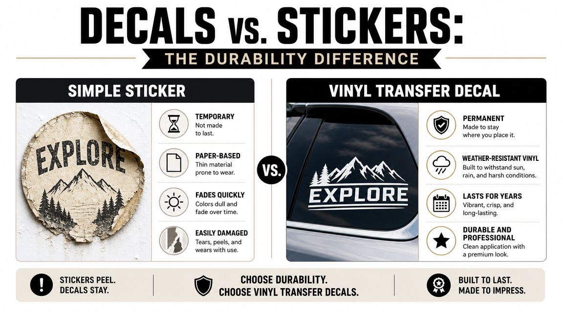
Sticker versus decal in real shop terms
Here's the practical version. A paper or low-grade printed sticker can work for a laptop, folder, or short-term indoor use. On a vehicle, it tends to show its weaknesses fast. Edges catch. Moisture gets in. Sun exposure makes fading more obvious.
A cut vinyl decal is different. Only the letters or shapes transfer to the car. There's no boxy background around the design unless the job specifically calls for one. That cleaner edge matters on windows and painted panels because it looks built for the vehicle instead of pasted onto it.
What actually affects lifespan
Material quality matters more than people think. So does the way the decal is made.
For outdoor automotive use, pay attention to these factors:
- Vinyl construction matters because automotive surfaces expand, contract, and get washed.
- Weather resistance helps the decal hold up through rain, heat, and regular road grime.
- UV resistance affects how long the color stays crisp instead of chalky or faded.
- Cut quality matters because rough edges and tiny unsupported details fail earlier.
Practical rule: If a design has hairline strokes, distressed textures, or tiny floating pieces, it may look good on a screen and behave poorly on a car.
Vinyl Decal Material Comparison
| Vinyl Type | Common Name | Outdoor Lifespan | Best For |
|---|---|---|---|
| Calendared vinyl | Standard sign vinyl | Shorter-term outdoor use | Flat panels, budget-friendly lettering |
| Cast vinyl | Premium conformable vinyl | Longer outdoor use | Curves, long-term vehicle graphics |
| Printed vinyl with laminate | Full-color decal film | Depends on film and laminate | Logos, multicolor graphics, photo-style designs |
| Cut lettering vinyl | Transfer decal vinyl | Depends on vinyl grade and placement | Names, slogans, clean window text |
The best name decal jobs are usually simple cut lettering in a quality vinyl. That setup avoids unnecessary background film, stays cleaner visually, and gives you fewer failure points around the edges.
Tips for Designing a Standout Name Decal
Design is where people either sharpen the idea or ruin it. A lot of weak decals come from trying to force too much personality into too little space.
Motorsports gets this right. NASCAR requires door numbers to be at least 21 inches high so they stay readable at speed and from a distance, according to 10KWraps' guide to race car number decals. Your daily driver doesn't need race sizing, but the principle carries over. If the text isn't readable quickly, the design isn't doing its job.
![]()
Font choice decides everything
Script fonts can look great. They can also become a mess on tinted glass or from a side angle. Block fonts aren't exciting on their own, but they usually survive real-world viewing better.
What works well:
- Bold sans serif fonts for rear windows, doors, and work vehicles
- Clean script for short names with enough letter spacing
- Military or stencil-inspired styles when the vehicle theme supports it
- Simple serif fonts for a more classic or vintage look
What usually doesn't work:
- Ultra-thin strokes that disappear at a distance
- Overly distressed fonts with too many breaks
- Tight cursive where letters crash together
- Long names in decorative script on small glass areas
Contrast beats complexity
A white decal on dark tint usually reads well. Black on light paint can also look clean. The trouble starts when buyers choose a color that matches the vehicle too closely because it looked subtle on the mockup.
For a name decal, subtle often turns into invisible.
A few safe design habits make a big difference:
- Match the decal to the vehicle's lightest or darkest surface, not your favorite color on screen.
- Keep add-ons small, like a flag, paw print, hobby icon, or simple symbol.
- Treat spacing as part of the design. Crowded letters look amateur even when the font is good.
If you're brainstorming branded text or vehicle-friendly logo ideas, this article on creating custom stickers for shop owners is useful because it pushes you to think about readability before decoration.
For sports-themed personalization, a product like this custom soccer ball name window decal shows how a small graphic element can support the name instead of competing with it.
If someone needs more than a second or two to figure out what your decal says, simplify it.
Sizing and Placing Your Decal for Best Results
Bad sizing can make a perfectly good design look wrong. Too small, and it disappears into the panel. Too large, and it fights the shape of the car.
Placement changes durability too. Inside-glass application shields the decal from weather and scratches, often extending its life, while exterior placement on doors or body panels maximizes visibility, as noted in Square Signs' car decal placement guide.
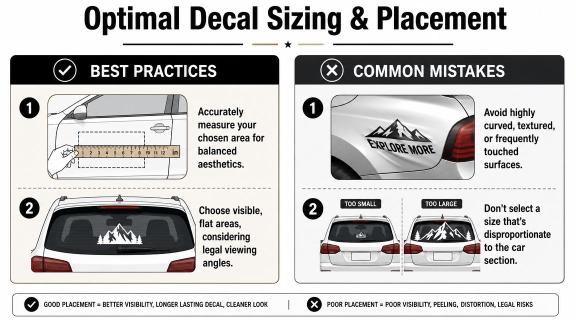
How to measure without guessing
Use masking tape and a soft tape measure. Don't measure the widest possible area and call it done. Measure the area that still leaves breathing room around the decal.
A simple process works well:
- Mark the left and right limits of the space with low-tack tape.
- Check height at more than one point if the glass or panel tapers.
- Step back several feet before finalizing size.
- Account for trim lines, defrosters, handles, and body curves.
If the decal is going on a rear window, avoid cramming it edge to edge. A name usually looks better with margin around it. That margin also helps the decal look centered even on glass that isn't perfectly rectangular.
Best locations for a name decal
Different spots solve different problems.
Rear window
Good for personal names, family names, team text, and hobby decals. It's visible and usually easy to install on a flatter section.
Door panel
Works well when you want the name to be seen from the side. This is common on trail rigs, work vehicles, and club builds.
Rear quarter glass
A smart choice for smaller names or side identifiers. It gives a more subtle look and usually avoids the visual weight of a large rear-window decal.
Hood edge or windshield area
Popular on off-road vehicles and enthusiast builds, but placement needs extra care because sightlines matter more up front.
If you want a simple text format sized for glass, something like this custom text window decal option gives a useful reference point for proportion.
Exterior versus inside-glass
This is one of the biggest trade-offs in the shop.
Exterior application gives you stronger visibility on paint, metal, and outer glass. It's ideal when the decal is meant to stand out. Inside-glass placement usually lasts better because the decal sits protected from weather, wiper contact, and routine abrasion.
Choose based on how you use the vehicle:
- Daily commuter: inside-glass often makes more sense
- Show truck or trail rig: exterior placement may suit the look better
- Fleet or business use: prioritize angle and readability first
- Family SUV: use a location that won't interfere with daily visibility
Legal and Safety Rules for Car Window Decals
A lot of decal shops are happy to say “works on windows” and leave it there. That's not enough. Glass placement is where style can run straight into visibility law and common sense.
A key issue is simple. State and local laws often regulate the size and placement of anything that could obstruct a driver's view, which is why guidance on car window decal legality matters so much. Rules vary, and that means a name decal that's harmless on one vehicle in one area can be a problem somewhere else.
The safest approach to window placement
Front windshield areas deserve the most caution. Even a small decal can become a distraction if it sits in the wrong part of the driver's field of view. Side windows matter too, especially if the decal interferes with mirror checks, lane changes, or low-light visibility.
Rear windows are where people usually want name decals, and that can work well, but size still matters. The practical question isn't just “will it fit?” It's “will it reduce usable rear visibility?”
Use these rules as a working filter:
- Keep the driver's forward view clear. Don't place decorative text where you naturally scan traffic, pedestrians, or signals.
- Be careful with side glass. If the decal blocks a shoulder-check zone, it's in the wrong spot.
- Treat rear glass conservatively. A name at the top or bottom is usually safer than a huge center placement.
- Check local code before applying anything to glass. Inspection standards and enforcement vary.
Solid vinyl versus see-through material
For a standard name decal, solid cut vinyl is the normal choice. It's crisp and readable. But solid text still blocks whatever area it covers.
Perforated window film is a different product category. It can help with larger graphics because it's designed for one-way visibility effects, but it isn't usually necessary for a simple name. If you only need lettering, don't overcomplicate the job.
Safety comes first. A decal should personalize the vehicle without turning the window into a blind spot.
If there's any doubt, move the decal lower on the body, smaller on a quarter window, or inside the glass where you can better judge the sightline before committing.
A Step-by-Step Guide to a Bubble-Free Installation
A name decal is one of the easier vehicle graphics to install, but people still get in trouble by rushing. Most failures come from dirty surfaces, crooked placement, or pulling transfer tape too aggressively.
This visual shows the basic flow before you start.
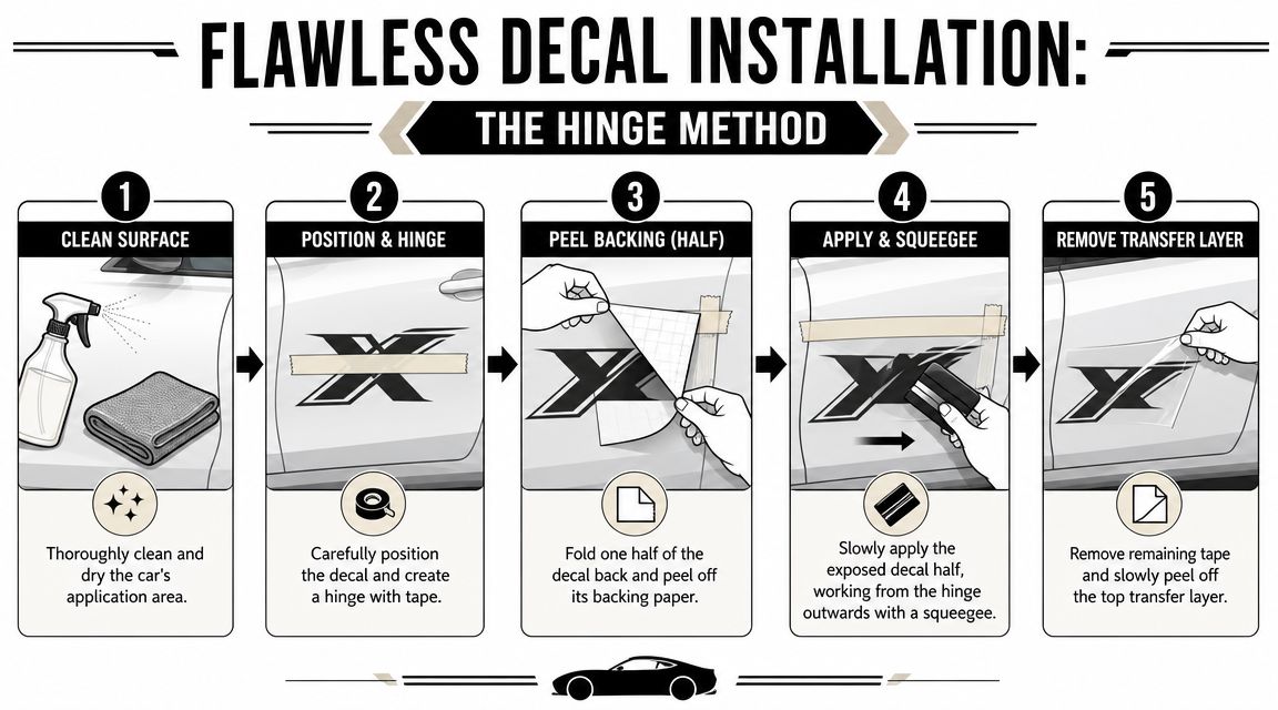
Prep the surface first
Don't install over dust, wax residue, or oily fingerprints. Clean the area thoroughly and dry it fully. On glass, especially interior glass, leftover film from cleaners can hurt adhesion.
If you want a better cleaning routine before installation, it helps to learn from Professional Window Cleaning, especially on how to avoid residue and lint.
Use the hinge method
The hinge method keeps the decal aligned while you work. It's simple and beginner-friendly.
- Test position the decal with the backing still on. Use small pieces of masking tape to hold it in place.
- Create a hinge by running one strip of masking tape across the center.
- Lift one side, peel away that half of the backing paper, and cut or fold the backing away.
- Squeegee from the hinge outward using firm, overlapping strokes.
- Repeat on the other half after removing the remaining backing.
- Peel transfer tape slowly at a sharp angle, not straight outward.
Here's a helpful installation video if you prefer to watch the motion before trying it yourself.
Common installation mistakes
A few habits cause most of the trouble:
- Applying in direct heat: warm panels can make positioning harder
- Touching the adhesive: skin oils weaken the bond
- Using weak pressure: light passes with the squeegee leave bubbles behind
- Ripping transfer tape off fast: that can lift small letters back up
Peel the transfer tape slowly and watch each letter. If part of the decal starts to lift, lay the tape back down and squeegee again.
After installation, leave it alone for a bit. Don't scrub the area right away, and avoid picking at corners if you notice a tiny edge still settling.
Why Choose a Trusted American Decal Shop
A clean result comes from three things. Good vinyl, accurate cutting, and proper prep before the decal ever reaches your hands. If one of those is off, the install gets harder and the finish looks cheaper.
That's why shop standards matter. A family-run American shop that cuts automotive decals every day is more likely to send lettering that's spaced correctly, taped correctly, and built from material intended for exterior use. In practical terms, that means less guesswork on your end.
What to look for before you order
The reliable signs are pretty easy to spot:
- Outdoor-rated vinyl suited to automotive weather exposure
- Transfer-taped lettering so small characters stay aligned
- Clear proofing or customization flow before production
- Responsive customer service when sizing or placement questions come up
One factual example is Custom Sticker Shop, a family-run, veteran-friendly decal maker in Topeka, Kansas, which has operated since 2001 and produces American-made decals using Oracal vinyl rated for up to 7 years outdoors, with orders pre-spaced and transfer-taped for installation.
Why this matters on a simple name decal
A name decal looks easy because it's small. Small lettering is less forgiving. Bad cuts show up fast. Misaligned transfer tape makes install harder. Weak vinyl edges fail sooner.
When the shop gets the basics right, your job gets easier. You spend less time fighting bubbles and more time enjoying a decal that looks like it belongs on the vehicle.
If you're ready to order a name decal for car use, Custom Sticker Shop offers custom text and vehicle decal options made from outdoor-rated vinyl, with pre-spaced, transfer-taped application that helps simplify installation.