
You're probably in the same spot most owners hit after the wheels, suspension, and tint are done. The car runs right, sits right, and looks cleaner than stock, but it still doesn't feel fully yours. From ten feet away, it could still be mistaken for somebody else's build.
That's where tuner car vinyl graphics make sense. They change the identity of the car without locking you into permanent bodywork or a repaint. A side stripe, windshield banner, quarter graphic, or subtle body accent can shift a build from generic to recognizable fast, but only if the style fits the platform and the sizing respects the body lines.
The sticking point isn't design taste; it's fitment. A common scenario involves finding a desired graphic, noting its “universal fit,” and then guessing if it will crowd the door, clip the wheel arch, or break awkwardly across a side skirt. This uncertainty is what makes many graphics appear cheap, even when the vinyl itself is good.
Beyond Stock The Power of Personalization
A lot of builds hit a visual plateau. You add wheels, lower it, maybe swap lights or aero, and the car looks better, but not more personal. It still reads like a parts list. Graphics change that because they create a visual signature people remember.
That's a big reason vinyl took over where custom paint used to dominate. The move from hard-painted customization to digitally produced vinyl decals became commercially practical in the late 1990s and 2000s, and today tuner graphics are commonly sold as pre-cut, transfer-taped kits in larger formats such as 20 inches by 90 inches and 6 inches by 104 inches, which shows how the category evolved from small stickers into full-body accent graphics for modern cars and trucks (vinyl graphics product examples).
Older paint-based graphics had presence, but they also had commitment, labor cost, and almost no easy way back. Vinyl changed the equation. You can test a look, revise it later, and build around the car's lines instead of handing the whole exterior over to one permanent decision.
Why vinyl works for tuner culture
Tuner style has always changed with the platform and the era. What worked on an older coupe with flat body panels doesn't automatically work on a newer hatch with sharper door cuts and taller quarter sections. Pre-cut vinyl kits fit that reality better because they're easy to place, easy to scale conceptually, and available in formats that suit side panels, windows, and body accents.
Practical rule: A good graphic should look like it belongs to the car's sheet metal, not like it was laid on top of it as an afterthought.
That's why placement matters as much as the artwork itself. A clean stripe that follows the beltline usually beats a louder design that ignores the car's natural shape. If the graphic works with the fender peak, rocker line, and glass shape, the whole build looks more intentional.
What separates a clean result from a messy one
Three things usually decide whether tuner car vinyl graphics look sharp or amateur:
- Proportion to the body: A long, low coupe can carry a stretched side graphic. A tall hatch often needs a shorter visual run or a thinner band.
- Break points: Door gaps, side skirts, and wheel arches can either frame the design or ruin it.
- Visual hierarchy: The graphic should support the car's stance, wheels, and paint color, not fight them.
That's where most “universal fit” advice falls apart. The primary job isn't finding any decal that sticks. It's choosing one that preserves the car's lines.
Decoding Popular Tuner Graphic Styles and Ideas
Style comes first, but style without context usually ends in a mismatch. A livery-inspired side graphic can look perfect on one car and forced on another. Before you shop, narrow the visual language you want the car to speak.
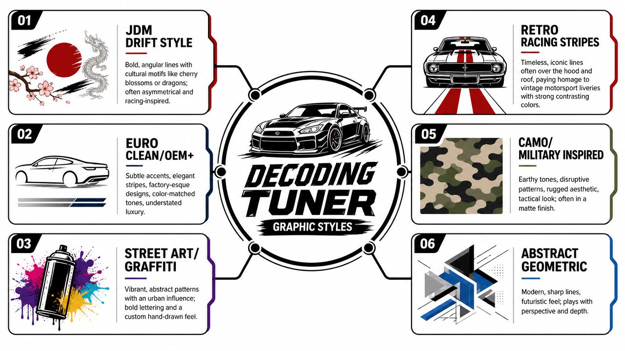
JDM drift style
This is often the first look envisioned. Angular lines, asymmetrical placement, rising-sun cues, kanji-inspired text, dragons, cherry blossoms, and strong diagonal movement all sit comfortably here. It works best when the car already has some attitude through stance, wheel fitment, or aero.
Use this style if you want motion even when the car is parked. The mistake is overloading it. A single aggressive side element plus a windshield banner often lands better than covering every panel.
If you're sketching your own concept first, it helps to simplify logos or artwork into cleaner linework. A quick primer on how to outline images can help when you're turning a rough graphic idea into something usable for vinyl cutting.
For a simple example of that look, a Nismo-style JDM window decal shows how a small graphic can add identity without committing the whole car to a full side treatment.
Euro clean and OEM plus
This is the opposite approach. The goal isn't to shout. It's to make people wonder whether the graphic came from the factory. Thin stripes, subtle windshield text, body-color-adjacent tones, and restrained placement define this lane.
This style suits daily drivers, newer sedans, and refined hatchbacks. It also works well when the car already has expensive paint and you don't want to hide it.
Look for graphics that follow existing creases rather than cutting across them. If the body already has a strong shoulder line, use that as your guide.
Itasha and character-led designs
Itasha graphics come from anime and manga fandom, and they're intentionally expressive. This isn't a subtle style. Character art, vivid color, layered panel coverage, and strong theme cohesion are the whole point.
What works here is commitment. Half-step it and the car looks undecided. If you're going this route, make sure the artwork scale matches the panel. Tiny character art on a big door often looks lost, while oversized art on a small quarter panel feels cramped.
The cleaner the theme, the better the result. One strong character direction usually looks better than mixing unrelated visual references.
Racing-inspired liveries
This category borrows from motorsport. Think side slashes, number-inspired placements, sponsor-style typography, hood accents, and bold contrast. On the right build, it gives the car a functional edge even if it never sees a track day.
There are two ways to do it well:
- Historic influence: Simple stripes and classic livery cues.
- Modern aggressive: Sharp cuts, layered diagonals, and logo-forward placement.
The risk is fake-race clutter. If every open space gets a decal, the car starts looking busy instead of purposeful.
Street art, graffiti, and abstract graphics
These are less tied to one subculture and more tied to pure personality. Spray-can textures, handstyle lettering, fractured patterns, and geometric forms all fall into this camp. They work best on builds that already reject the clean OEM-plus formula.
Choosing a style that matches the car
Ask three quick questions before you buy:
- Does the graphic match the platform? A BRZ can carry sharp motion graphics well. A luxury-leaning sedan may want cleaner, lower-contrast accents.
- Does it match the finish level of the build? Rough graphics on a polished build look off. So do ultra-clean stripes on a deliberately raw street car.
- Will it age well for you? The right style is the one you'll still like after the novelty fades.
Choosing the Right Vinyl Material for Durability
A strong design can still be the wrong buy if the material doesn't match how the car lives. Daily-driven cars, garage-kept show cars, tracked builds, and winter commuters don't put the same stress on vinyl. Sun, heat cycles, road film, washing habits, and textured surfaces all matter.
The biggest divide in practice is usually cast vinyl versus calendered vinyl. If you care about clean edges, long-term shape stability, and easier conformity on curves, this distinction forms the basis of your decision.
Cast vs calendered vinyl comparison
| Feature | Cast Vinyl (Premium) | Calendered Vinyl (Standard) |
|---|---|---|
| Manufacturing feel | Thinner, more conformable | Thicker, stiffer feel |
| Best use | Curves, contours, long-term exterior use | Flatter panels, short-term or budget installs |
| Edge behavior | Better around recesses and compound shapes | More likely to resist complex contours |
| Finish quality | Usually cleaner on close inspection | Can look fine on simple installs |
| Long-term value | Better choice for demanding use | Better choice for lower-cost experimentation |
A lot of sellers won't explain this clearly. They'll just call everything “automotive vinyl.” That doesn't tell you how it behaves when stretched around a bumper edge, laid across a subtle crease, or left outside year-round.
Premium automotive-grade vinyl used for tuner graphics is often marketed with an outdoor life of up to 5 years or more, while low-cost decals can start around $15, which is why cheap graphics can look appealing at first even when they may not hold up as well to sun, heat cycles, and pressure washing as premium laminated cast vinyl (durability and price context).
What that trade-off means in the real world
Cheap vinyl isn't always a bad purchase. If you're testing a style on a spare panel, adding a small interior-window piece, or building a short-term theme, budget material can be fine. The problem starts when buyers expect economy vinyl to act like premium wrap film on a car that sits outside, gets washed often, or sees serious weather.
Here's where premium material earns its cost:
- Complex body curves: Mirror-adjacent areas, bumper returns, and sculpted quarter panels need flexibility.
- Long outdoor exposure: UV and repeated heat cycling punish low-grade material faster.
- Frequent washing: Edges and laminated surfaces matter more once the car sees regular cleaning.
- Finish-sensitive builds: On darker paint or high-gloss finishes, mediocre film flaws show up fast.
If you want a broader material primer from the wrap side of the industry, this guide to choosing business vehicle wraps is useful because the same material basics apply even when the design style is completely different.
When Oracal and similar premium films make sense
In shop terms, premium films are for owners who care about removal behavior, edge hold, and the way the graphic looks after months of normal use, not just on install day. Good cast film lays flatter, responds better to heat, and generally fights you less on a refined install.
That matters most on tuner cars because many of them have busy body surfaces. Side skirts, kicked-up lower doors, aggressive fender arches, and bumper textures all create transition zones where cheap film can telegraph its limitations.
If the graphic crosses a panel shape that your hand can feel, the vinyl quality matters more than the artwork.
Match the material to the use case
A simple perspective is:
- Weekend car: You can prioritize finish and detail because the graphic won't take as much abuse.
- Daily driver: Buy for weather resistance and easier maintenance.
- Track-oriented build: Expect more heat, more wash cycles, and more panel contamination.
- Winter car: Keep expectations realistic. Salt, grime, and cold cycles punish every edge.
One practical option in this category is a vinyl windshield banner decal cut from automotive vinyl, because windshield graphics sit on a relatively simple surface and let you judge material quality without committing to a full side kit.
Perfect Fitment A Sizing and Placement Guide
Most sizing advice online stops at “measure the length you need.” That's exactly why so many installs look off. A side graphic can technically fit the panel and still look wrong because it breaks through a door seam awkwardly, rides too low into the side skirt, or visually crashes into the wheel arch.
Retailers often market tuner graphics as universal-fit and tell buyers to “just measure the length you need,” but owners of cars like the Civic, GT86, BRZ, and 370Z need more useful guidance about width, proportion, and avoiding interference with door gaps, side skirts, and wheel arches (fitment gap example).
Start with the body line, not the sticker size
The right way to size tuner car vinyl graphics is to identify the visual lane first. That's the section of the car where the design should live. On most tuner platforms, it's one of these:
- Upper side lane: Below the windows, near the beltline.
- Mid-door lane: Centered across the door and quarter area.
- Lower rocker lane: Just above the side skirt or lower crease.
- Glass lane: Windshield or quarter window placement.
Once you choose the lane, measure the uninterrupted visual span, not just the maximum metal available. If the graphic crosses a door seam, decide whether it should continue cleanly through the gap or terminate before it. Don't let the seam make that decision for you.
Coupe fitment
Coupes such as the BRZ, GT86, and 370Z usually reward longer, lower graphics because the side profile is stretched and the roofline is short. They can carry motion graphics well, especially designs that taper toward the rear quarter.
What usually works:
- A side graphic that starts behind the front wheel opening instead of too close to it
- Rearward movement that respects the door cut
- A lower edge that runs parallel to the rocker instead of diving into it
What usually fails:
- Graphics that are too tall for the shallow greenhouse
- Designs centered too high, which make the car look heavier
- End points that stop randomly in the middle of the quarter panel
Hatchback fitment
Hatchbacks, especially Civic-shaped platforms, have more vertical mass. That changes proportion. A long decal can still work, but the design often needs to be thinner or more segmented so it doesn't make the side of the car look bloated.
Focus on these rules:
- Use the window line as a balancing reference. Hatchbacks need visual lift.
- Keep the rear section under control. The hatch and quarter area can get crowded quickly.
- Avoid oversized graphics low on the body. They can make the car look shorter and taller at the same time.
A body-side set such as mountains and trees graphics for side panels shows the kind of long-format placement concept that can work when scaled and aligned properly, even though the final success still depends on the actual platform.
Sedan fitment
Sedans give you more door length and more break points. The challenge isn't space. It's continuity. If the design crosses front and rear doors, both sections have to read as one graphic when the doors are closed.
Good sedan placement usually means keeping the strongest visual mass on the front door and quarter transition, then letting the rear section support it. If the rear door carries too much of the design, the whole side can feel stretched.
On a sedan, the cleanest install often comes from designing for the closed-door view first, then checking whether each panel still looks intentional on its own.
A practical measuring routine
Before ordering anything, do this:
- Tape the lane: Use low-tack masking tape to mark the top and bottom edges where the graphic might sit.
- Check every gap: Open both doors and inspect where seams interrupt the shape.
- Step back: View the car from front three-quarter and side-on angles.
- Mock the end points: Tape paper strips where the graphic will begin and end.
- Protect key features: Don't let the design bury a strong OEM crease unless that's deliberate.
Video helps if you're more visual with placement and alignment. This walkthrough gives a useful reference for the application side once your sizing is sorted.
Installation and Maintenance for Lasting Style
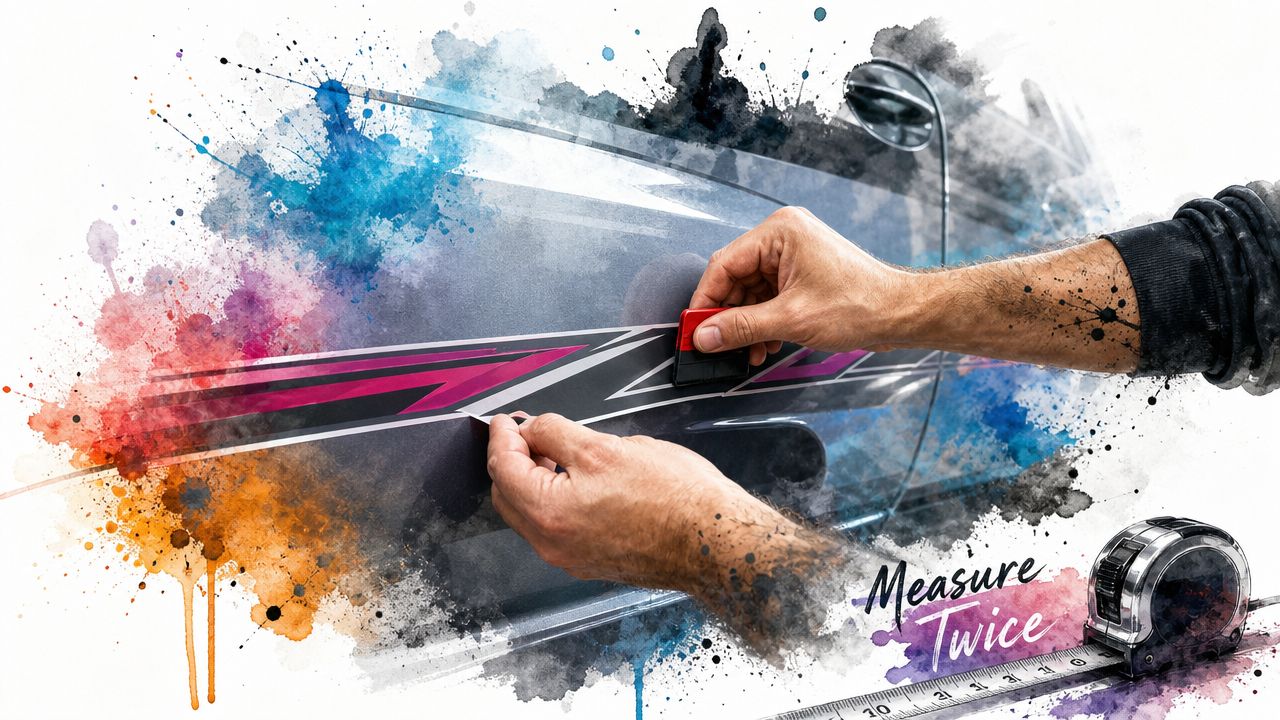
Most failed installs get blamed on bubbles. Instead, the cause is usually poor prep, rushed alignment, or trying to force vinyl onto a dirty or unstable surface. If the panel isn't clean and the placement isn't mapped before backing paper comes off, you're already behind.
A lot of modern automotive decals arrive pre-spaced and transfer-taped, which makes home installation much easier than loose-cut lettering or hand-laid multi-piece art. That doesn't remove the need for care, but it does simplify alignment and spacing.
Prep is where the result is decided
Wash the panel first. Then remove wax, residue, road film, and any leftover detail spray from the exact area where the graphic will sit. The surface needs to feel plain and dry, not slick.
Pay special attention to:
- door edges
- lower rocker areas
- spots behind wheels
- corners near badges or trim
These are contamination zones. They're also where edge failure tends to start.
A clean install routine
For most simple tuner graphics, a careful dry install works well. The basic sequence is straightforward:
- Test fit the full graphic. Hold it in place with tape and confirm sight lines.
- Set a hinge. Use masking tape to create a center or top hinge so the graphic can't wander.
- Peel backing gradually. Don't expose more adhesive than you can control.
- Squeegee with steady overlap. Work from the center outward.
- Recheck edges. Don't assume they're down just because the middle looks perfect.
If the graphic is long, don't try to freehand it all at once. Break the job into controlled sections. Long side pieces go wrong when the installer chases one wrinkle and introduces three more.
What to avoid during application
Some mistakes show up instantly. Others don't show up until the next hot day.
- Don't install over fresh contamination: Dust or polish residue creates weak spots.
- Don't stretch for no reason: Distorted vinyl may shrink back and reveal tension.
- Don't ignore panel texture: Textured bumpers and rough plastics are harder environments than smooth painted doors.
- Don't rush cold panels: Vinyl behaves better when the material and panel are in a workable temperature range.
A simple side graphic on a clean panel usually looks better than a complicated design installed on a rushed schedule.
Keeping the graphic looking sharp
Maintenance is mostly about reducing edge stress and chemical abuse. Hand washing is the safest route, especially for fresh installs. If you use a pressure washer, keep the stream controlled and avoid blasting directly at exposed edges or corners.
For daily-driven cars, the biggest enemies are heat, grime buildup, and aggressive cleaning habits. Strong solvents and harsh scrub tools can dull the surface or start lifting weak points.
A coating can also help with upkeep when it's compatible with vinyl. If you want to read deeper on that side of care, this overview of ceramic coating for vinyl wrap covers the basic idea of protecting wrapped surfaces without turning maintenance into guesswork.
Removal and long-term expectations
Good vinyl should remove more predictably than cheap material, but age, sun exposure, and paint condition all matter. Older graphics that have baked in for years take more patience. Heat helps. Pull angle matters. So does resisting the urge to rip.
If your paint is already compromised, no decal is going to fix that risk. Vinyl is safest on sound OEM paint or quality refinish work that has fully stabilized.
Finding and Buying Your Graphics
Once you know your style, your placement lane, and the material level you want, buying gets simpler. The decision is whether you need a pre-designed graphic or a custom one.
Pre-designed graphics work well when you already know the vibe and just need a clean, cut-ready solution. They're faster to order, easier to evaluate visually, and usually simpler to install because the layout has already been resolved.
Custom graphics make more sense when the car has unusual bodywork, a very specific theme, or a color and panel combination that needs tighter control. They also help when you want the design to avoid certain seams or trim pieces from the start.
What to check before you order
A decent-looking product page isn't enough. Vet the seller on practical points:
- Material transparency: The listing should tell you what vinyl you're getting, not hide behind generic language.
- Application format: Transfer-taped, pre-spaced graphics are easier to place consistently.
- Sizing clarity: If the page only says universal fit, assume you'll need to do more of the fitment work yourself.
- Surface suitability: Smooth painted panels and glass are different from textured plastics.
- Support quality: If the seller can't answer a placement question clearly, expect the same after the sale.
This is also where product breadth matters. If a shop only offers one visual style, you'll end up forcing that style onto the wrong build. A broader catalog usually makes it easier to match the car instead of settling.
Pre-made versus custom
A quick way to choose:
| Option | Best for | Watch out for |
|---|---|---|
| Pre-designed graphics | Faster installs, proven looks, simpler decisions | Generic fitment language |
| Custom graphics | Unique builds, exact sizing needs, seam-aware layouts | More back-and-forth before production |
One vendor detail that matters
If you're comparing options, look beyond the artwork. Shop policies, shipping clarity, installation format, and material choice usually matter more than flashy mockups. For example, the publisher of this guide, Custom Sticker Shop, states that it produces automotive decals in the U.S. using Oracal vinyl, with pre-spaced and transfer-taped formats across a wide catalog. That kind of information is more useful than a dramatic render because it tells you how the product will arrive and install.
FAQs and Final Considerations
Are tuner graphics legal everywhere
Not automatically. Window visibility rules, windshield banner limits, and local equipment regulations vary. Side body graphics are usually the least complicated, while windshield and front side glass placements need more caution. Check local rules before applying anything that affects the driver's field of view.
Will vinyl damage my paint when I remove it
On healthy paint, quality vinyl is generally safer than commonly perceived. Problems usually come from weak repaint work, already failing clear coat, or old graphics that were left on too long and baked hard into the surface. If you're worried, test a small area first and remove with controlled heat instead of force.
Are cheap decals a good way to start
Sometimes, yes. They're fine for trying a look or adding a small accent. They're a poor bargain when you expect long exterior life, regular washing, and clean removability from bargain material.
What's the easiest place to start on a first install
A windshield banner, quarter window decal, or short side accent is usually easier than a full-length body graphic. You get a feel for alignment, transfer tape handling, and edge pressure without wrestling a huge panel.
How do I know if a graphic is too big for my car
If it buries the OEM character lines, crashes through multiple gaps with no plan, or visually lowers the car in a bad way, it's too big. Good graphics support the shape that's already there.
If you're ready to add tuner car vinyl graphics without guessing on quality or fitment, browse Custom Sticker Shop for automotive decals and body graphics that arrive pre-spaced and transfer-taped, so it's easier to get a clean result on the first try.